|
|
|
Showing 1911 - 1920 of ~3604 |
| Image |
Comment |
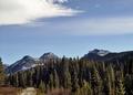
| 11/13/2004 08:18:14 PM | Octoberby TressiderComment: Lacks the punhc, the highly orthodox standard photographic approach to landscape that I'd expect of a calendar. A good enough scene, in itself, and in your chosen composition (although I think a more draatic cloudscape would be effective), but the light is not great - no sense of shape to the mountains, no warmth, and a sense of the image being cropped too high. You've done well howeever, to place the horizon strongly in frame, and to find those parallele shapes of tree-line and hills. Close - but it needs to be more imposing, to my eye. |  Photographer found comment helpful. Photographer found comment helpful. |
| 11/13/2004 08:14:07 PM | Novemberby geewhyComment: This looks like Gordon Whyte's trick with NI - most specifically in the resultant texture of those leaves. I can go with the kind of soft/non-soft feel of it for a calendar shot, but I'm not great fan of it photographically, I'm afraid. It'll garner a 6 though, for aptness, at least. | | Photographer found comment helpful. |
| 11/12/2004 07:05:53 PM | Januaryby cabaComment: To me, this seems like the photographic equivalent of a sketched idea for a shot - 'how about we set this thing up, you know, gloved hands, bowl of soup' kind of thing. Your execution leaves an awful lot to be desired, I'm afriad. The questions it throws up for me: the colour structure of it - black gloves, muted purple fleece, red cup? Was there no more coherent structure you could have found? The lighting - simple on-board flash is soblunt, so head-on, leaves those strong and ugly shadows, and doesn't have the angle or the softness to add grace to the scene. The composition and the set-up: was it really better to have gloved hands anyway? Was a completely symmetrical composition so very effective - would it perhaps not have been more effective to show more of the person? Did the contents of the bowl have to be quite so ugly-looking - and certainly not warming in appearnace? wouldn't captureing the steam coming off that bowl have given a greater sensation of coldness in the air than is implied simply by gloved hands?
I appreciate that this is a 'real' scene - but photography of the 'real' is not necessarily a matter of simply finding a moment that is so blatantly representative and shooting it any old how. | | Photographer found comment helpful. |
| 11/12/2004 06:58:11 PM | April 25, 1974 (Carnation Revolution)by DiscraftComment: The very irreality of this makes it a strong shot - the unlikeliness. I'm not a huge fan of it, Iwould have changed a number of things, mostly the dirtiness and graininess of the background, but I can see absolutely where you're coming from and what you have achieved. I'm certain you'll be knocked by the unthinking for that vase/shadow, although it is essential to my eye, and for the non-blatant calendar reference. I hope it finds it's audience, it deserves to have fans, this shot. 7 | | Photographer found comment helpful. |
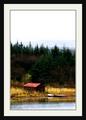
| 11/12/2004 06:54:50 PM | Novemberby JohannesFrankComment: Despite that frame, which is actually only distracting for me when one remembers to consider it, i rather like this image. You've captured that high white sky feeling of autumn without resorting to the usual medley of burnt orange colours, yet indisputably this is an autumnal image. it has that sense of peace, of the beginnings of rest after the rush and hurry of the glory of summer. Very good work. |
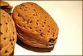
| 11/10/2004 06:34:16 PM | No bugs or flowers? AW... NUTS!by birdyblueComment: The light seems a bit strong, and the high-key background doesn't quite work for me, especially with those partially visible elements to the left. I would have thught a softer light would give a gentler feel to the image - I don't mean less bright, just more diffuse, to lighten the extremities of those shadows. | | Photographer found comment helpful. |
| 11/10/2004 06:32:06 PM | One cube or twoby pumaComment: good detail, and I like the fact that you've used just the barest hint of light to show the shape of the bottle here. - gives it a warmth and subtlety that appeals. | | Photographer found comment helpful. |
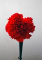
| 11/10/2004 05:37:49 PM | Tiny Vaseby Judith PolakoffComment: Wonderful light, neat and subdues sense of soft focus suits the subject quite well. Whilst I'm certain it is a macro, it has little of the appearance of one, nor of an extreme close-up; there is little sense of scale, and I have a problem with that for this challenge. But it's a sweet shot. 6 | | Photographer found comment helpful. |
| 11/10/2004 05:34:13 PM | Geodeby MarkComment: It might almost be an 'earth from the air' shot of a volcanic crater and lake, this. The small area top left upsets the composition, to my eye; I think, anyway, such a regular, graphic image requiress a much more regular composition. Neat, but as an abstract it is too busy for my taste, and as a photograph - well, it could be a created image. | | Photographer found comment helpful. |
| 11/10/2004 05:31:46 PM | Prehistoricby JeanComment: Seems weirdly blurred, slightly out of focus - my eye is constantly struggling to bring the image into precise focus in a most unpleasant way. Wonderful composition, i should think, but that distortion kills it for me. |
|
Showing 1911 - 1920 of ~3604 |
Home -
Challenges -
Community -
League -
Photos -
Cameras -
Lenses -
Learn -
Help -
Terms of Use -
Privacy -
Top ^
DPChallenge, and website content and design, Copyright © 2001-2025 Challenging Technologies, LLC.
All digital photo copyrights belong to the photographers and may not be used without permission.
Current Server Time: 08/27/2025 10:11:10 AM EDT.
|