| Image |
Comment |
| 12/06/2007 06:40:18 AM |
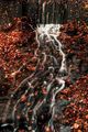
Spirit of the Waterby SanjuroComment: If we have to have more examples of the effect of slow shutter speed on moving water, then this is at least the way to do it - much more interesting then all the other efforts. |
| 12/03/2007 05:10:30 AM |
|
 Photographer found comment helpful. Photographer found comment helpful. |
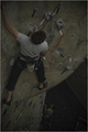
| 12/03/2007 05:09:18 AM |
Walks aloneby Icarus_dream_suiteComment: This is the best photo in this challenge, for me. Unfortunately, its hard to reconcile with the challenge idea, so i don't think you'll win, but I still like it most of them all.A fine, and clever, composition. |
| 11/22/2007 04:45:12 AM |
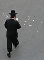
On the roadby OdedComment: Fine photograph - it is of course those white objects strewn in his path which make the image, along with the fine cut of his trouser leg. |
| Photographer found comment helpful. |
| 11/22/2007 04:44:06 AM |
Starting a long way in lifeby mb2006Comment: This is the only set-up shot of someone reading a book that I think has any merit in this challenge. The light is carefully done, the pose is controlled and you haven't gone overboard about trying to get some daft expression on your model's face. The tonality is a little strange perhaps - it could, it feels, have simply been brighter - although the muted nature of it also appeals. |
| Photographer found comment helpful. |
| 11/16/2007 03:54:49 AM |
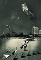
come fly with meby whiteroomComment: I rather enjoy this, although the processing is bizarre at the very least, and perhaps distracts from the integrity of a fine image...
... made me think though. Still can't see why it should be made to look like it was torn out of an old magazine. Can't see why not either, mind you ... |
| Photographer found comment helpful. |
| 11/15/2007 06:02:10 AM |
To Much Windby vtruanComment: I wonder if you haven't allowed slightly too much space around your subject, and perhaps too little detail in the fallen object. I quite like the sense of composition, the way it makes the little windmill almost not the point. |
| Photographer found comment helpful. |
| 11/15/2007 05:59:05 AM |
|
| 11/15/2007 05:56:32 AM |
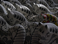
Topless Trioby karmatComment: I always think these terribly simple compositions cannot be hurt by taking things as simple as they will possibly go. The feeling that these aren't vertical adds an unwelcome tension to the image, one that isn't carried through in the image itself and thus feels wrong. The other element is of course the reflections, which show elements of a room and a window: clean those up, or simply use a soft-light, and you have, I think, an interesting tonal study in a kind of black/brown world. The shape of such shiny things is actually communicated through the shape of the reflections of light - if those reflections, as here, are of a more complex world they're likely to remove attention from what appears to be your subject: that is whay a simplification of those would work, and why every interesting shot of relective materials is almost always more softly-lit. |
| Photographer found comment helpful. |
| 11/15/2007 05:49:53 AM |
Peeled Offby travis_cooperComment: Seems very under-exposed, or even un-lightened in processing. The illumination of your subject appears fine, but everything is condensed into such a restricted range of brightness that its actually hard to tell. Cropping, or perhaps lack of it, is a touch uncomfortable too. |
| Photographer found comment helpful. |
Home -
Challenges -
Community -
League -
Photos -
Cameras -
Lenses -
Learn -
Help -
Terms of Use -
Privacy -
Top ^
DPChallenge, and website content and design, Copyright © 2001-2025 Challenging Technologies, LLC.
All digital photo copyrights belong to the photographers and may not be used without permission.
Current Server Time: 08/04/2025 04:03:05 PM EDT.