|
|
|
Showing 1531 - 1540 of ~3604 |
| Image |
Comment |
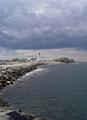
| 01/20/2005 08:13:25 AM | STORM COMINGby DArcy10Comment: I'm unsure about this one. You seem to have fallen betweentwo subjects, really: a shot that extends from the foreground to the lighthouse, with the suggestion of the dark sky above it, which would concentrate on the tones on the water and the rocks, and a shot of the dark sky looming over the lighthouse. Placing the lighthouse so central in the vertical leaves my eye switching between the two, without ever finding a place to concentrate. I think you could happily have extended the range of the mid-tones here too - the darkness of the sky isn't threatening, and the water has become almost the same tone throughout: it is those areas that give these shots their impact, and a faster exposure, or processing to bring the levels down in those areas would have given much more drama. You've also cropped out, or framed out, the foreground rocks, which would give your image a far greater sense of depth had you included them. It has real potential, this scene, I think, but it is unrealised. |  Photographer found comment helpful. Photographer found comment helpful. |
| 01/18/2005 09:02:33 PM | Stillnessby BudComment: There are strong elements of a classic stock image here - the boats on still water is an image I think we have all seen on occasions and to that extent part of our mental furniture - and that places particularly high standards for such a shot tot meet: after all, you're competeing with images in people's memories, rather than referencible images. This, I think, misses the absolutel simplicity - that branch, the perfect organisation of composition that half hidden boat, their organisation across frame, and lacks drama in the background - which you have nevertheless included. I wonder if perhaps a more powerful image might have been found within this scene, rather than in the entirety of it? The boat with the superstructure and it's neighbour look promising ... but it certainly has potential. Have you tried simply cropping out the boats to the right? It would, i think, be much stronger compositionally. Just some thoughts. | | Photographer found comment helpful. |
| 01/18/2005 08:54:37 PM | Constrainedby jbeazellComment: The classically staggering, yet bleak landscape, with it's extraordinary frame of the most humdrum brick, yet coupled with a strange sense of perspecive distortion to hwta we know should be a flat wall makes this image throw away presumptions on three levels. Yet somwhow it fails to move me particularly. I wonder if that odd sense of distortion on the wall, doesn't actually work against the simple weirdness of the scene itself, and draw the mind away from that very simple contrast and it's effect. | | Photographer found comment helpful. |
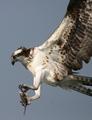
| 01/18/2005 08:30:45 PM | Osprey With Bassby GeorgeLentzComment: Whilst it's certainly an extraordinary moment, and in amny ways a fabulous capture, I must also say that I think there are elements missing from this shot that would make it a real no-hold-barrred wonder shot. I'm not talking about anything as simplistic as the crop, or framing - certainly for web display that works tremendously. There's a lack of sense of motion, of the process of movemtn in the bird - and a very strange aspect to it's eye, which is my main dislike here - it rather removes character, unfortunately. There's so much that is really really good here that it almost overcomes that hurdle - but just not quite, to my eye. |
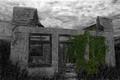
| 01/16/2005 12:21:56 PM | Modern Ruinsby DefyTimeComment: Now, here's one shot that I think had been edited beyond what it deserved. The building springs against it's background in a manner that clashes with expectation - and it isn't flash, because it applies equally to the further walls. It looks to me that there were probably some fascinating textures and contrasts to be had around the left-most window, but that's lost in the lack of contrast there, and the eye anyway is pulled by the selective de-saturation. The sky has become weird, and looks almost painted in. It's evident that a lot of work has gone into this - but I'm afriad i'm really not a fan of the results of that. |
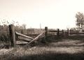
| 01/16/2005 12:17:55 PM | Fenceby inspzilComment: Pedro? Has the feel and tonality of some of his work, anyway, along with that sense of composition. Wonderul light on the nearer part of the fence. The leading lines, although they are played against by that light, take me perhaps too far out of frame, and the arresting point of those trees, being so clipped and weakly placed, do leave the image feeling incomplete, to me. I wnder if wouldn't actually have had more strength for cropping them out altogether? Just leave the fence's interrupted rhythm to speak for itself, perhaps? |
| 01/16/2005 12:13:38 PM | Scout (and Atticus): after the confrontationby nsbca7Comment: Good portrait - has the feel of a stage shot - probably the backlight on the girl's hair. Oddly, there is something about the composition that works, for me at least - I wonder if some of the more rigidly opinionated will dismiss it for infringing the 'rules'. The tonality works too - there does seem to be something old-fashioned about it, which re-inforces the idea of the stage. | | Photographer found comment helpful. |
| 01/16/2005 12:06:37 PM | Don't Try This At Homeby Travis99Comment: Good capture, especially to balance the exposure of flame and figure. A slight pity his expression is so bland, though :-) Good work. | | Photographer found comment helpful. |
| 01/16/2005 12:05:07 PM | gear and waterby colddog15Comment: It's quite intriguing, but the very small image size of our submission is bound to hurt you - especially from those vieing on bigger display resolutions. From the look of the vegetation, the grain of the gear, it seems heavily sharpened - though my guess wouwld be that it's actually your re-sizing process. Difficult to be more judgmental in these circumstances. | | Photographer found comment helpful. |
| 01/16/2005 07:32:07 AM | Breakin' the Veilby peeteComment: From one mushroom photographer tto another ...
This is great - though I would have tried to stop the slightly overdone highlights, myself. | | Photographer found comment helpful. |
|
Showing 1531 - 1540 of ~3604 |
Home -
Challenges -
Community -
League -
Photos -
Cameras -
Lenses -
Learn -
Help -
Terms of Use -
Privacy -
Top ^
DPChallenge, and website content and design, Copyright © 2001-2025 Challenging Technologies, LLC.
All digital photo copyrights belong to the photographers and may not be used without permission.
Current Server Time: 08/25/2025 06:32:03 PM EDT.
|