| Image |
Comment |
| 02/14/2005 03:48:38 AM |
|
 Photographer found comment helpful. Photographer found comment helpful. |
| 02/07/2005 07:28:04 PM |
Lostby instepsComment: I really can't believe that this only just scraped a 6. Sure the angle has probably cost a few points, but really. My suspicion is that simply because it looks so photoshopped (and I mean very skillfully photoshopped) ... but that vote curve is pretty evenly centred around the 6 point. I think you have perhaps suffered from the fact that this was an advanced editing challenge.
+fav |
| Photographer found comment helpful. |
| 02/07/2005 02:39:21 AM |
Aperture by ZoomdakComment: Great work Thomas - now and then there's an obvious winner in a challenge. You nailed it. |
| Photographer found comment helpful. |
| 02/06/2005 06:58:01 PM |
Red, Red, Wineby TranquilComment: neatly and carefully done, as far as the glass is concerned. There seems to be an added line of near-black each side of the image which annoys ne slightly - why not make it the same shade as the rest of the blackness? Given such extreme care with the lighting, it feels a slight let-down. |
| Photographer found comment helpful. |
| 02/06/2005 06:54:31 PM |
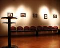
Lights of fame :)by rhipsterComment: Normally, I would say that there's all sorts of things wrong with this shot - your placing of that table directly beneath the first photo, the burn-out of the light on the wall, the slightly stange crop (bottom of table, edge of seating), slight sense of barrel distortion; but actually I feel something kind of pleasing in it; I think there's a strong compositional motion in it, from the table, along the line of seats and scross the uneven row of light. The erraticness of those lights, and the one missing, add a sense of intrigue, either of unfinidhed-ness, or of desertion. Interestingly engaging. |
| Photographer found comment helpful. |
| 02/06/2005 03:57:55 PM |
|
| Photographer found comment helpful. |
| 02/06/2005 03:56:13 PM |
Floating Angelby RedOakComment: Unsure about this shot; I like the basic idea of it, but there seems a lack of variation through frame in tonal terms - it's almost entirely black, white, or mid grey, and i think that's isolated the reflections too much; they don't quite come across as sparkle on water, but rather as an abstract patterning. Otherwise, lots of good stuff here. |
| Photographer found comment helpful. |
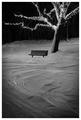
| 02/06/2005 12:43:43 PM |
Winter Benchby BeagleboyComment: I've been avoiding commenting on this one. There are a number of everso effective elements to it - the general strength of composition, the vignetting (whether edited or natural it is very useful). But there are elements of the composition that don't really sit very comfortably for me - chiefly your positioning of the bench/tree relative to one another, relative to frame: it leaves me wanting some element toward image left to provide a touch to re-balance things, or perhaps just to balance the composition more to the left, which I realise would mean croping out the end of that branch, but I think that wouldn't hurt in the same way as that slight upsetting of the balance of things does; these are very minor seeming details, but i think they have an exaggerated impact on the final composition. That hut and background behind the tree I think i would have tried to work/process out of the image too - or, if they're wanted, to give them more prominence. For dpc certainly, using levels or whatever to black them out would be preferred. |
| Photographer found comment helpful. |
| 02/06/2005 12:35:32 PM |
Pink Pongby FalcComment: Almost, almost very beautiful. I think you've restricted the graduations of light too much for this to be really effective - the highlights are blown, and the transitions into the black areas seem to happen pretty quickly, especially toward the bottom of frame. A little more care in the organisations of the balls, to prevent the seams showing, would have added a touch more neatness too. It could I think, have been a very beautiful shot, but needed a bit more care and attention to the finest level of detail and composition/organisation of elements. |
| Photographer found comment helpful. |
| 02/06/2005 12:32:12 PM |
Sourceby gaurawaComment: Very strong sense of both detail and light, as well as obviously meeting the challenge - a good still life. I wonder if a tiny touch of front fill light would have been useful - or might simply have added unhelpful reflections. It might also have added a yseful sense of plasticity to the main subject, of three-dimensionality. I like your background too - the uneven light there, the texture of the paper(?). Excellent work. |
| Photographer found comment helpful. |
Home -
Challenges -
Community -
League -
Photos -
Cameras -
Lenses -
Learn -
Help -
Terms of Use -
Privacy -
Top ^
DPChallenge, and website content and design, Copyright © 2001-2025 Challenging Technologies, LLC.
All digital photo copyrights belong to the photographers and may not be used without permission.
Current Server Time: 08/25/2025 01:38:21 AM EDT.