| Image |
Comment |
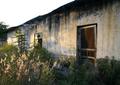
| 04/14/2005 03:44:36 AM |
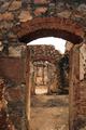
Old fort from 1897by angiedlComment: You should get points at least for not providing a simple portrait of the building. It's reasonably easy to see your intent here, I believe - good deep depth of field and that succession of doorways; but I feel that the light and shade through those doorways doesn't help to distinguish each from the other - and no doubt the basic rules aren't helping you here either. |
 Photographer found comment helpful. Photographer found comment helpful. |
| 04/14/2005 03:40:13 AM |
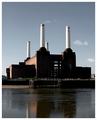
Battersea Power Stationby redmoonComment: I would personally have waited until that little cloud had passed, as it could easily be taken for smoke from that chimney. Kind of harsh light - I don't see much detail in the shadow areas without forcing the brightness of my screen. Good strong simple composition. |
| Photographer found comment helpful. |
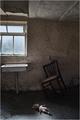
| 04/14/2005 03:37:36 AM |
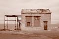
Forlornby MinutiaComment: Is the toning perhaps a little heavy? Together with what feels like a heavily reduced dynamic range - all midtones, and few highlights or real shadow - it sems like an attempt to reproduce the feel of aged photographs; which point I get, though I wonder if the effect hasn't removed too much of the sense of detail I would want to see in a very straightforward 'portrait' like this. |
| Photographer found comment helpful. |
| 04/14/2005 03:34:40 AM |
Shadows of Oldeby fulgentComment: A more interesting composition than many. Some odd noise along the shop-front, almost like you've lightened that area. Like the use of the tree shadow in foreground. |
| Photographer found comment helpful. |
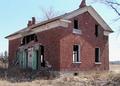
| 04/14/2005 03:30:26 AM |
Abandoned Dreamsby jessieComment: Good subject, though framing it so very tightly leaves little sense of context and is inclined to make it just another ruined house shot. Control of light on the building, light and shade is good; a shame about the over-exposed sky's colour and very bright foreground - but those damn basic rules ... |
| Photographer found comment helpful. |
| 04/13/2005 06:57:05 PM |
Leper-hospital (XVII century)by xoaoComment: Light - that's what lets this down. It could, in my view, be less over-exposed (this looks like what the makers of cameras think is an OK exposure), and the angle of light to your subject, an essential for communicating any sense of depth, of texture. This is obviously a fine subject for the challenge - but this presentation of it does it no favours |
| Photographer found comment helpful. |
| 04/13/2005 06:52:07 PM |
Abandoned (?)by TornikeComment: Detail and basic exposure is good here. You might usefully consider some ideas of composition, and simplicity of subject matter, I think. |
| Photographer found comment helpful. |
| 04/13/2005 03:59:13 PM |
May be she will come back ...by vasilkovayaComment: The contrivance of this reminds me of the work of Boyd Webb. It has that superb technical finesse - and that is seriously meant, as this is impeccable - but it seems ... well, to remove meaning from it, rather than to add it. A matter of personal taste only, but there you have it. |
| Photographer found comment helpful. |
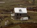
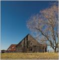
| 04/13/2005 03:50:00 PM |
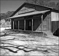
This Old Barnby fplouffeComment: Strong appreciation of the graphic nature of your scene shown here. I would personally want to add more punch to the image as a whole - just expanding the histogram a touch would add that - for the sake of impact for a challenge. |
| Photographer found comment helpful. |
| 04/13/2005 03:47:49 PM |
"Rusted house"by babymaderoComment: Wonderful light, wonderfully captured - although I'm not sure the herd of voters is going to give your image the time to see that. I find the blockiness of the sky a shame - would have thought a more gently graduated element there would have been more sympathetic - though I understand the restrictions. Strong compositionally - perhaps, for me, even too bluntly so. I also wonder if there's quite enough allowed for the restrictions of the medium here - the file and image size, and the inevitable result that images that rely on complex interaction of elements and detail are like to loose that impact under those restrictions. nice work though; would like to see it at a more natural size and resolution. |
| Photographer found comment helpful. |
Home -
Challenges -
Community -
League -
Photos -
Cameras -
Lenses -
Learn -
Help -
Terms of Use -
Privacy -
Top ^
DPChallenge, and website content and design, Copyright © 2001-2025 Challenging Technologies, LLC.
All digital photo copyrights belong to the photographers and may not be used without permission.
Current Server Time: 08/24/2025 03:21:37 AM EDT.