| Image |
Comment |
| 04/24/2005 10:09:38 AM |
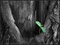
Genesisby casualguyComment: Impressive; the de-saturation - well, it's a trick I don't like. I appreciate the impact, and this one is as good as they come ... but for me it will always remain a cheap way of getting an impact, I'm afraid. |
 Photographer found comment helpful. Photographer found comment helpful. |
| 04/24/2005 09:12:16 AM |
Framedby whiteroomComment: Tremendous image - great sense of fun and participation. Good detailing and textures, and tones. Fine work. Is it you with a similar-feeling shot in the People challenge? |
| Photographer found comment helpful. |
| 04/24/2005 05:38:23 AM |
Isle of Rumby BobsterLobsterComment: Now this is wonderfully done - deceptively simple, and hard to do. Excellent detail, clever and well seen composition, and a great mood. Marvellous photograph. |
| Photographer found comment helpful. |
| 04/24/2005 05:34:13 AM |
Pegasusby dsa157Comment: Reminiscent of an Andre Kertesz fairground photograph - I'm not sure that Riboud hasn't also shot similarly. So that puts you in great company :-) I like it. |
| Photographer found comment helpful. |
| 04/24/2005 05:31:00 AM |
early morningby frumoazniculComment: I like this very much, though something has gone very strange with the progression of tones across his face - it seems to have that grey/black high contrast, rather than the evenness of movement there is in his jacket. Great moment, and nice capture. |
| Photographer found comment helpful. |
| 04/24/2005 05:24:37 AM |
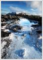
The Blue Lagoonby oskarComment: Compositionally strong - that open space leads into the lagoon and the mountain nicely. The slight wide-angle element really helpes this - a classic approach, but always effective. A minor point, but I wonder if you couldn't have framed things a little better - take the mountain more to the left of frame say, and perhaps that foreground lump to the right, to add a diagonal line to the image as well? What this sufferes from, to my mind, is a lack of detail, and that hurts it quite a bit: whether it's from re-sizing, or your camera, or compression, or over-sharpening, or just the original image is impossible to tell, but something has made most of the foreground very blocky (small blocks, but still ...) and that would be the element you need to add to get this shot seriously amongst the high scores. It's odd, because the sky feels like it still has good detail. I think you've pushed the exposure just too far, also - the highlights have 'gone', and that might well be contributing to that lack of detail also. It's good though - despite those points - and without more information impossible to really suggest how things might be improved. |
| Photographer found comment helpful. |
| 04/24/2005 05:13:37 AM |
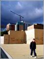
Old Warhorseby dpdaveComment: The detailing around the shaded part of the bonnet is very good - smoothness of texture, and interesting graphic elements; I really think you would score better if you'd found a way to fill the frame with the truck, rather than having that small area of background present - it's that that stops this from being a study of shapes and lines, and makes it become partly something else - confuses the image. |
| Photographer found comment helpful. |
| 04/23/2005 05:12:48 PM |
Blossoms And The First Lady Of Springby prbettsComment: She takes a little while to notice, does her ladyship. Mightn't it have been possible to bring her colour out a touch more, without disrupting the realism of this nicely shot scene. |
| Photographer found comment helpful. |
| 04/23/2005 05:17:24 AM |
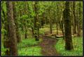
Going to schoolby kevrobertsonComment: This has strengths - real strengths that I suspect will get overlooked. Strong compositionally, strong tonality. Did you try it with a b/w or toned conversion? I would have thought it would allow the blokcy shapes of the walls and skyline to be less confised by their colours, and would not have harmed the magic in the sky. Love the balance of this composition. |
| Photographer found comment helpful. |
| 04/23/2005 05:08:05 AM |
K F Lby egillbjarkiComment: Light, tones, detail, and a composition that works strongly. Nothing to criticise, really. Just enough light into eyes to bring out colour. |
| Photographer found comment helpful. |
Home -
Challenges -
Community -
League -
Photos -
Cameras -
Lenses -
Learn -
Help -
Terms of Use -
Privacy -
Top ^
DPChallenge, and website content and design, Copyright © 2001-2025 Challenging Technologies, LLC.
All digital photo copyrights belong to the photographers and may not be used without permission.
Current Server Time: 08/23/2025 11:28:12 AM EDT.