| Image |
Comment |
| 08/18/2005 06:08:20 AM |
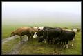
Raining againby JohannesFrankComment: Love the feel here - a strong sense of that head-down just-get-through-it unremitting drizzle. You might have had a slightly stronger composition - this seems to fall a little between a set of parallels and a more leading group of those cows; I also wonder if a little pulling down of the exposure wouldn't have deepened and enriched the green tones, and perhaps lost the sense of the sky drifting into over-exposure, although obviously the details of the cows themselves needed to be maintained. It's a fine shot, even with those reservations, and even with the slight feeling of missing the very finest detail. |
 Photographer found comment helpful. Photographer found comment helpful. |
| 08/18/2005 06:04:16 AM |
Come out and playby NazgulComment: Excellent portrait - with the slight reservation that you might have calmed down the highlights on the glove and the bear a touch - they have that very digital over-exposed feel. Great tones otherwise though. One has to hunt for the suggestion of rain (as opposed to cold) a bit more than bodes well for your score in a Rain challenge here, but it's a good shot. |
| Photographer found comment helpful. |
| 08/18/2005 06:02:12 AM |
|
| Photographer found comment helpful. |
| 08/18/2005 06:01:07 AM |
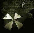
Umbrella Blownby JPRComment: Interesting, dirty image - love the feel of it, very expressive. The areas you appear to have darkened seems a brutal effect - perhaps a touch heavy--handed? Not enough feathering? Nothing else in frame seems to go quite a black as those areas ... and the overlap with the umbrella makes it plainly editing. Outside of that reservation though, a much more intriguing image than most |
| Photographer found comment helpful. |
| 08/17/2005 06:19:43 PM |
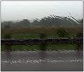
Slickby Army of nOneComment: Has a sense of the Andreas Gursky about it - not least in its quality of exposure. Strong compositionally - except perhaps the erraticness of the final horizon, which breaks the parallels quite strongly. |
| 08/17/2005 12:40:38 PM |
delivery boy (shot under basic editing rules)by tomzinhoComment: Nice image - and the kind of title I would expect to put folks' backs up. I'm not sure, for myself, and given the rule-set, that the process of your editing is much of an issue in my assessment of this - at least, it wasn't until I read the title. |
| Photographer found comment helpful. |
| 08/17/2005 12:36:41 PM |
Splashby johansecComment: I think this lacks a sense of drama, which might have been usefully increased with some contrast work, especially around that spray of water, which simply shades into greyness. |
| Photographer found comment helpful. |
| 08/17/2005 12:33:45 PM |
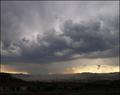
"The Monsoon Season"by tfarrell23Comment: Very strong indeed - reminds me of Simon Norfolk, who is a genius (so that's a high compliment indeed). I would love the foreground t have been pulled up a little, just to reveal some more detail in those buildings (and I don't mean throwing the dodge and burn at it indiscriminately). The tonality and light in the sky is wonderfully caught, and it remain purely photographic; very high standard. |
| Photographer found comment helpful. |
| 08/17/2005 12:31:00 PM |
A Kids Dreamby jenesisComment: Good contrast, strong composition, colour, exposure. I like it, but couldn't go overboard about it. Solid work. |
| Photographer found comment helpful. |
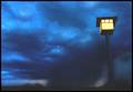
| 08/17/2005 12:29:34 PM |
Cloud burstby armelleComment: There's an odd, almost water-colour-esque feel to this image (not out of place, I suppose). I can see arguments both for and against the inclusion of the lamp-post, but oh, for it to be straight. Colour tones are good, and the sense of greyness, of dullness is well achieved. Without the post, it might have an almost turner-like quality of light about it. |
| Photographer found comment helpful. |
Home -
Challenges -
Community -
League -
Photos -
Cameras -
Lenses -
Learn -
Help -
Terms of Use -
Privacy -
Top ^
DPChallenge, and website content and design, Copyright © 2001-2025 Challenging Technologies, LLC.
All digital photo copyrights belong to the photographers and may not be used without permission.
Current Server Time: 08/18/2025 05:23:14 PM EDT.