|
|
|
Showing 1011 - 1020 of ~3604 |
| Image |
Comment |
| 02/28/2006 04:48:37 PM | some Hearts aren't meant to be Brokenby seebrownComment: I think the properly controversial has less of a sense of deliberate provocation and more of a genuine alternative world-view than this shot has. I don't find it to be particularly enlightening - yet it has that quality of photography that shouts out that 'this has a message for you'.
It's easy as anything to have a go at the technicalitites, certainlny for this dpc community - it doesn't have the technicolour pop, the tidiness of design, the clean presentation (look at all that unneccasry dust around the edges of heart, for heaven's sake). Most other technical stuff is fine here - you know, the old DOF, focus, detail and all that.
But hell, the most distressing thing about it is that your non-dairy creamer just doesn't look the slightest bit like cocaine. More like wood shavings.
Now why is that? One, large, part of that is the granularity of that material. This stuff is just too flakey, rather than the almost impossibly small grains of the 'real thing'. It's also, as someone has observed, an impossibly white stuff, and in this photo it just doesn't have that clarity of whiteness; that's some function of levels/curves and processing - even though your white points are there, it would be possible to even out the movement towards the mid-tones - here, I think that process is too quick - thus the oddness of the highlights on that rolled paper. Also, arguably, the social perception of the drug, and the usual presentation of it, and the lifestyle associations of it, perhaps require something a touch more considered that this approach?
e |  Photographer found comment helpful. Photographer found comment helpful. |
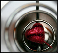
| 02/28/2006 04:34:02 PM | Happy Valentineby marvinComment: The process of producing stuff for this place can be brain-stretching, even at its normal wekk-long timescale; no time to digest, no time to ponder, no time to absorb the idea of the challenge and let it mutate into an original approach. However, there is something to be said for the speed of it, for the mental rush it can induce, if one has any time at all to committ to it.
The results overall, it appears, have made plain that the voters expectations were for the most clever use of all the facility that Photoshop puts at our fingertips; I'm glad this shot is not one of those. There's a cerain level of abstraction here, and that too often provokes the simpketon's fascination with 'what is that?' and this detracts, I think, from a true consideration of the photograph. Complete abstraction is more effective - there's no possibility of knowing the source materiel, and thius one has to resort to a consideration of shape line and tone. Here, your rings serve I think simply as a frame for the decorative heart: there's an industrial quality there, but that isn't, for me, carried any further by the sparkly pink thing itself.
The apparently careful framing to place the heart itself on the thirds line is slightly let down by the near square crop, and a certain ;ack of definition in the shape itself - from your processing notes, I would say that the one element of that you need to dispose of is the auto-levels part. I think that's taken things to an extreme in the sparkly areas of the heart (the kind of fine detail that automated processes can never cope with), removing a lot of the detail, and over-blowing the highlights. |
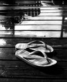
| 02/24/2006 03:09:54 PM | FlopFlipby kittsComment: Seems most arbitrary, without making enough play of the slight wackiness of the comsposition. The light and detail on the flip-flops is lovely, but I wonder if more depth of field would have helped to really play them against the reflections in the water? |
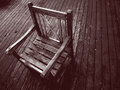
| 02/24/2006 03:08:20 PM | Garden Chairby jonrComment: The way the lines work across and against one another is interesting, and I like the contrast work also. Carefully thought out comspotion, and a good moment of light to catch also. | | Photographer found comment helpful. |
| 02/24/2006 03:06:55 PM | Back in black.by RisingSunComment: Lacks a certain amount of clarity on this screen - whether it's the exposure, or what is hartd to tell, but it is difficult to look at - I wonder if you've taken the contrast on the figure too far in order to get the background that way? | | Photographer found comment helpful. |
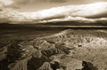
| 02/24/2006 03:04:24 PM | Lost Worldby edmengComment: Neat processing, and certainly a landscape that lends itself to the treatment. | | Photographer found comment helpful. |
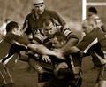
| 02/24/2006 03:00:59 PM | It's a rough gameby KHoltComment: I'm no fan of this composition. Fror all the evident exertion, it holds little drama for me, the arms and shirts become confused to the left of frame, the tonality and processing don't differentiate the players from their background well enough. | | Photographer found comment helpful. |
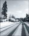
| 02/24/2006 02:58:39 PM | Long way homeby UusilehtoComment: Nicely controlled exposure, and with great detailing and a certain sense of composition. Who's to know, but the impression is that it might have been more successful framed to put the vanishing point more to a strong area of frame - this would have allowed the leftmost tree more 'breathing space' against the frame also. I like the technical proficiency of it, but am left a little cold by the subject - although it has something to it, for sure. |
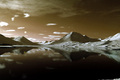
| 02/24/2006 02:55:41 PM | Tranquillityby gisliComment: Has a certain surrealism - almost like an invented landscape. Once noticed, the tiny bit of land bottom right is an annoyance for me, and leads me to think that a crop from the bottom mightn't have been a bad thing overall, and might also have balanced the composition a little more solidly. Excellent tones from a basic challenge. | | Photographer found comment helpful. |
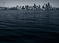
| 02/24/2006 02:53:01 PM | Seattleby KaliComment: Fun, although I think you've crowded the top of frame just a touch too much. I'm not sure that the separation of the leftmost tower has helped you at all - the shot would be simpler, and perhsp the better for it in dpc terms (at least), cropped to exclude it. Sure that's a Seattle landmark, but this image's impact is not about where it is, particularly. Now I mention that, I'm not sure oit wouldn't be stronger for being the more anonymous. Interesting stuff though, thanks. | | Photographer found comment helpful. |
|
Showing 1011 - 1020 of ~3604 |
Home -
Challenges -
Community -
League -
Photos -
Cameras -
Lenses -
Learn -
Help -
Terms of Use -
Privacy -
Top ^
DPChallenge, and website content and design, Copyright © 2001-2025 Challenging Technologies, LLC.
All digital photo copyrights belong to the photographers and may not be used without permission.
Current Server Time: 08/18/2025 07:40:53 AM EDT.
|