|
|
|
Showing 991 - 1000 of ~3604 |
| Image |
Comment |
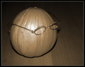
| 03/03/2006 09:00:34 AM | Melon with an attitudeby marvinComment: from just outside the Critique Club
Hi Robert.
What's with the auto-levels thing? On a quick look through your work here, that seems to be your first resort all the time ... I'd personally want to keep more control in my own hands.
Lighting really doesn't have to be expensive for at-home still lifes, possibly the most expensive piece of kit you need is something to put the camera on - a tripod being the obvious thing, and most controllable. And it's you lighting above all else that lets this shot down. It's the on-board flash that's produced that truly unpleasant bright area on the melon, and the equally unpleasant heavy shadow around it. A simple desk light, perhaps with a simple bit of paper taped over it to soften the direct light, and you'd have infinitely better lighting.
Other than that ... well, focus and detial are fine, you use of USM seems more effective than in your earlier stuff. The actual set-up itself has caused you as many problems score-wise as anything else, including the lighting. |
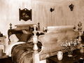
| 03/03/2006 08:51:31 AM | Old Bed Roomby clypComment: from the outer edge of the Critique Club
Good toning here, which is a fine start to this challenge. You haven't gone for the blatantly gooey sepia, but something a little harder, a little less blatantly warm, which is effective. my problems with this image lie, as a couple of people mentioned in comments, with the lighting and composition.
The direct on-camera flash has left you with some very very harsh light to deal with - the very bright near bed-post, the brightness of the wall, the very ugly shadows of the near bed-head too. Coupled with the brightness thing, your placing of that near post in frame makes it arguably the strongest element of the photograph, the thing the eye is first drawn to: but the flat light from the flash allows no shading of that object to give it any sense of depth and thus kills any interest it might hold for the eye. Compositionally, that post also obscures what one might think would be the 'natural' point of interest in the shot - the head of the bed - and that makes for an uncomfortable picture. Detail and difinition are fine, but it's you lighting that you most need to work on on this evidence. A good first rule is always to light from the side - get a remote flash, get a tripod and use natural light, but direct on-camera flash will always produce that flattening effect, and is rarely useful - especially in still life photography. |
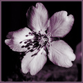
| 03/03/2006 08:41:59 AM | Apple blossomby 2mccsComment: from the Critique Club
Comments are so difficult to know how to handle - the variety you recieved for this are almost completely contradictory. Some like the tone, some apparently hate it, some like the hardness of light, some dislike it. The only trick is, I think, to look at the work of those who leave comments and see what you think of their own stuff.
There's a lot of good things here, I think. You've understood the square crop very well - the format throws a lot of the supposed 'rules' out of the window, and makes the centre of frame far stronger than in a landscape or portrait shot; and it's well suited to a rigidly graphical subject, such as this flower from this angle. Your toning works well also - it allows some feeling of warmth without resorting to the over-sed expedient of sepia, and is effective for the shadows that make the texture so evident in the petals.
The comment about the hardness of the light has a point, to my eye: though I don't think I would have tried to soften the direct light (that's useful for definition, and as I've said, for bringing out the papery texture of the petals. What I would have tried (and no guarantee of success) would be to put a reflector of some sort to image left. That need only be a piece of white paper held up just out of frame, but that would bounce a soft-edged light back into the image from the opposite side, and that would make the shadows less absolutely black, leaving some detail there. The edges would still be hard, and so the texture would still show, and you might gain some more definition around the left-hand side of the flower.
A good shot though, for all its score - unless they're quite outstanding, flowers often get knocked quite hard in the voting. |  Photographer found comment helpful. Photographer found comment helpful. |
| 03/02/2006 04:59:28 AM | Curly, Puffy, Foxy...by librodoComment: from the back of the class of the Critique Club
you really need a critique, Manny? And from me?
I'd be intrigued to know, given your chosen approach to photography (i.e. the portrait) - (at least as your work is presented to us at DPC) - whether your experience of the 80's is actually one of female fashion, or whether this is just the kind of photograph you take. Whether or no, you certainly have a stronger grasp of the period than the winners of this challenge - I find it bizarre that even in the wonderfully ephemeral world of street fashion the general belief is that the 'punk thing' was part of the 80's, rather than the 70's.
And the use of 4500? Challenging yourself? Not carrying the D200 everywhere? But you still proove that your technical finesse is not dependent on the expense of your camera. There is of course nothing to 'criticise', and nothing to 'critique' in your technical work - I'm more than certain that I could teach you nothing, anyhow. I would make the point that you've probably sacrificed too much frame-space to her face, and cropped too much of the clothing to really make this register for this challenge - unless this is intended as an illustration of period make-up, in which case your title is, at the very least, strange. Off-the-shoulder mohair is definitely of the time (oh, I remember some of my sister's friends ...), and probably the little wristlets, but in this image I think you've just relegated them too far for immediate impact - and without your trademark lighting the face doesn't quite register with your usual punch. The detail, colour, focus, and composition are as ever exemplary, although, to my eye, rather obvious and expected.
For an important historical period - the end and ending of the soviet experiment was as momentous worldwide as any other event of the 20th century, certainly in terms of its effects on people; the first sowing of the roots of the digital community likewise growing to move us into the strange new world we're part of - people's choices of ways to illustrate it are proving to be rather bizarre; but of course, ther's something of a fear of the serious here, so it's difficult to assess.
All the best
Ed | | Photographer found comment helpful. |
| 03/02/2006 04:39:14 AM | Glasnostby LevTComment: from the Critique Club
It's refreshing to read some suitable details written for a shot, rather than the everlasting lists of EXIF data, or the simple and dismissive 'N/A' - especially when asking for a CC piece on a photo. Thankyou for that, and thankyou for some way in to this image.
The difficulty, of course, is that in an Anglophone website, and a predominantly US-populated community, not only the Russian but even more the Cyrillic script is, I think, liable to alienate many voters. People just aren't going to give an image the time required to make a decent assessment. But you know this - your collection of ribbons tells me you know how to score here when you want to.
More than simply for the Russians, the eastern europeans, the primary moments of the 80's were about dissent against the autocratic regimes - not only the entire process of the 'velvet' revolutions, but also one recalls Tianenmen Square - arguably, photographically, the difining image of the period is of the young student stopping the tanks in the square.
This approach - I don't know: it has a certain obviousness, a certain blatant set-up quality that seems at odds to me with your message, with the intent of the image. I wonder if, perhaps, you've actually brought a rather 'western' cleanliness of image, of organisation of elements, to something that purports to illustrate a different world. The perfectness of the colour, the smoothness of light, the level of detail makes it absolutely clear that this is not only utterly 'posed', but also utterly digital and modern - modern in the sense of 'of the early years of the 21st century, rather than of a time of hiddenness, censorship and the years immediately before the real strike of the digital revolution - audio, in the form of the CD, had struck for sure (I was a student and yet had a CD player), but the internet, the ubiquity of the PC, and digital imaging were only on the horizon. For the purposes of this illustration, would you not want a greater feeling of desertion, of the forgotten: dust and cobwebs and a sense of a room forever locked?
Your choices are, of course, perfectly valid. The image was never going to resonate with the voters here in general: many are too young, few would give the image the time it deserves, and you only need glance at the winning images in this challenge to realise that what any period of history really means to people is the fashions of the time. Supposedly the ephemera - but if we ever needed a reminder of that ephemera you could take this challenge as an example. It's an indictment, but it's probably futile to resist - and the rise of this medium, the fact that anyone can publish whatever hits their mark, will lend it strength. Im' glad to see, however, that there are one or two people who will still resist that flow of nonsense. Thanks for a thought-provoking image.
ed | | Photographer found comment helpful. |
| 03/01/2006 06:35:55 PM | Urban Legendby Shan2112Comment: from the far side of the pond of the Critique Club
From first viewing, and not until I'd read way back in this image's comments, did I have the slightest idea what this image refers to. The mention of the aspirin and coke thing do I get a certain idea. Whether that's because it's massively us-centric (which I suspect), or whether I just have a gap in my memory I cannot say. Certainly very surprised to see the score on this.
Without that important bit of knowledge, it's the most bizarre collection of unrelated items - some form of chilrend's sweet, a dead person, and a can of coke. What is this? Something about the evil qualities of processed sugar? In an 80's challenge? I suspect, for a large number of the voters here - those from the rest of the world, that is, you've scored way below this average, out of simple confusion.
Your composition is pretty straightforward, the technicals are OK - no more than that, i think - and lighting is pretty much non-existent - I find those window reflections on the coke can particularly nasty: all the more so in an obviously posed photograph. If you're taking so much trouble over the set-up, whay not put a bit of effort into lighting as well? A bit of soft fill light, even simply using a piece of white paper to reflect fill light from the right would help the overall feel opf the coke can enormously - and a sheet or something stuck across the window would produce a much more even soft light, and deal with those horrible reflections. Often times, the difference between the winners and the rest is not so much in the idea, or the moment, or the thought, but actually in the lighting. | | Photographer found comment helpful. |
| 03/01/2006 06:24:39 PM | [1983] CDs go on sale - [1988] CDs now outsell vinyl recordsby gocComment: from the back room of the Critique Club
Are you saying that that's only backlight? I'm amazed, if so. Your numbers are a bit strange - is this really at ISO 1600? At 1/8th second you're lucky to get such sharpness - and if you were using a tripod or any steadying device, then why shoot at that sensitivity? Especially whne you haven't made a feature of the noise that that produces in the image. I'm slightly confused by that, I must say.
There isn't really all that much to this shot. I suppose it might, at a push, be said to have a certain brash shiny quality that one might associate with the 80's - but then, as with all these 'period' challenges, the inevitable winners are simply retro fashion shots. So, more power to you for the imagination (though I would also put CD's into a 90's box much more readily than 80's).
e | | Photographer found comment helpful. |
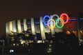
| 03/01/2006 11:36:31 AM | The Ben Johnson Drug Scandal in '88. (Seoul Olympics Stadium)by docpjvComment: from the outside edge of the Critique Club
I think, really, those commenters are correct - and certainly it has afected your score, that the image did require an explanation in order to fit this challenge. Personally, I don't find these recreation of period challenges fun - especially given the very demanding public voting; can you imagine entering an image processed to look like an 80's colour photograph? I don't think that would score too well either. So really, I think we were only left with recreations of fashion and certain american crazes of the time as an option.
The other problem is that this is really a pretty ordinary image: the technicalities are all there, but the point is more about the point of view and the framing that you've chosen. It's a very everyday approach to a stadium shot, even though you've been quite careful to place the rings strongly in frame. The trees abscuring large parts of the image are a problem I think, complicating and disrupting the very clean lines of the building. I would have tried to make more use of the curves of the concrete against the curves of the olympic rings - there might be interesting tonal and textural differnces there - always presuming you could actually get that close to the stadium, of course.
ed | | Photographer found comment helpful. |
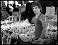
| 03/01/2006 06:17:52 AM | 1980's Remnant: AC/DC Tatts and Mulletby hotpastaComment: from behind the bike shed of the Critique Club
Nothing wrong with this shot at all - perhaps some attention to the precision of your challenge-meeting, if we want to get all picky about how to score higher here. It's an interesting portrait, arresting even, and in that sense there's nothing much to criticise.
I'd perhaps want more work on the processing. The shot as a whole has strong elements - and the detail works in the fruit, and his tats, and the face, but I woinder if perhaps the tonality of some of those areas could usefully be expanded? More contrast, inevitably, but then I'm a devotee of a high-ish contrast style - but for me the body shape here and facial details are just a little bland. Of course, in that sense, it perhaps the more 'honest' a photograph for it, but also maybe less communicative.
I really like the feel I get that you want to hunt out your photography in the real world, rather than the strange plastic environment of the studio/portrait that this place encourages. There are a few of us with that devotion here, and it's pleasant to discover another one (presuming I'm right). Particularly enjoyed you 'signs' shot from your profile - proper clever work.
All the best
ed | | Photographer found comment helpful. |
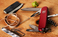
| 03/01/2006 05:11:21 AM | MacGyver - 80's TVby moonwellComment: from the back of the room of the Critique Club
NB: all of your comments on this image are from people who know what your reference is. I'd be surprised if many of us Europeans, or of the far east brigade, let alone the Icelanders have the first clue. I have to approach this simply as an image, without knowing the refernces ...
... and as such, it's just too damn busy, I think. Too much stuff, and in a not particularly pleasant arrangement. Almost always, certainly in terms of dpc and this kind of still life shot, the old adage 'less is more' is absolutely true. I'm sure there are reasons for including everything here - but the chewing gum looks likema brussels sprout, half the objects are cropped slightly by the frame (why? what does that communicate?), and the duct tape could almost be any old piece of paper. I'd have tried to reduce the number of objects - there isn't a rule, but I'd want no more than three, and then work on the lighting and the arrangement of those objects. Use the shapes of the rubberbands to make distorted circles that could lead the eye to the other items, but make them have some reference to one another, make the shapes help the composition ... have a good look at all the various still lifes around this site, and see how the successful ones work.
And while you're there, I'd have a good look at the lighting of them too. There's no actual problem here, as such - everything is nicely lit, focussed, there is detail, texture and so on ... it's just a bit bland, isn't it? I'd want to produce a bit more shadow - like the way the shaping of that thicker rubber band is defined by the light, use that across everything in this shot, to really give a sense of shape to the objects, and to allow you to lead your viewer's eye through your composition.
That's all reflected in this score, I think. Whilst those who 'got it' will have scored you one way, the rest - the majority - will have seen a pretty average still life and have moved on pretty quickly. In short too much information here, and not enough organisation of that information. And never forget that this comes from someone who loathes most of the most-favourited photographs on this site, and so should be read wioth the understanding that my suggestions are not guaranteed crowd-pleasers - although i've managed a couple of popular still lifes in my time ;-)
All the best
ed | | Photographer found comment helpful. |
|
Showing 991 - 1000 of ~3604 |
Home -
Challenges -
Community -
League -
Photos -
Cameras -
Lenses -
Learn -
Help -
Terms of Use -
Privacy -
Top ^
DPChallenge, and website content and design, Copyright © 2001-2025 Challenging Technologies, LLC.
All digital photo copyrights belong to the photographers and may not be used without permission.
Current Server Time: 08/18/2025 05:58:36 AM EDT.
|


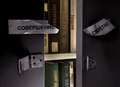

![[1983] CDs go on sale - [1988] CDs now outsell vinyl records](https://images.dpchallenge.com/images_challenge/0-999/451/120/Copyrighted_Image_Reuse_Prohibited_297588.jpg)