| Image |
Comment |
| 04/02/2007 12:23:16 PM |
|
| 04/02/2007 12:15:05 PM |
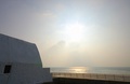
Victorian VS Modernby facesastheycomeComment: The PP makes this a really "flat" photo. Nothing stands out and it becomes hard to distinguish between the elements involved. Effect reminds me (not unpleasantly) of some types of 60s/70s pop art, but it doesn't work for me here. |
 Photographer found comment helpful. Photographer found comment helpful. |
| 04/02/2007 12:13:11 PM |
|
| Photographer found comment helpful. |
| 04/02/2007 12:12:03 PM |
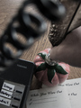
May I Take A Message?by GeneralEComment: Cool idea. It's not entirely obvious that the person is using a quill, however. Although the names on the phone also put the point across. |
| Photographer found comment helpful. |
| 04/02/2007 12:10:56 PM |
|
| 04/02/2007 12:09:13 PM |
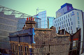
Dry Goods - Phone Homeby LanceWComment: Good idea, and technically this is a very well done photo. However, I wish that the phone had been more prominent somehow. Had to search for a second before I caught it. Perhaps a couple of retail boxes of phones or other electronics would have made the point more clearly and obviously. - 6 |
| Photographer found comment helpful. |
| 04/02/2007 12:06:45 PM |
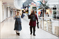
Picnic at Noonby CamComment: I had the same sort of an idea for my shot, but this is executed much better than mine. Very nice! - 8 |
| Photographer found comment helpful. |
| 04/02/2007 12:05:36 PM |
Disconnectedby ZoomdakComment: Cool shot. I wish the guy was a little more seprated from the background. His arm and the hill behind sort of blend together. Moving him a little right (or the camera a little left), might have solved this. |
| Photographer found comment helpful. |
| 04/02/2007 12:00:25 PM |
1939 Tea Potby BrianRComment: The pot is certainly out of time to the present, but it isn't apparent that it is out of time to any of the other elements in the environment of the shot. As to the picture, I wish there had been a little deeper DOF to keep the cups in focus, the lighting on the pot is too harsh, and (while they may have been intentional) the reflections on the background above and behind the pot don't work for me. |
| Photographer found comment helpful. |
| 04/02/2007 11:56:14 AM |
circa 1583by Dr.ConfuserComment: Couple of things that aren't working for me in this shot: First, the composition seems really off and out of balance. The statue and building elements in the right and lower right are really heavy and the negative space in the upper left doesn't offset them. If you could have managed an angle that would have placed the tower further to the left of the frame, that might have helped. Second, it looks as if you have either desaturated the statue or it is being lit differently from the background buildings. This gives the effect of the statue not being a true part of the composition, but rather something that was cut and paste in. (Note, I'm not saying that you did PS the statue in, just that the color and light on the statue give that impression.) This detracts from the impressiveness of the angles used to achieve this natural composition. One other thing, while the subjects do seem out of time to the present, I don't know that they are readily out of time to each other. Seems like there is a lot of potential here, but the execution needs work. |
| Photographer found comment helpful. |
Home -
Challenges -
Community -
League -
Photos -
Cameras -
Lenses -
Learn -
Help -
Terms of Use -
Privacy -
Top ^
DPChallenge, and website content and design, Copyright © 2001-2025 Challenging Technologies, LLC.
All digital photo copyrights belong to the photographers and may not be used without permission.
Current Server Time: 08/08/2025 05:12:47 AM EDT.