|
|
|
Showing 211 - 220 of ~1949 |
| Image |
Comment |
| 04/29/2004 05:10:33 PM | Waitingby artvetComment: Greetings from the Critique Club!
Hi Art!
DPC and "art" don't really belong together. It's a good site to learn some cool stock photography ideas, though. Now ya know, as JPR said.
As far as the image itself, if you're going to clean it up, why not go all the way and clean the rest of the brightest spots? It seems speckled in some places it should not be. The composition and lighting are great and I hope you continue to submit interesting shots.
Mav |  Photographer found comment helpful. Photographer found comment helpful. |
| 04/29/2004 05:07:19 PM | Marina Sunsetby jazzmanmgtComment: Greetings from the Critique Club!
Hiya Mike,
This shot seems to have been taken 10 mins too late. The colors aren't very vibrant and it's not all that interesting to look at. It's missing something - a subject perhaps. I think if there was a bit more color, that would be good.
Is this focused sharply? I can't really tell - it doesn't SEEM it, but I can't really see any unnecessary blur, but it just doesn't feel sharp enough.
Mav |
| 04/29/2004 04:59:36 PM | For Which It Standsby hstegComment: Greetings from the Critique Club,
Hi Harrison, nice to meet you.
First things first: egillibsen's comment is his opinion, but a silly one. I think he gave you a 1 because it's an AMERICAN flag, not the Icelandic national flag. *shrug* Shooting the flag will always get a polar reaction. Oh well.
Thoughts - the toy part on bottom could have been cut off/removed so that we couldn't see how silly it looks as a toy. *shrug* Just a minor thing, but the diff between a 4.5 and a 6.5 is image quality and details, NOT in your idea, usually.
Given that this is a silhouette and the background is meant to look like something, I'd have preferred this bg be in focus and the subject be silhouetted but also sharp. The soft focus and partial overexposure on the left detracts from the image.
I don't like the thick border, but that's just my opinion. All borders are subjective and usually detract on dpc.
Mav | | Photographer found comment helpful. |
| 04/29/2004 12:05:28 PM | Self Silhoby TommyMoe21Comment: Greetings from the Critique Club!
Hi Tom, nice to meet ya!
A few possible reasons for the average score:
Photographers shoot a LOT of self-portraits as well as a LOT of pictures of their own gear. Sometimes it's not the best subject (as I learned in Black-on-black). You could pull this shot off, but it would have to be unique, spectacular, creative or you're going to lose points for being "ok."
The blinds are a personal preference thing. Some people will like them, some will hate them. I personally love them. I can understand, however, that at DPC if you want to appease the masses, you can't have any single element in the photo that some voters will just utterly dislike. It's creative, however, so it works here for me.
That's about all I can come up with - silhouettes are about shape, no? Try tracing your shape here and seeing if you're interested in what it creates. Look at the top shots to do the same.
Good luck and happy shooting,
Mav
|
| 04/29/2004 12:00:32 PM | Wingless Flightby dirtkahunaComment: Greetings from the Critique Club!
Hiya Doug, nice to meet you.
I know you already know this, so I will keep it short - if he was in front of the sun, much better photo.
Another suggestion is to back off this composition a bit. I don't normally say that, usually I say the opposite! But in this case, maybe the bar he's jumping is TOO simple. A bit of perspective or even a show of the height may enhance your shot.
Happy shooting and good luck,
Mav |
| 04/29/2004 11:58:22 AM | Final restby Mad-DComment: Greetings from the Critique Club!
Hiya Marino, nice to meet ya.
My first thought on this shot is that it needs a major crop. One of the most common problems in shots here on DPC is that the subject isn't focused on in a photo. Imagine a vertical crop from just left of the line of tombstones near the center of the image that extends just barely to the right of the last tombstone on the right, top to bottom just as it is. This new image would have none of the emptiness on the left side of the image and would have a very strong composition with the cross near the right-center of the image. As the cross is taller than it is wide, the vertical crop would enhance its shape (shape is what silhouettes are all about, non?)
Otherwise a fantastic image. Add about +5 on contrast and see how you like it. :)
Good luck and keep shooting,
Mav | | Photographer found comment helpful. |
| 04/29/2004 11:54:56 AM | Sunny Swanby WildpurpleComment: Greetings from the Critique Club!
Hi Carl, nice to meet you.
I'm not sure why you applied the blur, at all. I don't know that it added anything, but I'd have to see the sharper image. The blur here does nothing for me.
Also, why not pull back a bit from the bird, get more of the bird in front of the sun and shoot the whole curvature of the neck? It would seem a good plan.
The light is a bit bright, a bit harsh. Maybe if there were other background elements such as the sky or a horizon, we'd have more perspective.
Good luck and keep shooting!
Mav | | Photographer found comment helpful. |
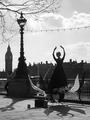
| 04/29/2004 11:51:58 AM | Power and Eleganceby clickawayComment: Greetings from the Critique Club!
Hi Ray, nice to meet you.
This image has a strong central figure, but you could have improved the composition by following my favorite photo rule:
Compose your shot, take two steps forward, click the button. Maybe in this case, gotten on one knee and composed. She's elegant, the thing she's on is interesting. The problem is I see that wire, I see the city, I see the guy, the clock tower.
Another aspect is the darkness. In a silhouette, things shouldn't just be dark. They should be almost wholly black. The silhouette is interesting because of shape, not the details. You captured a great silhouette but it was an "almost" great image.
Good luck in the future!
Mav |
| 04/28/2004 08:15:36 AM | |
| 04/28/2004 08:07:10 AM | | | Photographer found comment helpful. |
|
Showing 211 - 220 of ~1949 |
Home -
Challenges -
Community -
League -
Photos -
Cameras -
Lenses -
Learn -
Help -
Terms of Use -
Privacy -
Top ^
DPChallenge, and website content and design, Copyright © 2001-2025 Challenging Technologies, LLC.
All digital photo copyrights belong to the photographers and may not be used without permission.
Current Server Time: 08/28/2025 06:31:13 AM EDT.
|