|
|
|
Showing 4631 - 4640 of ~5319 |
| Image |
Comment |
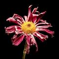
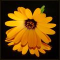
| 04/10/2003 04:47:40 PM | Wilting Awayby jenaromComment: Greetings from the Critique Club!
My comments below are intended to my own interpretation of your work. I suppose my main goal would be to simply enhance your desire to look at your photo in a self-analytical way.
Interestingly, I was given your photo to critique, even though I've already posted these comments below:
"Through what I think is exceptional lighting, you've captured the wilting of this flower in its beauteous decline. The lighting is just so vital in this shot, and you've done it so well. Thanks for creating an image I enjoy looking at over and over. It makes my thoughts go beyond the flower and to the realms of other things like striving, tragedy, the temporary nature of beauty, and more. It's what a really good photo should do. 10"
So I am already impressed with it! Your lighting works wonderfully here to help you build a sense of mystery and awe. This is a flower that is perhaps past its prime, yet you are able to show me that it is still full of beauty and wonder despite its aging. As I said below (and above, now), this is what I give 10s for. You make me think beyond the photo and into other realms. This is not just an image of a flower, it is an image of decline and grace and age and beauty all at once.
I see no fault in your cropping or in your composition. The DOF is fantastic, too. I'm sorry I can't offer more in the way of "things you could do better." This is just a magnificent photo: the kind to which I aspire! It will fit in nicely with your other excellent work.
Best of luck to you!
-David |  Photographer found comment helpful. Photographer found comment helpful. |
| 04/10/2003 12:59:23 AM | The Nuts N Boltsby dg02Comment: Greetings from the Critique Club!
I ranked this photo very high, and it ended up getting a good score, so you should be pleased. I really enjoy many qualities of this image. During the challenge, I noted: "Simple tools, yes? No. You communicate much more here and bring your image some mythic qualities that really delight me. Thanks!" This is all true. Not only is the arrangement of these odds and ends marvelous, with lighting you've been able to make us see past these tools. It has a mood to it that makes us think of workmanship, craftsmanship and the mysteries they contain. It's almost as if by showing us this extreme close up, you are hinting that their uses are many and and perhaps unfathomable in their entirety. Sorry to get metaphysical on you.
Technically, this image is wonderful. Good arranging, great cropping and focus, and super lighting. It provides textures and surfaces that are engaging and fun to explore with the eye. Artistically, it is wonderful as well.
I suppose that's about all I can say. Keep up the excellent work. I look forward to seeing your work in the future!
-David | | Photographer found comment helpful. |
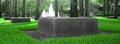
| 04/10/2003 12:51:19 AM | square? there is more..by cq107Comment: Greetings from the Critique Club!
From looking at your other superb work, you seem to have a real gift for creating mood, and this is no exception. I certainly think it fits the challenge, though I assume others did not. I like the creative interpretation of symmetry, though it may have been unclear or unacceptable to others. Your wonderful use of color here really gives this image some punch. Using Photoshop to saturate the greens worked well without making the image look "doctored." I also like how you've cropped it to a shallow rectangle, providing us with one more constraint and making us focus right on the stones and the fountain.
The fountain in the middle adds another bit of interest here, though it might be better a little more toward the center of the stone, but not in the center. Of course, then you'd lose your marvelous point of view of the other stones. Maybe there's a way to finagle it, have your cake and eat it too. What really gives this image its stability are the tree trunks that anchor everything to the top of the photo with an assumed continuance through the bottom.
Your focus and use of line and form are excellent here. I find the various textures engaging and interesting.
If there is any fault with this photo, it may be simply that I don't know what to think or feel. It does not create any strong emotional and/or intellectual reactions, even with your title. I am unsure what to feel or what to think. The image does not appear sad nor happy nor solemn nor celebratory. Even with the great light you've captured, it still retains a detachedness that I can't seem to bridge. It does not seem to be a "study" of color or form or shape or light, and it does not seem to be hinting at any "message" or targeted emotion. So I'm just confused, and I may be alone and stupid (which I often am!), or I may not be alone.
So technically, I can find little to help you. Artistically, and most subjectively, you may want to see how you can make your focus and point here as clear as it is in your other top photos that are so enjoyable. Or you can just consider me a little on the daft side as it's late at night for me!
Keep up the great work!
David | | Photographer found comment helpful. |
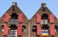
| 04/09/2003 05:17:29 PM | Peaceful symmetryby johnmkComment: Greetings from the Critique Club!
This is a nice image that is indeed peaceful. You've got a lot of horizontal and round lines from the brick work that add to this feel, and since the vertical lines from the shutters aren't that pronounced, they don't detract from it. Even your diagonal roof lines do not totally break the peaceful nature of the shot, perhaps because they are capped by horizontal additions at the top. The soft colors of the bricks also help.
The image to me is symmetrical, and I don't mind the flag in terms of symmetry; I guess I'm pretty liberal when it comes to symmetry and can accept a softer symmetrical look. I also find the buildings well positioned in the frame, though as many of your commenters noted, it does appear slightly tilted due to the "keystoning" of looking up. If you look at the bricks at the bottom of the frame, they look level, but looking up skews and warps the image. The only way to combat this is to get either closer or farther away and make sure you're exactly in the middle. I would guess that you were slightly to the right of the symmetrical plane in the center: note how the extreme left of your image is also slightly more out of focus than the right. So tilting it in Photoshop would not work as the image is warped and not tilted at all. You could also crop the outside edges more to eliminate the worst of the distortion.
The flag adds a bit of interesting color, but like other voters, I feel it tends to compete for attention rather than augment the photo.
Light: I notice that your aperture was at f 2.6. Setting that higher, perhaps to 8.0 or so, would both increase your depth of field and lower the light entering your camera. I'm not sure you can do that with your camera, but many cameras allow you set the aperture. I find the light in this photo a bit harsh and uninteresting. Coming at a different time of day or increasing the shutter speed to limit the light that enters the camera would both darken and enliven the shot, I feel. The reds of the bricks and shutters could really come to life in the right light.
I like the composition of this photo and enjoy how the sky balances the image at the top. Nicely cropped and well positioned in the frame. I also enjoy the various lines of the windows that you captured here.
The photo seems slightly out of focus, and perhaps running an Unsharp Mask filter would help, if you have Photoshop. You may not want to always trust your camera's autofocus. Increasing the aperture might help with overall focus as well.
In sum, I like the image: you've chosen a good subject and communicate a nice sense of symmetry through it. I find it well composed and cropped. I do feel it needs that last spark of interest that could be added through more interesting light, which would be my main suggestion for improvement.
Thanks for letting me look!
David | | Photographer found comment helpful. |
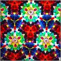
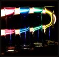
| 04/09/2003 04:49:24 PM | A Chorus Lineby daysezComment: Hi! I'm from the Critique Club and have been assigned your photo to critique.
The colors and lighting of this image make it a very engaging and delightful image to look at. I don't mind not knowing exactly what I'm looking at, though it appears to be a kaleidescope, or at least kaleidescope-like. You seem to be going for an abstract image, and you largely succeed. Overall, I can see the image trying to give me a happy, celebratory feeling.
The composition is well done, and the image certainly adheres to the challenge--and in more ways than one since you have multiple planes of symmetry besides the main plane down the middle.
As one commenter pointed out, this image does seem out of focus. Having all of those images sharp would really help it. This might be tough because you are dealing with reflections that work their way up the tube of the kaleidescope, so you need a great dept of field for this shot. f 5.6 is what you used, but I would put your very nice camera (I have the same camera) on Aperture-priority and change the aperture to f 8.0 for greatest depth of field. There may be a little motion blur, too, so make sure both camera and kaleidescope are well anchored.
Another option would be to put a soft focus on everything and experiment with that.
Look also at the lighting. What we're getting now is a dirty yellow in the background that does not add much to the image. A crisp white or some other deliberate color choice for the lighting may be better at communicating either the joy of these colors (like your Profile page image) or the mystery of them (like you used with the snail in one of your previous images), depending on your aim. If you are using photoshop, you can also use the brightness/contrast or levels or color balance windows to help these colors become more pure.
In sum, I like the photo a lot and think you've done quite a good job at capturing the essence of what you were aiming for, but go through your checklist of things to check and make sure that light: the color, direction and quality, makes it to the top of the list.
Hope that helps!
Thanks for letting me look,
David |
| 04/09/2003 03:21:33 PM | Symphony In F Majorby jmsetzlerComment: It might be the superb lighting, but this image uses light and space to create a mood that moves me and makes me think of not only the flower, but of its mystical origins. 10 |
| 04/09/2003 03:19:42 PM | A Streak of Lightby mariomelComment: To me, this image speaks of how color is created by light and by perhaps something magical--so you adhere to the challenge very well and in dymanic, almost mythic ways. Wow! I like! 10 | | Photographer found comment helpful. |
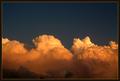
| 04/09/2003 03:17:56 PM | Amber Lightby crabappl3Comment: I've seen a lot of clouds in this challenge, but these are CLOUDS--enhanced by their color to communicate things to me that transcend your image and dwell in meta-experiential realms. Whew! | | Photographer found comment helpful. |
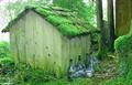
| 04/09/2003 03:16:12 PM | Moss and Glassby friscaComment: Slightly washed and slightly out of focus, this image still manages to transport my thoughts beyond the photo and into realms of nostalgia and history and tradition: which the green tones bring out very well. | | Photographer found comment helpful. |
| 04/09/2003 03:14:46 PM | | | Photographer found comment helpful. |
|
Showing 4631 - 4640 of ~5319 |
Home -
Challenges -
Community -
League -
Photos -
Cameras -
Lenses -
Learn -
Help -
Terms of Use -
Privacy -
Top ^
DPChallenge, and website content and design, Copyright © 2001-2025 Challenging Technologies, LLC.
All digital photo copyrights belong to the photographers and may not be used without permission.
Current Server Time: 08/17/2025 02:23:56 AM EDT.
|