Hi! I'm from the Critique Club and have been assigned your photo to critique.
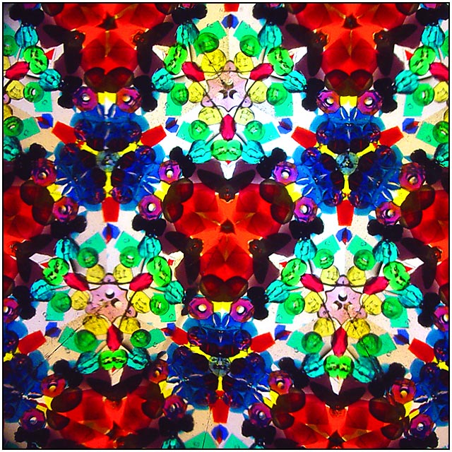
The colors and lighting of this image make it a very engaging and delightful image to look at. I don't mind not knowing exactly what I'm looking at, though it appears to be a kaleidescope, or at least kaleidescope-like. You seem to be going for an abstract image, and you largely succeed. Overall, I can see the image trying to give me a happy, celebratory feeling.
The composition is well done, and the image certainly adheres to the challenge--and in more ways than one since you have multiple planes of symmetry besides the main plane down the middle.
As one commenter pointed out, this image does seem out of focus. Having all of those images sharp would really help it. This might be tough because you are dealing with reflections that work their way up the tube of the kaleidescope, so you need a great dept of field for this shot. f 5.6 is what you used, but I would put your very nice camera (I have the same camera) on Aperture-priority and change the aperture to f 8.0 for greatest depth of field. There may be a little motion blur, too, so make sure both camera and kaleidescope are well anchored.
Another option would be to put a soft focus on everything and experiment with that.
Look also at the lighting. What we're getting now is a dirty yellow in the background that does not add much to the image. A crisp white or some other deliberate color choice for the lighting may be better at communicating either the joy of these colors (like your Profile page image) or the mystery of them (like you used with the snail in one of your previous images), depending on your aim. If you are using photoshop, you can also use the brightness/contrast or levels or color balance windows to help these colors become more pure.
In sum, I like the photo a lot and think you've done quite a good job at capturing the essence of what you were aiming for, but go through your checklist of things to check and make sure that light: the color, direction and quality, makes it to the top of the list.
Hope that helps!
Thanks for letting me look,
David |