|
|
|
Showing 4381 - 4390 of ~5319 |
| Image |
Comment |
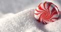
| 04/25/2003 06:18:15 PM | The King of Sugar Mountain by BigSmilesComment: Greetings from the Critique Club!
I concur with all of the compliments below--and there are many!
I feel a bit foolish critiquing this, but here goes! In this photo, the first thing that comes to mind is the happiness that sugar can bring. The twirling lines of the candy on the mountain of sugar bring with it some very fun colors, and the white background, created very effectively and creatively by sugar, add a lightness and joviality to this communication. The composition implies that there is sugar endlessly ready to deliver further messages of warmth and fun. It's as if this candy were indeed a living entity spontaneously created out of primordial ooze--except the ooze is sugar in this case. I'm just sure that only a little way in the future, I'll find more such candies, and perhaps different varieties. Your great cropping enhances this feeling. I like your understated comment "this is a candy on some sugar." It is, but as really good photos do, it suggests much more.
To improve the shot, as I mentioned below, you might try to subdue that harsh light on the upper right of the candy. On the one hand, that glimmer reminds us that this candy is shiny, fresh and magical, so is you do fiddle with that at all, I hope you are able to retain the good qualities that it gives.
This is just a fun, happy image that is simply and skillfully communicated through a lot of implied drama. Well done!
I look forward to seeing more of your work in the future!
Thanks,
David
|  Photographer found comment helpful. Photographer found comment helpful. |
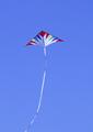
| 04/25/2003 05:42:41 PM | Kite Flying Weatherby MusicmanComment: Greetings from the Critique Club!
I concur with all of the compliments below!
In this photo, I see, pure and simple, a kite. It is held aloft by the wind, so there is no doubt, at least in my mind, that this image fits the challenge well. The kite is brightly colored, and has a long, ribbony tail, so I get a subtle feeling of celebration, as if the wind (and kite flying) were something to gently celebrate. I really love how the tail wouldn't fit into the frame, suggesting perhaps that this kite in all of its exhuberance is just too hard to capture in its entirety. Also, the composition and placement of the kite in the frame is excellent. it gives it an appearance of height without sacrificing its focus. Your use of negative space wonderfully sets the kite and its tail as something very important.
To improve this photo, I would simply push what you have already done well. Through looking at your other images on the site, it is obvsious that you have a great eye for showing simlicity and drama with the smallest details. So if the kite has bright colors now, can they be brighter? Can the sky be bluer? Perhaps a polarizing filter would help, or just a bit of post-shot processing with your software. The focus is off slightly, so it may be fun to explore your two options here: increase the motion blur to show that the kite is in motion or sharpen it up.
Anyway, a really great idea for this photo, and most of your elements work very well; it wouldn't take much to add just that little bit of drama to make it really communicate with us.
Keep up the good work!
Thanks,
David |
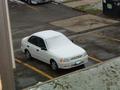
| 04/25/2003 05:28:46 PM | 2nd Day of Spring in Chicagoby Ambrose007Comment: Greetings from the Critque Club!
I concur with all of the comliments below!
In this image, I see, first and foremost, a car with a light blanket of snow, but only on the windshield. I am directed there by its being the only pure white thing in the photo. The rule of thirds, used well here, is used perfectly, and the scene retains its natural qualities. This is almost a still life that has many elements that give it interest and tell a story. Though the challenge is weather, and that is what is most apparent here, I infer from the clues in the photo that it is actually about Chicago itself.
We have some interesting geometric lines going on from the sidewalk to the yellow lines of the parking lot, and you've given us a snapshot of sorts by including the window frame on the left (or is that a building?) which makes it look like you had to shoot fast, or this scene of Chicago life would pass by quickly--good technique, though subtle. The inclusion of the garbage can is also a wonderful detail.
The mood is sombre and almost scientific, but not quite. Like I said before, there is a story being told here. Perhaps you will be driving the car soon and this photo implies a kind of relaxed, resigned dread. The drama is appropriately low, and your soft lines and focus enhance this feeling.
To improve the image, you might try enhancing the drama, even though it appears you want things to be low key. If so, then be low key enthusiastically! Perhaps different light, or a more dramatic point of view--even to the including of more wall/window frame on the left to give a sense of urgency would work. Think of your communication goals with the image, and then ask yourself how to really make this communication clear and dramatic, even if the drama consists of resignedness or cool, scientific interest.
A few voters below mentioned that the image was uninteresting, but I disagree. However, the things that work well for this very complex photo are not to be extracted or understood with a cursory glance, yet that is what most voters here at DPC give images.
In sum, I like this photo, and you should too. It is complex, whether you meant it to be or not, and the comlex elements work well. I'm sure that more people would appreciate a more "exciting" look or feel or mood, but that choice is ultimately up to you.
I hope to see more of your excellent work in the future!
David | | Photographer found comment helpful. |
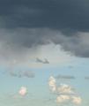
| 04/24/2003 11:21:14 PM | Starting To Rainby fyjimoComment: Greetings from the Critique Club!
I concur with all of the compliments below!
In this photo, I see clouds. The weight is clearly on the top, and it is exciting to see some of that weight begin to make its way down over on the left. This little shift of weight to me makes this image interesting and engaging. The weight on top is also clearly oppressive to the other miniscule clouds below, so there is a sense of drama here, too. This whole element of weight is interesting, because the image does not seem unbalanced or upside down, so you've made it work even though we all expect weight to be downward. What this also does is really create an anchor for us that is up, so while most photos for this challenge have a tree or mountain or ocean on the bottom to "ground" the image, you've "sky-ed" your image by "grounding' it up (if that makes sense...).
I think you do a disservice to yourself in your comments, for I think this photo works. The elements that make it work, most of all the weight, are elements that are not to be had with a cursory look, which is what most voters give images here. Other important elements include your sense of light grading, beginning dark at the top and ending much lighter on the bottom. I feel that even more contrasts would enhance the drama of the photo even more, so you might want to explore making the whites whiter and the darks darker. The fact that you looked up and thought "Wow! I'm gonna take a picture of this sky" says much about your natural ability to perceive drama and interest in simple things. Keep doing it.
Best of luck to you in the future, and keep up the great work!
David |
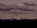
| 04/24/2003 11:07:29 PM | Clouds over Rainierby SwashbucklerComment: Greetings from the Critique Club!
I concur with all of the compliments below!
In this image, I see Mt Rainier, a rare enough occurance! It is centered, which gives the photo and mountain a solid, anchored look. The large dark portion adds to this feel in a (wisely) needed way, because the mountain, disappearing into the clouds, tends to look higher and in need of anchoring. The rule of thirds would have, in my opinion taken from this, when it is what is needed for the strong mountain look. This is an extremely difficult shot, because you have different whites on white and different grays on gray and black. You have a few other very subtle hues mixed in just to make it interesting!
Below, folks said that the image was too dark, but to me an image is too dark only when it should be lighter. In this case, I think the darkness adds to the drama of the mountain and clouds. What's missing for me here are strong contrasts. It is a very subtle image with grays on grays on lighter grays. It would be nice, perhaps if more whites were present, which would increase the drama without lightening it too much. The clouds you've captured here are quite marvelous, and I love how they float in three distinct levels, giving the image depth and interest. In this photo the focus is the clouds, which also get focus in your title. In fact, the mountain seems appropriately hazy and a bit blurry compared to those sharp clouds. I suppose some may be perplexed that there is a mountain here, but the clouds are stealing the show! Mountains do have the corner on being majestic, and focus on the mountain is probably anticipated, but I'm glad you made the choice to show us that clouds can hold their own, too, even if your exploration did not pull an exciting score. Again, perhapas more contrast in the clouds may have increased their importance in the shot.
In sum, this is a solid shot. You've managed to give clouds the focus and provide some drama through lighting and good composition. Many of the elements that really work well in your photo are not evident with a mere cursory look, which is what most folks give images here these days, but I want to congratulate you on crafting an image that is both interesting and engaging.
Best of luck to you in the future!
David | | Photographer found comment helpful. |
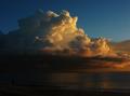
| 04/24/2003 02:56:40 PM | Storm brewingby brentg3Comment: Greetings from the Critique Club!
I concur with all of the compliments below!
This is an image full of drama, captured so well by the light and contrasts you pointed out with your point of view and cropping. It reminds me that nature is powerful, yet strikingly beautiful at the same time. It does what a really good photo should do: move me beyond the image itself and to other thoughts. In other words, you don't merely "record" clouds here, you artfully suggest deeper and broader things upon which to think, or at least feel. The light you've captured here is fantastic, and makes those clouds really fire up with color. the cropping, also composes the clouds within the frame so that the brightest portion of the image is in a place that looks natural, yet allows us to explore the image at the same time. My clouds for this challenge were never sharp, so I really admire the skill you've shown with clarity.
To improve the shot, if this is possible, I would begin by looking at the "uninteresting" portions of your image. The figure, for instance, might be interesting, but we can't see him/her well enough to know if that is an important part of your photo. The ocean, likewise does not have enough light to command any focus, so we are wondering what function it serves as an element in this image. On the one hand, your choice to keep these elements was wise because clouds can rarely "stand" on their own in a photo, but perhaps playing with exposure may have given these elements a bit more of a role, while retaining the exciting drama of the clouds. Well, I'm picking nits, now!
This is a great photo that ought to be on your wall. Keep up the great work. I hope to see more of your images in the future!
David | | Photographer found comment helpful. |
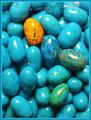
| 04/24/2003 02:42:53 PM | Rotten Robin: Ugly Duckling Syndrome?by CLarson557Comment: Greetings from the Critique Club!
I concur with all of the compliments below!
This is a happy image that is all delightfully jumbled and filled with a wonderful "pattern" (we'll call it). This close up point of view really works to celebrate these candies, their shapes and their colors. Perhaps some day we'll be able to communiate flavor through photography as well! This arrangement of candies works really well. It looks random, and may be, but you've composed and cropped so that there are interesting and different colors right where they need to be. The yellow candy, especially, is well placed and an interesting point on which to focus. You make the candies look enticing, and it looks like it will be fun eating them. The DOF is excellent, too, with the out of focus candies just at the edges of your frame.
To improve the shot, the first thing I would explore would be to diffuse the light. I actually like the little glares of light, making the candies shiny and lovely, but they are just a bit too "glaring(?)" and harsh. Your border might also be a bit much as it does attract attention to itself rather than simply setting the image apart from the gray screen.
In sum: a happy, well done shot! I want to eat one now! Good luck in the future, and I look forward to seeing more of your excellent work in the future.
David | | Photographer found comment helpful. |
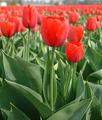
| 04/23/2003 11:03:01 AM | Red Tulipsby AzrifelComment: The point of view here works fantastically as the tulips fade to a red blurry line! Nice DOF too. The colors seem a little too "pushed" and unnatural, but your concept works well. | | Photographer found comment helpful. |
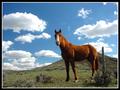
| 04/23/2003 01:03:01 AM | Prairie Boundby SonifoComment: The horse against the sky really adds drama to this shot. Wonderful light and colors. | | Photographer found comment helpful. |
| 04/23/2003 12:59:51 AM | |
|
Showing 4381 - 4390 of ~5319 |
Home -
Challenges -
Community -
League -
Photos -
Cameras -
Lenses -
Learn -
Help -
Terms of Use -
Privacy -
Top ^
DPChallenge, and website content and design, Copyright © 2001-2025 Challenging Technologies, LLC.
All digital photo copyrights belong to the photographers and may not be used without permission.
Current Server Time: 08/23/2025 05:33:13 AM EDT.
|