| Image |
Comment |
| 12/03/2006 12:05:29 PM |
Glass artby photobuddyComment: I'm sure some are nailing you for the flaws in the glass but I still love this one - good luck! |
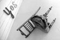
| 12/03/2006 12:04:36 PM |
No!by PatmaniaComment: Great title & composition - gave me a laugh so you get my only 9... |
 Photographer found comment helpful. Photographer found comment helpful. |
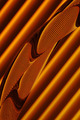
| 12/03/2006 12:02:43 PM |
Diagonals and Curvesby banmornComment: Lovely abstract - came back to bump you to 10 - can't wait to find out what it was so you better tell! |
| Photographer found comment helpful. |
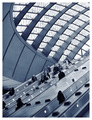
| 12/03/2006 12:01:02 PM |
Canary Wharf by AlexSaberiComment: Great initial impression - very nice composition, exposure & tones - well executed - all those angles povide some 'wow' factor, but I'd still need more before voting higher than 8. |
| Photographer found comment helpful. |
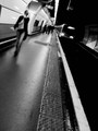
| 12/03/2006 11:57:43 AM |
Subway Lineby FrancoisBComment: Though the motion blur might kill you during voting, I really like the overall impression of this one. |
| Photographer found comment helpful. |
| 12/03/2006 11:51:43 AM |
Diagonal lightsby WindtaleComment: Came back to bump you up to an 8. Though I would have rather seen the camera either tilted more or aligned better (angle seems unintentional & dutching more would have served the spirit of the challenge better) it is a beautifully captured moment. |
| 12/03/2006 11:46:27 AM |
Untitled Figure Studyby KeepUrFrkThrsPieComment: Beautiful & evocative, love the shadows & texture - but I wish there was more interest as far as the facial expression goes. Colors/exposure also seem to go askew around the face which is bothersome to me. Nice composition & gorgeous model, though! - 7 |
| Photographer found comment helpful. |
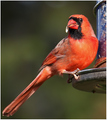
| 12/03/2006 11:38:44 AM |
Good Seeds !by rileyComment: Handsome subject - but he's a bit soft as far as focus goes. Good luck! |
| Photographer found comment helpful. |
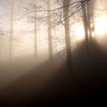
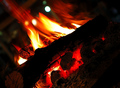
| 12/03/2006 11:38:25 AM |
Woods On Fireby onarComment: Diagonal connection is strong, but for me the image is a little lacking in impression. The flames are nice, but the globs of white completely detract from them which makes me look down & to the right for more to see but I'm met with black void. I'm pretty much a newbie here, though, so take my comments with a grain of salt - just 'cause I'm being critical doesn't mean I think MY stuff is doing any better! You'll likely lap my submission... Good luck! |
| Photographer found comment helpful. |
| 12/03/2006 11:38:03 AM |
Andrewby SheryllComment: Cute little one - but a stronger angle would have suited the challenge better. Also, a little sharpening overall would have helped & I think I would have liked this better in b&w with a healthy serving of contrast adjustment. I'm pretty much a newbie here, though, so take my comments with a grain of salt - just 'cause I'm being critical doesn't mean I think MY stuff is doing any better! You'll likely lap my submission... Good luck! |
| Photographer found comment helpful. |
Home -
Challenges -
Community -
League -
Photos -
Cameras -
Lenses -
Learn -
Help -
Terms of Use -
Privacy -
Top ^
DPChallenge, and website content and design, Copyright © 2001-2025 Challenging Technologies, LLC.
All digital photo copyrights belong to the photographers and may not be used without permission.
Current Server Time: 08/21/2025 05:20:45 AM EDT.