| Image |
Comment |
| 01/22/2003 10:55:32 PM |
|
| 01/22/2003 10:54:39 PM |
|
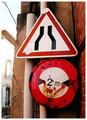
| 01/22/2003 10:54:18 PM |
Ironicby teachme53Comment: lighting is too harsh on the meter, sign in the background isn't in focus, which would make this photo much better. also i'm not sure if a meter is a sign but whatever, this is well composed |
| 01/22/2003 10:52:59 PM |
|
| 01/22/2003 10:49:55 PM |
|
| 01/22/2003 10:48:42 PM |
|
 Photographer found comment helpful. Photographer found comment helpful. |
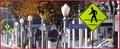
| 01/22/2003 10:45:57 PM |
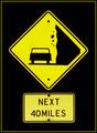
-by jjbeguinComment: open up the picture more so we can get a better idea of what the signs mean |
| Photographer found comment helpful. |
| 01/22/2003 10:40:32 PM |
|
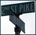
| 01/22/2003 10:39:52 PM |
Redundancyby ClubJuggleComment: i think this is too dark. also i think that it is pretty uninteresting. the title is understandable, but there's nothing that grabs me. it's good execution none the less. more light next time |
| Photographer found comment helpful. |
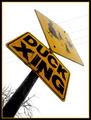
| 01/22/2003 10:37:36 PM |
Duck's Eye Viewby jodiecostonComment: nice perspective. the lighting on the top of the sign is too harsh. powelines aren't good either. good composition though
|
| Photographer found comment helpful. |
Home -
Challenges -
Community -
League -
Photos -
Cameras -
Lenses -
Learn -
Help -
Terms of Use -
Privacy -
Top ^
DPChallenge, and website content and design, Copyright © 2001-2025 Challenging Technologies, LLC.
All digital photo copyrights belong to the photographers and may not be used without permission.
Current Server Time: 08/28/2025 10:25:28 AM EDT.