| Image |
Comment |
| 04/28/2007 08:25:05 AM |
Gemmaby alwaysREDComment: love the face and the exposure is pretty good - i just would have liked the eyes and nose a little sharper in focus - it currently seems a little soft on the face. |
| 04/28/2007 08:22:18 AM |
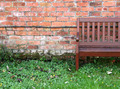
Waiting for Springby jenlanComment: nice crop on this 'rather' mundane image - it works and adds just the right tension by not showing the entire bench. 8 |
 Photographer found comment helpful. Photographer found comment helpful. |
| 04/28/2007 08:20:55 AM |
|
| Photographer found comment helpful. |
| 04/28/2007 08:19:27 AM |
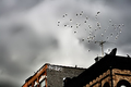
BRKLYNby roby21112Comment: i like the processing on this image - the extreme contrast really adds to this image 9 |
| Photographer found comment helpful. |
| 04/28/2007 08:12:14 AM |
When You're Alone (It Ain't Easy)by hhuddleComment: The halo around the tree and horizon is a significant issue with this photo - and the swirls on the image really distract. I like the theme and the title a lot - wish the image was a little clearer and had less technical issues. |
| Photographer found comment helpful. |
| 04/28/2007 07:22:31 AM |
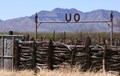
Southern Az Ranchby bigtreearrowheadComment: There are so many (almost too many) cool things in this image! The mountains, the fence, the trees, the ranch sign all are great topics for photos - but it seems that having them all in the same photo is a little bit of overload.
The image is pretty sharp in the foreground, but the mountains in the back are a little soft and the colors are not very vibrant - especially the sky being a little too pale blue/grey.
Another issue I noticed is the horizon seems askew by a few degrees - even though the ranch sign is parallel with the horizon. I wish I had such great subjects to use in photos! |
| Photographer found comment helpful. |
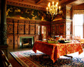
| 04/28/2007 06:52:12 AM |
morningby vikasComment: wonderful rich colors and tones - awesome location. Is that your house or the servants quarters? |
| Photographer found comment helpful. |
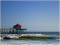
| 04/28/2007 06:51:33 AM |
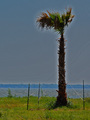
Ocean Restaurantby PhotologistComment: That is a great exposure of the waves and the pier behind, but the sky is adding very little to the photo - reshooting so that the pier and horizon are at the upper third and the surf (interesting textures and colors) could be emphasized a whole bunch more - 6 |
| Photographer found comment helpful. |
| 04/28/2007 06:48:49 AM |
Everlasting Covenantby AgaricusComment: love the lighting on this entry - just wish the barn wasn't blown out. the grasses in front are perfectly exposed and the sky and rainbows are really well composed. I just wish you would have placed the horizon a little higher in the frame so it is more at the third rather than down about 20%. I realize you were trying to put the barn at the intersection of the thirds, but the horizon is such a large component of the lines in this image - I think it could have been a little higher. Still - I like it a lot 7 |
| Photographer found comment helpful. |
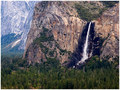
| 04/28/2007 06:45:12 AM |
Bridaveil Fallsby bryanbrazilComment: i love yosemite - it is hard to take a bad picture there! Nice placement of the falls and the edge of the rock outcropping in the other third. I would have liked a little more movement of the color to brighten up the pines - these darn things always seem beautiful in real life but are so hard to capture with a camera. |
| Photographer found comment helpful. |
Home -
Challenges -
Community -
League -
Photos -
Cameras -
Lenses -
Learn -
Help -
Terms of Use -
Privacy -
Top ^
DPChallenge, and website content and design, Copyright © 2001-2025 Challenging Technologies, LLC.
All digital photo copyrights belong to the photographers and may not be used without permission.
Current Server Time: 08/26/2025 06:50:21 AM EDT.