| Image |
Comment |
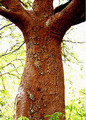
| 05/24/2007 02:59:45 PM |
Hugs Treesby planetxComment: This looks like it could really use some tonemapping. The colors seem oversaturated and the sky is completely blown out. Use of Photomatix Pro or other to show the detail in the tree trunk and not end up with a blown out sky might work really well on this image. |
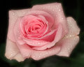
| 05/24/2007 01:10:43 PM |
Flower_LR.jpgby geraldhillerComment: Pretty colors on this one. I am not so sure about the soft focus on the flower. I gave it a little photoshop treatment - adding unsharp mask 25,50,0 then 85,0.5,0 two times. I think it makes it pop more.
See below...
 |
 Photographer found comment helpful. Photographer found comment helpful. |
| 05/23/2007 09:11:48 AM |
Enchanted Satinby aliquiComment: Excellent job teammate - Really nice image - one of the best flower images in the whole challenge. |
| Photographer found comment helpful. |
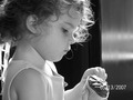
| 05/23/2007 09:10:06 AM |
A Treat After Playby stepheroo31Comment: This is a sweet image - but I don't see a specific shape that you are trying to capture. If it is the cupcake - you should have focused it on the cupcake (and gotten rid of the date stamp!!!!) Sorry, but I have to give this a 3 |
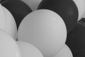
| 05/23/2007 09:08:51 AM |
Balloonsby joanvito89Comment: I think you have a nice concept to show shapes, but the exposure and lightin on this image need some work. First, the white balloons are more grey than white - bracketing the exposure of this photo might really help. In addition you may be able to adjust the levels on the histogram to bring out the whites and the blacks more clearly. Second, the focus seems a little soft. For a macro type image like this - sharp focus on a specific area is really needed. |
| 05/23/2007 09:06:19 AM |
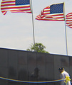
Rectangles of Remembranceby okiesisiComment: This has a lot of potential as a subject - however the image itself has some technical flaws. Because of the flaws, I am giving it a 3
First, the image appears very blurry as if no specific area is actually fully in focus.
Second, the colors of the image are very washed out - the yellows and blues are very pale.
Third, the perspective on this photo could use some work. This memorial is a moving place, but not showing a full section of it (we don't see the bottom half of the wall) and seeing such a small section of it really does not do it justice. Shooting it at a much more extreme angle - get to the left and shoot down the wall might really help. If you wanted to get the reflection of the old man - i would have gotten closer to him and focused the image on him (orient the camera in vertical instead of horizontal). |
| Photographer found comment helpful. |
| 05/23/2007 09:00:49 AM |
Hmm Biscuitsby simontaylorphotoComment: the image is pretty well photographed - reasonably sharp, etc. but the subject is really not that interesting to me 4 |
| Photographer found comment helpful. |
| 05/23/2007 08:59:57 AM |
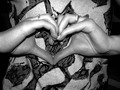
Let Me Show You The Shape of My Heartby Dancing620queenComment: I am giving this a 3. I like the concept of hands forming a heart - but the image seems to be much more of a snapshot - harsh flash on the fingers, a busy shirt in the background of the heart shape, a heart that seems to be tilted down. |
| 05/23/2007 08:57:35 AM |
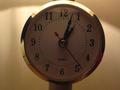
tick tack unstopby alwin_tanasComment: the focus and lighting need some help on this issue - it appears to have been underexposed and then brightened to show more detail - but the result is a pixelated image - 3 |
| 05/23/2007 08:56:21 AM |
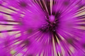
Star Burstby willhadlComment: this image is a little too abstract ofr me - i think it is a flower but i can't quite tell. this may be due to the focus - it doesnt seem to be placed at any specific location |
Home -
Challenges -
Community -
League -
Photos -
Cameras -
Lenses -
Learn -
Help -
Terms of Use -
Privacy -
Top ^
DPChallenge, and website content and design, Copyright © 2001-2025 Challenging Technologies, LLC.
All digital photo copyrights belong to the photographers and may not be used without permission.
Current Server Time: 08/28/2025 06:14:31 AM EDT.