| Image |
Comment |
| 11/14/2007 10:57:58 AM |
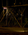
Smokin' Dewaltby RegencyRiggsComment: Welcome to DPC, Will!
It's not a bad shot, but from the DPC perspective, it suffers from a couple of things...
* It's too complicated. You only have 640 pixels to work with, and voters only look at an image for 2 seconds before voting. Anything complicated will get whacked in voting. You have to create an image that says what you're trying to say in really simple terms, with nothing else to take the viewer's attention. The kinds of things that work as large, detailed prints often don't work at DPC.
* Subject. It looks like your subject is a "no smoking" sign, because the sign is the best lit part of the shot. A more interesting subject will get more interesting votes.
* Lighting, clarity, sharpness, etc. General technicals are okay, but nothing special.
* Meeting the challenge. I may be wrong, but it *appears* that there's more than one light source lighting things in the shot. It doesn't really matter if you're actually meeting the challenge. It's all about appearances. If the voters think you're not meeting the challenge, you'll get beat up, especially if there's any other problems with the photo.
Hope this helps. |
 Photographer found comment helpful. Photographer found comment helpful. |
| 11/14/2007 10:34:45 AM |
|
| Photographer found comment helpful. |
| 11/09/2007 01:39:06 PM |
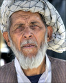
Distinguishedby MelethiaComment: I like this guy a lot, Deb. I would have used the original "basic editing" levels, but pimped the eyes more like this version, and used basically this crop (maybe crop a little less tight). But it's really good already, so I may be full of it. |
| Photographer found comment helpful. |
| 11/09/2007 01:32:11 PM |
In progressby MelethiaComment: Hi Deb,
I think this is actually a much better than average photo, entered in the wrong challenge. It doesn't really say "new" to my American brain.
As far as the image goes, since you couldn't take it at a different time of day, I think you could get a lot by using levels to make the midtones (a lot) darker. the image isn't really overexposed, the highlights and shadows are in the right place, but overall, the image is too bright.
The other thing would be cropping off the bottom "empty" portion. It isn't really adding anything to the shot, and just sucking my attention away from the important bits. |
| Photographer found comment helpful. |
| 11/08/2007 08:53:28 PM |
|
| Photographer found comment helpful. |
| 11/07/2007 10:03:38 PM |
|
| Photographer found comment helpful. |
| 11/07/2007 07:08:25 PM |
|
| Photographer found comment helpful. |
| 11/07/2007 06:07:32 PM |
|
| Photographer found comment helpful. |
| 11/05/2007 10:42:48 AM |
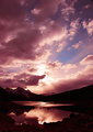
p a s s i o nby rinacComment: An example of a photo that's so amazing that it does well even though nobody can figure out how it meets the challenge. Beautiful!!! |
| Photographer found comment helpful. |
| 11/05/2007 10:40:08 AM |
|
Home -
Challenges -
Community -
League -
Photos -
Cameras -
Lenses -
Learn -
Help -
Terms of Use -
Privacy -
Top ^
DPChallenge, and website content and design, Copyright © 2001-2025 Challenging Technologies, LLC.
All digital photo copyrights belong to the photographers and may not be used without permission.
Current Server Time: 08/09/2025 03:31:11 AM EDT.