| Image |
Comment |
| 03/25/2008 01:54:41 PM |
coal mineby charliebakerComment: I didn't vote in this challenge, but I loved reading the comments afterwards. To me, however, this looks more like a cave than a coal mine. Maybe if you sized it at 640x, I might see what you were getting at. |
 Photographer found comment helpful. Photographer found comment helpful. |
| 03/25/2008 01:51:14 PM |
|
| Photographer found comment helpful. |
| 03/08/2008 12:12:48 PM |
|
| Photographer found comment helpful. |
| 03/03/2008 03:37:58 PM |
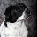
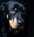
Pepperby JamesKWComment: It's a good, technically solid, doggie portrait. I gave it a 6. Nice focus, lighting, detail in the fur. Good job getting detail in both the white and black, and good catchlights in the eyes. The only "technical" problem I see is with the cheesy background. I have no idea why anyone would give this less than a 5.
Now, as to what could make this really stand out...I think what's missing is the lack of connection with the viewer. If you look at the top 10 in this challenge, there is a wide variety of poses, looks,etc, but the one thing they have in common is that every animal is looking directly at the camera, bringing the viewer into the shot. Even the chicken.
The other thing that might bring it over the top (or make it tank) is some sort of hook to grab the viewer's attention. You don't have to dress the dog in a party hat (ahem), but the top shots all stand out for one reason or another, either because they're cute, unusual, emotional, or whatever. Pepper's shot doesn't have that kind of kick to it.
|
| Photographer found comment helpful. |
| 03/03/2008 03:33:35 PM |
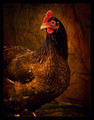
Obviously, this is my better side... by shamerComment: Congrats, Shawn! This was one of my 10's. A question for you...what are you using as a background? A backlit burlap sack? Whatever it is, it works really well. |
| Photographer found comment helpful. |
| 03/01/2008 12:19:36 PM |
Damon's Pointby getnoutsideComment: It's a good start, but I think this would work better framed differently. The main horizontal line running through the image divides the image into halves, and the water closest to the camera isn't doing much for you. I think it would work better to crop both the bottom and the left. Bring the horizon line down to about 1/3 of the way up, and get rid of everything to the left of the island. That would bring the island in closer and make the whole shot more interesting. |
| 03/01/2008 12:10:04 PM |
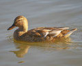
Mallardby SteveJComment: The lighting and texture is good. With moving birds, it helps to frame the shot so that there's some extra space in front of the bird to give it some space to move into. Otherwise, it feels a bit cramped. |
| Photographer found comment helpful. |
| 03/01/2008 12:05:03 PM |
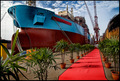
Nguyima-Yinby dougi555Comment: The framing and leading line is good, but the red path is so colorful it draws the attention away from the rest of the shot. |
| Photographer found comment helpful. |
| 03/01/2008 11:59:29 AM |
|
| Photographer found comment helpful. |
| 03/01/2008 11:58:48 AM |
|
| Photographer found comment helpful. |
Home -
Challenges -
Community -
League -
Photos -
Cameras -
Lenses -
Learn -
Help -
Terms of Use -
Privacy -
Top ^
DPChallenge, and website content and design, Copyright © 2001-2025 Challenging Technologies, LLC.
All digital photo copyrights belong to the photographers and may not be used without permission.
Current Server Time: 08/14/2025 09:01:46 AM EDT.