| Image |
Comment |
| 02/08/2003 01:25:43 PM |
Hello yesterday....by niwedimagesComment: Composition: Left-hand tin seems slightly too close to the left hand edge for me.
Technical: Lovely DOF and choice of B&W. Is the very thin line around the edge because of sharpening? Might have benefited from cropping a pixel on each edge.
Meets challenge: Not sure where the cliche is, sorry.
Overall impression: Nice interesting pic, but composition lets it down a little for me. 6 |
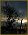
| 02/07/2003 04:00:14 PM |
Sunset #16by zadoreComment: Composition: Nice balance between the pole and tree. I like the way the tree stretches out into the space at the top/right of the pic.
Technical: This is quite a dark pic, which I don't think is aided by the border. Did you try a border that is even lighter?
Overall impression: Although it is quite dark there are so many things I like about this it's hardly even a problem. 9 |
 Photographer found comment helpful. Photographer found comment helpful. |
| 02/07/2003 03:55:08 PM |
The Empire State Building, (shrunken)by catpixelComment: Composition: Nice use of lines to draw your attention to the main subject.
Technical: The quality of the building looks qutie iffy, was this a camera issue or some rescaling prob?
Overall impression: Very clever idea put the pixelation of the building lets it down. 6 |
| Photographer found comment helpful. |
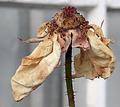
| 02/07/2003 03:52:52 PM |
Faded Rose from 2002by vtruanComment: Composition: Excellent
Technical: Absolutely love the DOF. There's just enough detail in the b/g to make it interesting but not enough to take you off the main subject. Not sure if it's a feature of the camera, but the pic seems to have a white line around it.
Overall impression: So nearly excellent, but the white line puts me off a bit. 8 |
| Photographer found comment helpful. |
| 02/07/2003 03:51:31 PM |
Bird of Paradiseby CubComment: Composition: I think I would have been tempted to crop this pic square. This would make all the leaves cropped to the same length.
Technical: Nice focus and colour, it's a shame the beak of the bird merges with the leave a ltitle.
Overall impression: With the colours and focus is could have been nice, I guess it was difficult to get a good pose from your model! 6 |
| Photographer found comment helpful. |
| 02/07/2003 03:50:09 PM |
Floral Arrangementby jgillardComment: Composition: Might have tried lowering the camera so the pic did not contain any table/mats. I like the inclusion of the pot though, rather than just the flowers themselves.
Technical: The flowers look nice and vibrant but some of the leaves near the bottom are qutie dark meaning they don't have a lot of clarity.
Overall impression: Very nearly a good pic, but lacking slightly on the above. 6 |
| Photographer found comment helpful. |
| 02/07/2003 02:21:20 PM |
A Rose by any Other Name...by bdshortComment: Composition: I like the direction of the two crossing petals and the thin leaves. For a flower it seems quite angular.
Technical: Focus is excellent. On my monitor the stem is very dark, which detracts from the pic for me.
Overall impression: Darkness let it down slightly for me. 7 |
| 02/07/2003 02:18:49 PM |
Sandy....!!by STEINRComment: Composition: Good. Did you try cropping so the subject was slightly more central?
Technical: Great lighting.
Overall impression: Good shot with the tongue out! 7 |
| Photographer found comment helpful. |
| 02/07/2003 02:16:09 PM |
Let Sleeping Dogs Lieby mcraelComment: Composition: I really like the way the frame is filled.
Technical: Focus is slightly off on the subject's forehead but looks great elsewhere. Lighting looks a little dark, but this does draw your eye nicely into the centre of the pic. Excellent use of borders too.
Overall impression: Really nice pic. 8 |
| Photographer found comment helpful. |
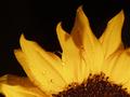
| 02/05/2003 11:44:18 AM |
Sun Rise Cliche'by justineComment: Composition: Really good positioning and balance between the yellow petals and the black of the b/g and centre.
Technical: I really like lighting and contrast. Pic is let down slightly by the focus of the end of the petals.
Overall impression: If focus was slightly better this would be near perfect. 8 |
| Photographer found comment helpful. |
Home -
Challenges -
Community -
League -
Photos -
Cameras -
Lenses -
Learn -
Help -
Terms of Use -
Privacy -
Top ^
DPChallenge, and website content and design, Copyright © 2001-2025 Challenging Technologies, LLC.
All digital photo copyrights belong to the photographers and may not be used without permission.
Current Server Time: 08/26/2025 06:24:10 PM EDT.