| Image |
Comment |
| 04/15/2010 07:54:09 PM |
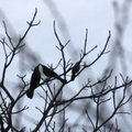
love triangleby posthumousComment: Greetings from the Critique Club!
As previous commenters have indicated the image is pretty soft as you probably already know. This likely due to the aggressive cropping you did. With an image like this I think you can say its just okay ...or
...work with what you have. Its a soft image. Maybe try to actually soften it even more to make it more abstract yet keeping the shapes of the birds recognizable. You could even just blur every but the birds to give the appearance of sharpness to them.
Judging from the sky it was fairly overcast though you shot at the right time or day (either early morning or just before dusk). Maybe changing the white balance would have warmed up the image making this more inviting and working with the love bird theme you were working for.
I think that to get the strong silhouette you were going for you needed to get closer so you wouldn't need to crop and your focus would have been better. To get closer and have all three birds in the frame would have required patience and a little luck.
In terms of the challenge I think this one was pretty open so your image certainly met the challenge pretty well and wasn't a shoe horn in any sense.
|
 Photographer found comment helpful. Photographer found comment helpful. |
| 04/12/2010 01:12:32 AM |
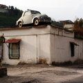
Free Parkingby Rino63Comment: Damn! I just went by a Volkswagen Beetle spider yesterday. Why didn't I shoot it?
Cool entry that fits the challenge topic well. |
| Photographer found comment helpful. |
| 04/09/2010 02:25:58 PM |
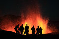
Infernoby orvaratliComment: Greetings from the Critique club!
I must say, first off, that I am a little jealous you got to shoot this. :)
I have to agreee with the previous commenters to certain extent. It would have have been nice to have them the people in better focus. Its understandable why this wasn't so. It looks like your focus was on the lava and not the people. Unless you were to back up a lot more they would have been out of focus no matter what. And you were shooting at f/4 which didn't give you a lot of depth of field to play with. True you could have tried to stop down but I don't think you would have gotten the depth of field anyways and you would have introduced more noise using a higher ISO or messed up the perfect capture of the lava which you got with your shutter speed. I think given all that, having the people sharp AND the lava sharp might not have been an option.
The composition works well for me. It is a little central but I think it works in this case. The people could have been separated a bit more but again, that probably wasn't an option and I think there's sufficient separation to pull it off.
In regards to the challenge? Yup...that's definitely orange. :)
Overall, a great image. Great job! |
| Photographer found comment helpful. |
| 04/07/2010 11:57:23 PM |
|
| Photographer found comment helpful. |
| 04/07/2010 11:55:13 PM |
Aphroditeby Sterling87Comment: Very interesting pose. I'd almost want to see her head turned slightly to her left while keeping her eyes on the camera. This would help complete the S curve that is started with the pose as you have it.
Lighting is a little bright but I think it really works here especially with the mood I think you are trying to go for here. |
| Photographer found comment helpful. |
| 04/07/2010 11:54:36 PM |
|
| Photographer found comment helpful. |
| 04/07/2010 11:54:31 PM |
Snailby androgeusComment: wow. The composition is so perfect that I can't express anything except that single word. I mean the colors and the lighting and exposure are good but the composition totally makes this shot. I expect to see this in the top 10 and hopefully with a blue ribbon! |
| Photographer found comment helpful. |
| 04/07/2010 11:51:32 PM |
Death Canyonby AarthekComment: A bit oversharpened as I can see haloing around the edges of the hills/mountains. |
| Photographer found comment helpful. |
| 04/06/2010 12:52:44 AM |
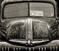
Double Barrelby radarbratComment: Greetings from the Critique Club!
Not a lot to say about this image other than positive feedback. I like the crop and the symmetrical composition. Good choice on the black and white conversion (I am curious about the color version though). The sign takes this from being a straight on vehicle shot to something a bit more. (A picture with a story!). Naturally this subject fits the challenge topic.
Not quite a personal best but pretty close. Congrats on your top 10 finish! |
| Photographer found comment helpful. |
| 04/01/2010 01:19:58 AM |
Love At First Sightby dahlinComment: The vignette, if it was added in post, doesn't work well with here and takes attention away from the two subjects somewhat rather than bring your eye to them. (My eye is actually drawn to her hand). Perhaps if a more subtle vignette was added and then dodging and burning applied to shift the lighter area to her and the baby's face it might be more effective.
In any event, this is still a touching scene and photographed well. |
| Photographer found comment helpful. |
Home -
Challenges -
Community -
League -
Photos -
Cameras -
Lenses -
Learn -
Help -
Terms of Use -
Privacy -
Top ^
DPChallenge, and website content and design, Copyright © 2001-2025 Challenging Technologies, LLC.
All digital photo copyrights belong to the photographers and may not be used without permission.
Current Server Time: 09/04/2025 03:14:15 PM EDT.