| Image |
Comment |
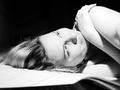
| 06/19/2003 03:31:44 PM |
Little Old Me.by iconsueComment: Love the pose, lighting, composition! The whites in the hand and shoulder get a little too white, in my opinion, but this doesn't hurt the overall photo. Nice work! |
 Photographer found comment helpful. Photographer found comment helpful. |
| 06/19/2003 01:33:39 PM |
|
| Photographer found comment helpful. |
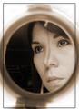
| 06/19/2003 01:32:47 PM |
My - Self - Portraitby frozensunComment: I like the expression, and it looks like the wind is blowing. This photo has a lot of interest in it, from the blurred-out valley to wondering what you might be looking at. Only concern is that the sky is VERY blown-out, maybe too white. |
| Photographer found comment helpful. |
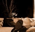
| 06/19/2003 01:31:28 PM |
Sorry, I'm a vampire..by swaroskjiComment: The shoe placement is what makes this work. It DOES tell me something about you, but not much... frankly, I like the way it's composed. Pillows are a bit dark on the couch, but that's it. |
| Photographer found comment helpful. |
| 06/19/2003 01:22:31 PM |
|
| Photographer found comment helpful. |
| 06/19/2003 01:17:13 PM |
HI! I'm Down Here!by BukiosComment: If your eyes were in the picture, even just the top half of them, this composition would RULE! Without them, it's hard to make an emotional connection to the photo. |
| 06/19/2003 01:15:24 PM |
self-portretby andlbComment: Interesting gesture and lighting, but very blurry on my monitor. |
| 06/19/2003 01:15:05 PM |
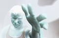
3 Foot handby michaeldeyComment: I like what you're doing here, but what loses you points is that this is such a STRONG gesture and I'd like to see you looking at the camera (maybe menacingly!) instead of at the monitor or wherever you're looking. That's what would make the difference for me on this. |
| 06/19/2003 01:13:53 PM |
Holding Himby sagestudioComment: Aha! Now I get it! :) I think "his" photo worked better because of his expression, but I think this would make a GREAT pair of photos for you to print and frame! I like how your composition mirrors the other one, but to be honest, his stands alone better than yours (I think mostly because you look like you're having fun with the picture-taking aspect of it and seem to be focusing on that rather than "on him".) |
| Photographer found comment helpful. |
| 06/19/2003 01:10:12 PM |
Woe is Meby eloiseComment: To me, this photo looks blurry, and the colors aren't very sharp. Try sharpening it and saturating it (or desaturating it completely) and see what you get. I like how it's cropped and the expression and everything! Just technical aspects of the execution would be my gripe here. |
| Photographer found comment helpful. |
Home -
Challenges -
Community -
League -
Photos -
Cameras -
Lenses -
Learn -
Help -
Terms of Use -
Privacy -
Top ^
DPChallenge, and website content and design, Copyright © 2001-2025 Challenging Technologies, LLC.
All digital photo copyrights belong to the photographers and may not be used without permission.
Current Server Time: 08/23/2025 07:14:39 PM EDT.