| Image |
Comment |
| 05/19/2003 07:38:27 PM |
three pairsby tomzinhoComment: meets the challenge but doesn't interest me that much. A very literal and lifeless composition |
 Photographer found comment helpful. Photographer found comment helpful. |
| 05/19/2003 07:37:44 PM |
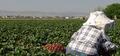
Strawberry Fields........Forever?by autoolComment: I see the greens, I see the red strawberries, but I also see a lot of other stuff that doesn't really enhance the picture. Perhaps a different position or getting closer could have changed things around and brought more focus on the point of the picture ? |
| Photographer found comment helpful. |
| 05/19/2003 07:36:53 PM |
The Birth of Envyby harveymorrisComment: funny title, good complimentary colours and interesting textures, particularly on the green object (melons ?) The red textures seem either over saturated or slightly out of focus which detracts - I'd like to see more texture in that part of the scene. |
| Photographer found comment helpful. |
| 05/19/2003 07:35:48 PM |
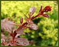
Rain dropsby pitsamanComment: good colours, and you've obviously thought about the background which compliments the leaves. |
| Photographer found comment helpful. |
| 05/19/2003 07:35:17 PM |
Window peepby RobroComment: nicely abstract and good strong colours and composition. Might suggest being even more agressive in the cropping and lose the glass, or even the white areas. |
| Photographer found comment helpful. |
| 05/19/2003 07:34:37 PM |
Less is Moreby danwanComment: good subject choice but a better background is really needed to help this out. Strong sunlight doesn't help the composition either as it has made this really contrasty. |
| Photographer found comment helpful. |
| 05/19/2003 07:34:00 PM |
|
| Photographer found comment helpful. |
| 05/19/2003 07:33:38 PM |
Her red silk scarfby jjbeguinComment: good composition, the scarf makes a good sweep down through the shot and the leaves give a lot of texture/ pattern to set it off. Nice work (7) |
| Photographer found comment helpful. |
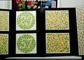
| 05/19/2003 07:33:01 PM |
Uh-Oh...by GeneralEComment: colour blindness charts - interesting take on the challenge! The clutter/ poster at the top doesn't add much to this. |
| Photographer found comment helpful. |
| 05/19/2003 07:32:25 PM |
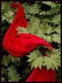
Floating Flameby TerryGeeComment: wish the shadow wasn't there in the background - would have preferred a more seamless blue. Good light, good colours, strong entry. |
| Photographer found comment helpful. |
Home -
Challenges -
Community -
League -
Photos -
Cameras -
Lenses -
Learn -
Help -
Terms of Use -
Privacy -
Top ^
DPChallenge, and website content and design, Copyright © 2001-2025 Challenging Technologies, LLC.
All digital photo copyrights belong to the photographers and may not be used without permission.
Current Server Time: 07/29/2025 11:05:27 PM EDT.