| Image |
Comment |
| 01/24/2005 10:54:23 PM |
Milk & Cookiesby EddyGComment: I think the technique is probably a lot cooler than the final image - impressive concept. |
| 12/26/2004 05:57:47 PM |
|
 Photographer found comment helpful. Photographer found comment helpful. |
| 12/13/2004 07:25:36 AM |
|
| Photographer found comment helpful. |
| 11/26/2004 10:14:23 AM |
Aussie spring. "November"by NodeComment: The rocks really dominate this composition. THe pier less so - in fact it is quite hard to tell what it is initially. The sky is quite featureless and flat and the light isn't the best either - feels like it was shot around mid-day - giving you the very harsh shadows and dark areas in the rocks and pier.
I think this location probably has some potential - on a day with some more interesting cloud forms and later or earlier in the day when the light is better. Around 1 hour before and after sunset and sunrise are great times to shoot landscape shots - the light is beautiful, the shadows aren't so harsh - depending which way this pier faces would help determine the best time though - you want some light on the side of the pier.
Composition Issues:
The horizon doesn't feel straight - this can be quite easily fixed using the skew transform in something like photoshop to tweak it to horizontal. It seems like a little thing but it can be quite distracting.
Horizon placement - it isn't quite along the top third, floating somewhere between there and splitting the middle of the frame - I think with the almost total lack of sky in this shot, I'd have placed it quite agressively high in the shot - maybe even only about 2% of the scene as blue sky, just by tilting the camera down - and probably getting myself to a higher position if possible.
Rock/ sand/ sea composition. The rocks merge with the sea and sand - particularly the two that poke 'up' A slightly higher viewpoint would have had the rocks surrounded by the sand, making them stand out more strongly as a main element in the composition (blue/grey against orange/yellow sand, rather than blue/grey rocks against the blue/grey sea)
Pier - it certainly can make for a strong leading line element - though I think you need to be slightly to the left and shooting more 'in' to the pier for that to work - here it forms a strong vertical line on the right that doesn't really lead off and then further out in the distance starts to lead in to the scene. |
| 11/24/2004 10:18:31 AM |
Read my mind!by NodeComment: Great initial impact - the dog, the eyes. The shallow DoF and fall-off to the background also add to this effect of being 'in your face' Very effective. However, the left side of the shot just doesn't work for me, with the square and pencil - they lead my eye out of the scene - particularly the bright yellow and reds in the pencil and the line shape they form pointing away from the subject and off the page to the left.
This can be helped a whole lot by cropping the shot square, around the dog. The right hand two thirds of the image are strong enough and with a centered crop the dog is the real focus of the shot.
Now following convention, you should use rule of thirds, right ? Well the reason is that if you have a subject bang in the center of the frame it takes all the attention, is very arresting, static and generally dominates the composition. In this case - that is what is happening anyway. If you compose it in a square frame by cropping the left third - you'll get an even stronger, more arresting scene. The elements in it build to that effect, the composition will enhance that and I think it'll be stronger all around.
After doing that, you are still left with the piece of wood jutting in from the left - which does still clutter it a bit, but I think this crop would make for a much stronger image - try it and see how you like it! Then maybe try and re-create this sort of image, with just the green grass background and without the other elements - try the off center and very centered/ square compositions with those as well and see which you prefer. |
| Photographer found comment helpful. |
| 11/23/2004 05:09:02 PM |
Remnants of the stormby NodeComment: Another shot with great initial impact. The colours and patterns are really strong and the leading lines give a lot of visual interest. Only issues I have are the high contrast, out of focus areas in the upper left and lower right, that draw my eyes. The yellow line leads off to the background, walking me through the image, but I get lost in the rear 'V' shape without really anywhere to go. This is a subject with a lot of potential.
The soft foreground and background, with only the midground in sharp focus confuses my eye a little too - I start in the out of focus region, move through the sharpness and back to out of focus again - I think I'd prefer it if it was sharp at one end or the other and lead off to either sharpness or an out of focus area. This would probably require manual focus setting on your camera, rather than using one of the AF points. You could focus and recompose but that often isn't the best way to achieve something like that. For this - I'd probably try and have the very tip of the yellow line in sharpest focus.
Also worth checking the edges again - particularly for the lighter red/ orange regions creeping in at the bottom - They could probably have been cropped out in this case. |
| Photographer found comment helpful. |
| 11/23/2004 05:04:33 PM |
Soup kitchen volunteersby NodeComment: Initial impact: I like how you've abstracted this to the hands giving and getting only. Good repeating patterns in the hands and soup pans too, as well as the trays give a strong graphic element to this image.
The background might have been managed better, somehow removing or reducing the impact of the red chairs - if possible a more 'overhead' view would have assisted with this. The lighting seems a bit rough and ready - on camera flash ? It has left you with some quite harsh blown areas on the foreground sandwich and the shadows in the background.
In general, I think good seeing and a bit of work on the lighting and more attention to the background would make this a really strong image. |
| Photographer found comment helpful. |
| 11/22/2004 08:22:19 AM |
|
| Photographer found comment helpful. |
| 10/29/2004 01:29:06 AM |
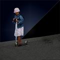
Girl with Scooterby zeuszenComment: nice composite - very effective composition you've used to put it back together - works well! |
| Photographer found comment helpful. |
| 10/20/2004 11:45:23 AM |
|
| Photographer found comment helpful. |
Home -
Challenges -
Community -
League -
Photos -
Cameras -
Lenses -
Learn -
Help -
Terms of Use -
Privacy -
Top ^
DPChallenge, and website content and design, Copyright © 2001-2025 Challenging Technologies, LLC.
All digital photo copyrights belong to the photographers and may not be used without permission.
Current Server Time: 07/22/2025 01:50:47 PM EDT.