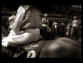
DPChallenge: A Digital Photography Contest You are not logged in. (log in or register
 
Browse Settings
Currently viewing:
Registered UserGordon

Show comments:

Per page:

Order:

Comments:


Comments Made by Gordon
Pages:   ... ... [231]
Showing 361 - 370 of ~2309
Image Comment
Papa Mountain and Son
11/07/2006 11:40:30 PM
Papa Mountain and Son
by vtruan

Comment:
wrong challenge ? Deep rumination on the nature of portraits and our interaction with the environment ? Anthropomorphizing a huge pile of rock ?
Photographer found comment helpful.
The Paso Man
11/07/2006 11:39:38 PM
The Paso Man
by Ristyz

Comment:
You've got some great light for this shot. Soft, no harsh shadows, even from the hat. He does get a bit lost against the tree though, because of the similar tones of the hat and tree. I keep wanting to cover up the yellow wall on the left as it drags my eye away from the focus.
Photographer found comment helpful.
Bewildered
11/07/2006 11:38:19 PM
Bewildered
by basicentry

Comment:
Great colour and expression. The direct, front light (on camera flash ?) seems a bit harsh and doesn't give a lot of shape to the features. background doesn't really distract but doesn't really enhance the shot either - some sort of contrasting or complementary colour with the pink would really be great.
Photographer found comment helpful.
Tempest
11/06/2006 10:31:22 AM
Tempest1st Place
by slide12345678

Comment:
Beautiful light. Love how it is raking through the spray.
Photographer found comment helpful.
The Horse and The Rider: Darren Gauci
10/22/2006 02:09:41 PM
The Horse and The Rider: Darren Gauci
by hotpasta

Comment:
Critique Club

Listening to: The Everyothers - Too Far

The first thing I notice is the quality of the light. Strong, directional light from the left of the frame, raking across the subjects, creating depth and shape. The next thing I see is the quality of the jockey's top, the silky feel that the light and highlights give it. The bright, white region of the leg draws my eye, then I flow through the scene, to the jarring lack of head.

I like the fact that both the horse and rider have had their head's cropped, hitting the challenge theme, twice. Taking it by the neck as it were. Overall, the shot has great flow, across the horse, the rider, along the legs, horses neck, and so on, then through into the out of focus background, with the riders, grounding the shot and giving it a real sense of the place. I think those background elements really help the shot and give it a lot more context.

Seeing the Flemington name on the horse also helps locate it well. Overall very successful at giving a great insight into the jockey, without having his face in the frame at all. Great stuff. The B&W processing works well too, detail where it's needed, blown out and good blacks where required too. Very enjoyable.

The only thing that I take issue with a bit is the selective blurring, particularly around the horse - it seems quite obvious but not consistent - e.g., the horse's haunches are sharp, but blur down the back - but not in a way that would make sense for a lens - least it looks wrong to my eye. Same with the horse's mane it goes from sharp to blurred, without a justifiable transition - same with the jockey's knee. In short, I think that could maybe have been handled more subtly.
I like the blur towards the top of the frame though - so maybe just a bit more care ?

Overall, I really enjoyed this shot - there's plenty of interesting things going on but they've been handled well. There's a great left to right then right to left flow through the scene, out towards the horses. Thanks for entering it!
Photographer found comment helpful.
Colores de la Fantasía
03/31/2006 08:34:49 AM
Colores de la Fantasía
by yanko

Comment:
Nice - I like the colour contrast you added to this with the red brush
Photographer found comment helpful.
Appealing Light
03/08/2006 09:10:55 AM
Appealing Light1st Place
by hokie

Comment:
Nicely done - the light enhances and compliments the theme very attractively.
Painting With Red Light
02/03/2006 12:08:01 AM
Painting With Red Light
by DrJOnes

Comment:
Cool - I'm flattered ;)
Fantasia
02/02/2006 11:48:58 PM
Fantasia1st Place
by Gordon

Comment:
Originally posted by reevey:

Originally posted by Gordon:

Originally posted by lhall:

Even after all this time, it's hard for me NOT to come back to this to look at it. So simple yet so very compelling to me - the movement of the image combined with the gaussian blur make it a continuing favorite of mine.


Thanks - but there wasn't any gaussian blur used in this shot.


But you said there was: "...Bit of selective gaussian blur..."


A true enough, but it was only on the small 1 cm diameter spot immediately above the bristles - probably not where you think it is.
pizzazz
01/17/2006 10:17:25 AM
pizzazz3rd Place
by ursula

Comment:
Great use of complimentary colours. Really pretty result.
Photographer found comment helpful.
Pages:   ... ... [231]
Showing 361 - 370 of ~2309


Home - Challenges - Community - League - Photos - Cameras - Lenses - Learn - Help - Terms of Use - Privacy - Top ^
DPChallenge, and website content and design, Copyright © 2001-2025 Challenging Technologies, LLC.
All digital photo copyrights belong to the photographers and may not be used without permission.
Current Server Time: 07/21/2025 08:25:14 AM EDT.