| Image |
Comment |
| 11/07/2006 11:51:06 PM |
Mikeby rdesaiComment: Good portrait but the background really doesn't add. You could have backed him up to the side of the skip and used that as a more consistent pattern for example. Light is good for this sort of shot. Having him even out his glasses would help with the strength/ distortions they introduce. |
| 11/07/2006 11:49:21 PM |
Serious Snowstormby smellyfish1002Comment: Good colour, with the hat contrasting against the white snow. The red cheeks/ skin adds to that. Seems a bit underexposed, with the greyish snow. Fine light for portraiture but a bit flat - some sort of reflector would help to give a bit of direction to the light and create a bit more modeling on his face. |
| 11/07/2006 11:48:15 PM |
The Pumpkin Fightby th3ph17Comment: Fun, colourful, good expressions. Light is really harsh though and the cropping is very awkward. Somehow has a real 80s feel to it. |
 Photographer found comment helpful. Photographer found comment helpful. |
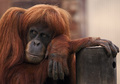
| 11/07/2006 11:47:30 PM |
Every Which Wayby FalcComment: Beautiful light, great timing, big fur ball. Good colour, even some catchlight in his(?) eyes. Fantastic portrait, though gives a depressing view of zoo life. |
| Photographer found comment helpful. |
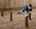
| 11/07/2006 11:46:48 PM |
Leapfrogby WildcardComment: Great action. Wonderful expression. Really clean composition with the three posts and a very clean, uncluttered background with the fence and grass.
Post processing seems a bit over the top, particularly with the way sharpening has been applied and the obvious halo'ing around features in the image (e.g., his left shoulder/t-shirt. This lets down what would be a great image. |
| Photographer found comment helpful. |
| 11/07/2006 11:45:31 PM |
Hoopsby MakkaComment: Good simple light, though it feels a bit hot on her face, She doesn't seem to be very engaged with the photographer. The multiple catchlights are a bit distracting, particularly from the square softbox/ light source. |
| Photographer found comment helpful. |
| 11/07/2006 11:44:24 PM |
In a good moodby smykComment: A good expression but the light is very flat/ low. Doesn't really evoke a particular mood like a real low key shot, or low light - it just feels badly lit/ exposed. Lot of potential. |
| Photographer found comment helpful. |
| 11/07/2006 11:43:36 PM |
Fragileby RedOakComment: Great contact with the viewer and you've picked up good catchlights in her eyes.
Overall, it feels like its trying to be low key, but somehow comes across as a bit muddy, or lacking in contrast where it really matters. The hair to her nose is a bit compositionally distracting, the way it merges. |
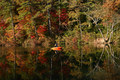
| 11/07/2006 11:42:17 PM |
Drift Awayby neenee1999Comment: Seems more like a person in a landscape, than a landscape orientation portrait. Lovely location though and the kayak is a great compliment to those colours. Very centered and far away though. |
| Photographer found comment helpful. |
| 11/07/2006 11:41:30 PM |
Pendant portraitby virtuamikeComment: Really good light and a fairly classic profile, though there is a bit of her rear eye showing. The colouring all works well together, though I find the necklace and sticks together sort of competing for attention. |
| Photographer found comment helpful. |
Home -
Challenges -
Community -
League -
Photos -
Cameras -
Lenses -
Learn -
Help -
Terms of Use -
Privacy -
Top ^
DPChallenge, and website content and design, Copyright © 2001-2025 Challenging Technologies, LLC.
All digital photo copyrights belong to the photographers and may not be used without permission.
Current Server Time: 07/21/2025 08:25:07 AM EDT.