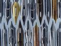
DPChallenge: A Digital Photography Contest You are not logged in. (log in or register
 
Browse Settings
Currently viewing:
Registered UserGordon

Show comments:

Per page:

Order:

Comments:


Comments Made by Gordon
Pages:   ... [134] [135] [136] [137] [138] [139] [140] ... [231]
Showing 1361 - 1370 of ~2309
Image Comment
What's the point?
11/11/2002 07:33:00 AM
What's the point?
by goodtempo

Comment:
great negative spaces! Very graphic, like it a lot - why did you pick grey for the background colour ?
Photographer found comment helpful.
Elizabeth
11/11/2002 03:29:00 PM
Elizabeth
by titotapado

Comment:
too close! for good people close-ups you want to use the telephoto end, not the wideangle side of things - less feature distortion
High Strung
11/11/2002 07:36:00 AM
High Strung
by briansquared

Comment:
love the shallow field - grey background is dissapointing
A macro ghost
11/11/2002 07:26:00 AM
A macro ghost
by angel

Comment:
the longer I look, the more ghost I see !
Vertigo
11/11/2002 07:18:00 AM
Vertigo
by rdesai

Comment:
nicely composed, draws the eye in. Lighting might have been better more even, or harsher - one extreme or the other.
Luscious
11/11/2002 03:25:00 PM
Luscious
by Alecia

Comment:
Very saturated colours - makes me want to eat it! I think I'd like to have seen the whole shadow and perhaps a whiter/ less grey background. Very crisp macro
90 degrees latitude
11/15/2002 02:45:00 PM
90 degrees latitude
by zadore

Comment:
good background choice, great selective depth of field, well composed in the frame
Photographer found comment helpful.
Early Christmas Cactus
11/11/2002 07:34:00 AM
Early Christmas Cactus
by NHCameraMan

Comment:
well taken macro, though the background lets this down - too grey/dark
PALATABLE COLOURS
11/26/2002 12:00:00 PM
PALATABLE COLOURS
by Ptman

Comment:
The new Critique Club: Test Critiques #1

Initial impression : A wonderful riot of colours that 'sets the scene' of a painting palette very well.

Technically the diagonal placement of the brushes gives some movement to the picture, though
the slightly soft/ out of focus brush in the lower left is a bit annoying. The brown brush ends up
as the center of interest and my eyes keep coming back there and working through the implied
triangle between that and the other brush. Again the softness gets in the way.

I think I might have preferred this with some paint on the brushes as it feels too setup - there is a
difference between a setup shot that looks setup and a setup shot that doesn't!

You might have been able to tweak the contrast/ saturation of this shot a bit and made the colours
even more vibrant but they are strong as they are and that could be the vagaries of monitors
making an impact.

Overall a very strong entry and a good close-up. Certainly trying to keep more elements in the plane
parallel to the lens might have kept more of the shot in sharper focus, as there doesn't seem to be
much motivation for more selective DoF control in this particular instance.

Gordon - feel free to disagree or contact me to continue a discussion
Photographer found comment helpful.
Reading
11/15/2002 07:14:00 AM
Reading
by hardwaybets

Comment:
Great way of highlighting with focus. Nicely done.
Pages:   ... [134] [135] [136] [137] [138] [139] [140] ... [231]
Showing 1361 - 1370 of ~2309


Home - Challenges - Community - League - Photos - Cameras - Lenses - Learn - Help - Terms of Use - Privacy - Top ^
DPChallenge, and website content and design, Copyright © 2001-2025 Challenging Technologies, LLC.
All digital photo copyrights belong to the photographers and may not be used without permission.
Current Server Time: 07/29/2025 08:46:43 PM EDT.