| Image |
Comment |
| 04/30/2007 11:43:51 PM |
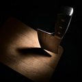
cleaver by alreadythereComment: Originally posted by David Ey:
This is a great photo and well deserving of a blue. However, to me it is a rather unusual angle of the knife.....I'da had it tilted the other way ie: the handle tilted to the left. and rotated 180. |
really funny you should say that. i took about 30 shots, 29 of which were pretty much what you describe. they were from the opposite angle, light and camera focused on these chinese characters etched on the blade. this shot i took at random, as one of the first shots i took, and then paid it no mind for the rest of the time i was shooting.
it ended up that i didn't like any of those 29 as much as this one. it's weird, my mental picture was totally backwards from what i ended up with.
thanks for the comments! --dr |
| 04/30/2007 01:07:01 PM |
cleaverby alreadythereComment: Originally posted by kevrobertson:
Ok, well done, you can leave now. |
hehe, i have to admit i kind of feel that way. i feel very weird about having won on my first try. i'm certain i've jinxed any further attempts...
Originally posted by kevrobertson:
Only joking, An excellent image. Simple btu very effective.
I must try out your edditing steps.
Keep up the good work. |
thanks very much! yeah, that kind of editing technique i really favor often. i find that for a lot of my images, i need them to look good in b&w before i'm satisfied with how they look in color. and lab is such a weird and wonderful colorspace to work in.
cheers,
dr |
| 04/29/2007 10:53:35 PM |
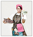
Go Ahead, Make My Cake!by JeniYComment: i think high-key doesn't really suit the subject, and the mixer is kind of anachronistic... i dig the cross-processed film look, though. very 50's. |
 Photographer found comment helpful. Photographer found comment helpful. |
| 04/29/2007 10:19:18 PM |
|
| 04/29/2007 10:18:31 PM |
Sieveby aznymComment: i like the abstract minimalism here... the blur and the b&w really works. there's also something i really like about the composition. |
| Photographer found comment helpful. |
| 04/29/2007 10:16:58 PM |
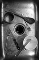
Bad Companyby karmatComment: cool texture and color, but i can't really tell what i'm looking at. also, the light area in the top left seems out of place, compared to the black background in other areas of the photo. |
| Photographer found comment helpful. |
| 04/23/2007 08:20:10 PM |
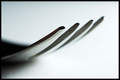
Utensilby darnokComment: nice clean, simple pic. good composition, shape and depth of field. the color is subtle too. |
| Photographer found comment helpful. |
| 04/23/2007 12:26:43 PM |
Mack The Knifeby Dr.ConfuserComment: cool subject -- i've seen these before -- but i think it would have more impact if it were just one or two knives, and against a totally black background. as shot, i think it's too mundane. |
| Photographer found comment helpful. |
| 04/23/2007 12:24:43 PM |
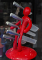
|
| Photographer found comment helpful. |
| 04/23/2007 12:23:45 PM |
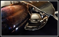
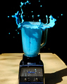
BlueBerryBlenderby ralphComment: wow! very dynamic feel, and amazing color. i wish the perspective were a bit different, though. the shadow cast by the blender, the cut-off base, and the tabletop all spoil the surreal, otherworldly feel for me. |
Home -
Challenges -
Community -
League -
Photos -
Cameras -
Lenses -
Learn -
Help -
Terms of Use -
Privacy -
Top ^
DPChallenge, and website content and design, Copyright © 2001-2026 Challenging Technologies, LLC.
All digital photo copyrights belong to the photographers and may not be used without permission.
Current Server Time: 06/29/2026 02:16:19 PM EDT.