| Image |
Comment |
| 01/09/2007 11:45:29 PM |
|
 Photographer found comment helpful. Photographer found comment helpful. |
| 01/09/2007 11:44:34 PM |
East Perthby MrDarcyComment: The mixture of different light colors gives it a nice feel. |
| 01/09/2007 11:38:40 PM |
|
| Photographer found comment helpful. |
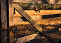
| 01/09/2007 11:35:09 PM |
river front viewby aplomb76Comment: GREAT use of contrasting subjects. It kind of reminds of John Pfahl's "Power Places" series. The selective desaturation also works well.
The one thing I'd like to see is less on the left, so that the smoke, or other point of interest, is more at 1/3 of the frame. Nice. 8 |
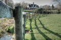
| 01/09/2007 11:31:47 PM |
A fence to follow...by Ian-AndrewComment: The fence serves as a nice leading line through the photo. There seems to be a funny black cloud around your trees, not sure if that was from post processing or not. Also, it might look nicer with all of the sky on top cropped off. But a very nice photo. the colors work well together. 7 |
| Photographer found comment helpful. |
| 01/09/2007 11:30:01 PM |
Tropical Waveby scarbrdComment: WOW! What a fence! nice color, and that little branch coming through adds some interest. |
| Photographer found comment helpful. |
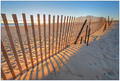
| 01/09/2007 11:29:16 PM |
Dune Fence, Daybreakby Bear_MusicComment: Wonderful lighting to bring out the texture and the nice warm color. You somehow avoided camera flare! Good job! |
| Photographer found comment helpful. |
| 01/09/2007 11:28:03 PM |
Fence of @rtsby Wilson LowComment: Simple and very nice. Elegant. I really like how you included the curve of the bar at the bottom to add some depth. Nice use of negative space. This reminds me of how simple things can be so awesome...9 |
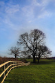
| 01/09/2007 11:25:35 PM |
Protectionby ArtifactsComment: The color in this one is really nice. Nice composition, and a cool take on the challenge. One thing that might make the post stand out even more is if the background was a bit less saturated. |
| Photographer found comment helpful. |
| 01/09/2007 11:24:22 PM |
Heaven's Gateby mkenneyComment: Nice silhouette and the star from the sun is nice as well. The one improvement I could see is getting the sun more at 1/3 of the frame to make the composition more dynamic. |
| Photographer found comment helpful. |
Home -
Challenges -
Community -
League -
Photos -
Cameras -
Lenses -
Learn -
Help -
Terms of Use -
Privacy -
Top ^
DPChallenge, and website content and design, Copyright © 2001-2025 Challenging Technologies, LLC.
All digital photo copyrights belong to the photographers and may not be used without permission.
Current Server Time: 08/05/2025 08:44:47 PM EDT.