| Image |
Comment |
| 04/12/2003 11:26:52 AM |
Symmetry lifeby zerocusaComment: Greets from the Critique Club!
I like this image a lot, mainly because it is a different idea. The colours are nice and vivid, espcially for being shot through bubble wrap!
The symmetry isn't immediately obvious, which could be one of the causes of the low score. One of the ways to improve this would be to crop out more of the left side, though I don't think it really needs it.
Good job, I really think this should have placed higher.
-Matt |
 Photographer found comment helpful. Photographer found comment helpful. |
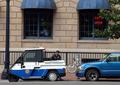
| 04/09/2003 08:28:02 PM |
Forty Five Miles Per Hourby lennierComment: If it hadn't been for the nasty glare on the sign this would have ranked higher in my book. Actually, I think you could have dropped the sign all together out of the photo and I would have ranked it high. I love the greens and that lonely tree. |
| Photographer found comment helpful. |
| 04/09/2003 08:19:38 PM |
Urban Rainbowby jgal76Comment: ehh.. ROYGBIV
Missing a couple colours there for it to be a rainbow.. and they aren't even the right order. Nice compositon, but it seems like the focus is just a tad bit off. Good pic none the less. |
| Photographer found comment helpful. |
| 04/09/2003 04:59:53 PM |
Flying Tigerby pncowleyComment: Oh wow. This stirs emotions with me as my grandpa flew for the Flying Tigers in China. Good shot, but it seems to be a bit over compressed. |
| Photographer found comment helpful. |
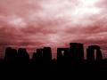
| 04/08/2003 04:28:21 AM |
Stonehengeby KonadorComment: Wow.. I really really like this shot. The red tone gives an otherworldly feel to it. The connection to Pi is rather tenuous. Still 7. |
| Photographer found comment helpful. |
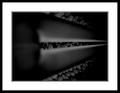
| 04/08/2003 04:15:18 AM |
Dark Lightby moonoComment: OeBi..
"In PS I removed dust & scratches and I lifted the contrast"
You do realize that removing dust and scratches violates the rules of the challenges? Unless you're using some techinque that affects the entire picture, that's considered spot editing. I appologize in advance if you removed them by some other means.
-Matt |
| 04/06/2003 04:20:29 PM |
Time's Upby ruthiekComment: Greets from the Critique Club!
Initial Impression:
Interesting idea, too much going on.
Challenge:
I really like the idea you had here, it's a very different interpretation of time than one would think of but still very reconizable. Good Job!
Compostion:
This is where you would lose the most points from me, I feel it's too jumbled and there's not enough focus on the action. Cropping either right below the cafe windows or right below the "Cafe Open" sign would have made this a better shot, in my opinion. It would allow the viewer to really get a feel for the situation without any of the other distractions.
Technical:
Good. Lighting is good, focus is good. Nothing really to fault in this area.
Overall:
Good action shot that meets the challenge creatively. A tighter crop would create more balance and a more focused composition.
Good Job and keep up the improvement!
-Matt |
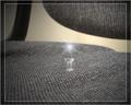
| 04/04/2003 03:05:44 PM |
Take Your Seat by TarbiniComment: The pic is okay. The nice bit is the lens flare on the tack. Reminds me of a WB cartoon. :) |
| 04/04/2003 03:03:34 PM |
|
| Photographer found comment helpful. |
| 04/04/2003 03:00:54 PM |
|
| Photographer found comment helpful. |
Home -
Challenges -
Community -
League -
Photos -
Cameras -
Lenses -
Learn -
Help -
Terms of Use -
Privacy -
Top ^
DPChallenge, and website content and design, Copyright © 2001-2025 Challenging Technologies, LLC.
All digital photo copyrights belong to the photographers and may not be used without permission.
Current Server Time: 08/05/2025 01:44:01 AM EDT.