| Image |
Comment |
| 05/07/2003 05:41:47 PM |
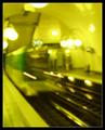
A Simple Way To Go Faster Than Light That Does Not Workby greenem2Comment: I initially thought this photo was just another blurry shot. After sitting and pondering it a while, I realized it was the work of an experienced photographer that knew what they were doing.
How? The bluriness is all very controlled. It's not just random motion blur, but more like slow deliberate blur. It got a 7 from me. Good job! Keep posting what you like - 'cause I like it too! |
 Photographer found comment helpful. Photographer found comment helpful. |
| 05/07/2003 01:30:17 AM |
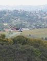
Beemby mbardeenComment: It was interesting seeing the reaction to the colours in this photo. I wonder how many people thought they were done in post-processing and gave me a lower score because of it?
Would the picture have scored higher if they knew this is what the original looked like? Not much difference. The blue and magenta have been brought out more, but that's it. |
| 05/06/2003 07:42:48 PM |
|
| Photographer found comment helpful. |
| 05/06/2003 04:21:21 AM |
Not Your Everyday Carby frd91gtComment: a v16? How odd. What kind of car is this? Ohh I see now. Very very clever. I love the colors but I think the composition is a bit cluttered. Not sure how you could have made it better tho... 8 |
| Photographer found comment helpful. |
| 05/05/2003 12:07:12 AM |
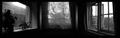
Dreams of a Bay Windowby mbardeenComment: Hmm.. Not as good as I had hoped. The trick to this shot is that it's taken in 3 completely separate rooms. Just careful observation of layout and persepective.
It was inspired by this photo by DeCarava.
Thanks for the great comments guys! |
| 05/04/2003 07:03:55 AM |
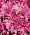
Pink...by WILDBLUEComment: Greets from the Critque Club!
This photo has a lot of potential.. I enjoy the textures and the colours you have captured here, only I wish for something to rest my eyes on.. Just a hint of color somewhere else in the frame would have done it for me, but like this it's just too busy. Apart from that I don't have too much else to say, the focus is spot on and nothing looks over processed.I love the lighting you've found and the shades of pink you've captured!
Keep up the good work!
-Matt |
| Photographer found comment helpful. |
| 05/03/2003 07:30:32 PM |
California Goldby autoolComment: Greets from the Critique Club:
Hi autool!
First off, let me say that I admire the effort you went through to get this picture - I love photographers that are willing to go that far to get a shot! However, this shot just doesn't do it for me. The idea and the intent is there, but the execution leaves some to be desired. I think the crop is extremely harsh in this picture and I would gladly have traded a few wind generators for more scenery. The way you've framed the flower with the other plants takes away from the flower itself. My eye tends to follow those up, but it's uncomfortable because they're so close to the edges, thus it makes the whole picture feel constrained to me. I wish the background was a bit fuzzier too, but that's just me...
Everything else is spot on. I love the colors you've captured here and the focus on the poppy is wonderful.
-Matt |
| Photographer found comment helpful. |
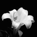
| 05/03/2003 04:58:08 PM |
Lily of the nightby RefractedComment: Greets from the Critique Club:
Sorry Refracted.. not sure exactly what to say about this shot! I think it's simply stunning. The lighting is a bit harsh in places but I don't think it detracts at all - more like enhances the petels and makes them look silky. I absolutely love the composition. Great great stuff.
Good job and I can't wait to see your entries with the F717!
-Matt |
| Photographer found comment helpful. |
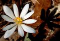
| 05/03/2003 03:08:19 PM |
Bloodroot and Shadowby drdab99Comment: Greets from the Critique Club!
I really like this image, it's nice and simple. The exposure is great and the focus is superb. The only thing that I can really nitpick on is the composition. For some reason I feel like I want to see more on the right hand side of the frame. Maybe the whole of the shadow?
The colors are wonderful though the leaf at the bottom is just a tad distracting. Overall, this is a really good photo that deserved the high score it got. Congratulations!
-Matt |
| 05/03/2003 02:56:10 PM |
Still Aliveby mikemtiComment: Greets from the Critique Club!
Hi Mike,
This subject could have been much better presented, in my opinion. The lighting is great and really shows off the details in the flowers, however that gets lost in all the stuff going on around the flowers. The surrounding branches get lost in the table, the table pulls the viewer away from the flowers, and the green just adds confusion.
DrJones, who critiqued one of my worst shots, gave me some really good advice - the simpler the subject, the more tempting it is to overload it with surrounding details. Keep it simple. Rather than laying the flowers out on the table, lay them out on a piece of cloth. Get in real close to them so the viewer can see the detail.
Just one or two changes and this would have an outstanding picture, as it is now it's consigned to snapshot status.
Good luck in the next challenge!
-Matt |
Home -
Challenges -
Community -
League -
Photos -
Cameras -
Lenses -
Learn -
Help -
Terms of Use -
Privacy -
Top ^
DPChallenge, and website content and design, Copyright © 2001-2025 Challenging Technologies, LLC.
All digital photo copyrights belong to the photographers and may not be used without permission.
Current Server Time: 08/05/2025 03:56:03 PM EDT.