| Image |
Comment |
| 06/29/2003 08:39:04 AM |
Italian bathroomby GalinaComment: Greets from the Critque Club
Hiya Galina!
This is a lovely portrait. The tones are very well done and I love the form and framing. I really can't find anything I would fault on this photo. Everything in it just works for me!
I suppose that if I was to fault anything, it would be the cloth on the model's body. She has such nice toning compared with the backdrop, I think I would have liked to see that carried down to the bottom of the photo.
Good job!
-Matt |
| 06/28/2003 07:01:31 AM |
Trampoline!by magnusComment: Greets from the Critique Club
Hi Magnus,
This is nice example of stopped motion and it meets the challenge well, but it's not an exciting photo. The house in the background is distracting, I would have perferred to see a tighter crop with no house.
All in all, a nice photo but not a great one.
-Matt
|
 Photographer found comment helpful. Photographer found comment helpful. |
| 06/27/2003 07:27:23 PM |
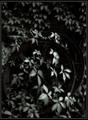
Virginia Creeperby indigo997Comment: There's a reason you're tops in my statistically favorite photographer list and this is it. I gave this a pure and unreserved 10 - you make the ivy look dangerous and alive. Good job. |
| Photographer found comment helpful. |
| 06/25/2003 06:39:10 PM |
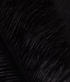
Black Featherby AnnidaComment: I love this. Brilliant! 1.
ok. I'm just kidding. this is definitely a 10. It looks like it's a drawing, a really black sketch. Almost out of a cartoon. I love the textures. It's all good! |
| Photographer found comment helpful. |
| 06/23/2003 03:16:01 AM |
There is no Spoonby mbardeenComment: For those that didn't get the title - it's a reference to The Matrix. It is a hint that reality (in the movie) is not quite what it seems.
The overexposure and harshness were deliberate, I wanted the reflection to look real and everything else to look dreamlike and unsubstantial. In my mind this picture is off-center in a conventional way as well as in a metaphorical way.
Thanks for the comments!
-Matt Message edited by author 2003-06-23 03:16:17. |
| 06/20/2003 05:04:52 PM |
Hand on my heartby KaveyComment: Oooo. Nice breast! Seriously, I really like the toning and graininess in this shot, it has a *real* feel to it, and I think that's what you were aiming for. Good job! |
| Photographer found comment helpful. |
| 06/20/2003 07:00:19 AM |
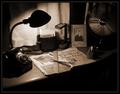
Planning and Calculatingby cmrk74Comment: Greets from the Critique Club:
Hi Mark,
This is an appealing image, I like the colours you've used in the duotone process and it really puts me in the blueprint mood. The composition of this shot is good, but not excellent. I do like all the angles yet it still comes out feeling bit busy. Perhaps a simpler setup would have worked better? The glare doesn't bother me very much - I actually quite like the effect, but that's just me.
Hope this is helpful! Good job and good luck in future challenges.
-Matt |
| 06/16/2003 03:33:25 PM |
one for the scrapbook by indigo997Comment: Good job Indi! This reminded me of one of my grandfather's photos and it got a very good score from me. Thanks for bringing up that memory!
-Matt |
| Photographer found comment helpful. |
| 06/10/2003 08:00:57 PM |
Sevenby Dim7Comment: Greets from the Critique Club:
Hi Neil,
My intial impression of this shot is one of visual confusion. To properly expose the house, you've overexposed the flowers and the grass in the foreground. The house feels cramped in the frame, and there's very little place for the eye to wander to expect the top left hand corner. What I like about the photo is the angle you captured your house from. Not many people would think to shoot from this angle. I also like the hints of the purples in the flower bed. If the front area was just a bit darker, I think this would have scored better.
Hope this helps! Good luck in future challenges!
-Matt |
| 06/10/2003 07:56:18 AM |
RioSamba rose.jpgby Crafty SueComment: Hi Sue
This is a very nice shot! I like the yellow of the rose contrasted with the green of the leaves. Also, the composition is very nice, having the diagonal of the plant stem to the right and the circle of the rose to the left creates loads of interest.
Good job!!
-Matt |
| Photographer found comment helpful. |
Home -
Challenges -
Community -
League -
Photos -
Cameras -
Lenses -
Learn -
Help -
Terms of Use -
Privacy -
Top ^
DPChallenge, and website content and design, Copyright © 2001-2025 Challenging Technologies, LLC.
All digital photo copyrights belong to the photographers and may not be used without permission.
Current Server Time: 08/02/2025 08:40:15 PM EDT.