| Image |
Comment |
| 07/16/2003 05:51:28 PM |
Maestroby albright1Comment: Hmmm.. this looks familiar. I think I know who the subject (and thus the photographer) is. I really like the light down the right side of his torso, but I would have liked to see a bit more lighting to highlight the shape of his back. |
 Photographer found comment helpful. Photographer found comment helpful. |
| 07/16/2003 08:36:36 AM |
.:: in my dreams ::.by magnetic9999Comment: The lighting here is choice. The soft tones of her skin and the subtle greys, blues, and whites go together nicely. Composition is excellent, I love that you have her in such a straight line on the diagonal. Almost like she's seperating the dark from the light. Brilliant! |
| Photographer found comment helpful. |
| 07/12/2003 12:40:24 PM |
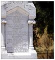
Calamity In 1881by TarbiniComment: This is just good. It nails the challenge topic but isn't an easy photo to 'get'. If you take the time to look, the realization of how bad this must have been hits you. What happened to this family? Was it disease? What about the parents?
Good shot. 10. |
| Photographer found comment helpful. |
| 07/12/2003 12:35:30 PM |
|
| Photographer found comment helpful. |
| 07/12/2003 12:31:58 PM |
|
| Photographer found comment helpful. |
| 07/10/2003 07:44:48 PM |
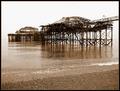
How?by marboComment: Letsee.. My guess would be two big storms, high tide, and two fires. Does that cover it? *grin*
Good shot. Like the sepia toning. |
| Photographer found comment helpful. |
| 07/10/2003 08:25:28 AM |
|
| 07/10/2003 08:19:45 AM |
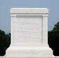
Tomb of the Unknown Soldierby ChiquiComment: This is a really hard shot to get..bright subject, darkish background. I would have perferred to see the tomb properly exposed and the background underexposed. As for meeting the challenge - it does. |
| 06/29/2003 09:03:42 AM |
Rock and Roll Hall of Fameby STEINRComment: Greets from the Critique Club!
Hi Steinr,
This is a wonderful architectural photo and it caught my eye during the voting, however I was one of those that wasn't quite happy with how off center it was. While it is off-center, it doesn't feel off-conter, and I think that was a major part of this challenge. I think this would have fared much better if the left side was cropped close to the building. To me, this feels more center, even though it's more centered technically. Hmm.. I hope this is making some sense. Anyway, everything else on the shot works, I like the little patch of green on the right and the blueness of the sky. There are some parts of the photo that are a bit too over-exposed for me, but it's not enough to detract majorly from the shot.
Hope this helps and good luck in future challenges!
-Matt |
| Photographer found comment helpful. |
| 06/29/2003 08:51:36 AM |
Ladybird trekby hawkidaComment: Greets from the Critique Club:
Hi Max,
I like this shot for the texture of your t-shirt. The play of the light makes this shot interesting. I would have liked to see better focus on the ladybird (bloody amerocentric voters) and perhaps, the ladybird pointed up into the picture. I think this would have given more impact to your title.
Good job and good luck in future challenges!
-Matt |
Home -
Challenges -
Community -
League -
Photos -
Cameras -
Lenses -
Learn -
Help -
Terms of Use -
Privacy -
Top ^
DPChallenge, and website content and design, Copyright © 2001-2025 Challenging Technologies, LLC.
All digital photo copyrights belong to the photographers and may not be used without permission.
Current Server Time: 08/03/2025 03:30:39 PM EDT.