| Image |
Comment |
| 04/09/2008 08:19:42 PM |
Dressing up the Earby XMountaineerComment: I learned my lesson before. The idea is awesome, just have to be careful with the saturation of the color. Too much makes it look like it was edited in afterwards. Calm it down a little and it would fit in a little more. But its always up to the photographer. I do the same stuff and enjoy it. |
 Photographer found comment helpful. Photographer found comment helpful. |
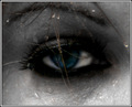
| 04/09/2008 08:17:15 PM |
Eye Seeby dawngrrlComment: Maybe just saturate the color in the eye a little more to make it pop a little more. But I do like the hair and the water and the rest of the composition. |
| 04/09/2008 08:14:31 PM |
|
| Photographer found comment helpful. |
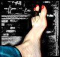
| 04/09/2008 08:13:07 PM |
Foot Note: Artby classycamComment: I lose the idea with the background. I look too much trying to figure out what the art is, and the 'polish' on the nails just doesn't work with the rest of the foot. Too much detail in the foot and the flatness of the polish just contradicts each other. |
| 04/09/2008 08:10:28 PM |
Loveby epescalaComment: I love it. Just the right amount of contrast in my eyes. I like the focus on the toes and not the tattoo, but enough of the tattoo that I'm not just stuck on the toes. I want a copy. |
| Photographer found comment helpful. |
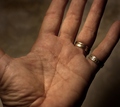
| 04/09/2008 08:08:17 PM |
Read My Palmby MaryOComment: I like the lighting and the detail. I would have put a little more of an angle on the hand in some way. |
| Photographer found comment helpful. |
| 04/09/2008 08:06:11 PM |
Noseby keibo84Comment: I think I get the idea you were going for, but personally I would have defined it just a little bit more so it didn't take me quite as long to figure it out. I do like the idea though. |
| Photographer found comment helpful. |
| 04/09/2008 08:01:24 PM |
Oops... Wrong Toothby artvetComment: Very interesting perspective on the challenge. Love the idea and the detail. Maybe would have lightened the pliers a little? Not too sure, just seems a little off in that area. |
| Photographer found comment helpful. |
| 04/09/2008 07:59:09 PM |
|
| Photographer found comment helpful. |
| 03/28/2008 11:39:50 PM |
You make me shineby mflakkeComment: Great photo and idea, however, I am a little distracted by the creases in the backdrop. I also noticed a little pixelation when you get into the transition to the darker areas. |
| Photographer found comment helpful. |
Home -
Challenges -
Community -
League -
Photos -
Cameras -
Lenses -
Learn -
Help -
Terms of Use -
Privacy -
Top ^
DPChallenge, and website content and design, Copyright © 2001-2025 Challenging Technologies, LLC.
All digital photo copyrights belong to the photographers and may not be used without permission.
Current Server Time: 08/21/2025 10:54:51 PM EDT.