| Image |
Comment |
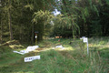
| 10/27/2006 03:18:29 PM |
'the orienteers have all left'by nootComment: Nice choice of an atypical sporting venue. The path/road gives a good direction for the eye to follow. I might like this better compositionally if the perspective were lower to the ground with the start sign prominent - might bring the focus to feet. Does that make sense? Just my 2 cents. Thanks for sharing. |
 Photographer found comment helpful. Photographer found comment helpful. |
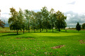
| 10/27/2006 03:13:51 PM |
The 19th Holeby SycoPhantComment: I always thought the "19th hole" was the clubhouse (but I'm not a golfer so maybe not). I like your choice of venue. I like how the darker grass leads the eye to the green but think a tighter crop on the bottom would make the picture more compelling (and cut out some of the empty sky too) making a much more horizontal image. I'd like to see it with it cropped on the left just left of the tree line (so that the slope up to the green really grabs your eye and the tree line also would help to move your eye left to right with the open space on the right). You have some nice clouds on that right side to give the open space more impact. |
| Photographer found comment helpful. |
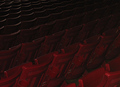
| 10/27/2006 03:06:47 PM |
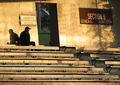
'Til Next Sundayby ElaineComment: I like seat pictures and yours is well done. It's dark for me (but I know that can be my monitor). I like the composition which gives it movement and the lighting complements that movement. |
| Photographer found comment helpful. |
| 10/27/2006 02:32:50 PM |
Scare Crowby fotomann_foreverComment: I like this image a lot and suspect it was meant for the bokey challenge???? The straw/paper in front of the scarecrow's (looks mroe liek a witch to me) eye is very distracting. I like the pumpkin shaped lights in the background. Nice composition. |
| Photographer found comment helpful. |
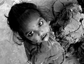
| 10/27/2006 02:30:43 PM |
Innocent eyesby chandramComment: compelling image! Wow. But I'm not seeing the connection to this challenge. |
| 10/27/2006 02:29:02 PM |
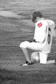
Praying Playerby jstnknightComment: This image sets a mood and I think the conversion to B&W was a good choice.
I would have liked this image better if the boy's foot wasn't cut off and perhaps you moved him down to the bottom of the frame. Being in prayer, I think leaving all the space above his head (like a church with the open, lofty ceilings) would feel "right". This images also has more of a "before game" feel to me - I'll admit to not having watched any youth football games but it seems prayer tends to come before the game; regardless, if his uniform (and/or dirty skin) had shown the effects of having played then that would have been moot.
For me a big part of this challenge was how to make an image (of a sports venue) compelling and interesting without people. I'm marking you down based on my interpretation of the challenge criteria.
Thanks for sharing. |
| 10/27/2006 02:19:39 PM |
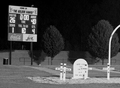
Section 8 Sundownby madcrabberComment: I like the mood here. The light makes it feel "post game." The composition is compelling. This image has really grown the more I've looked at (back for a second look to leave a comment). For me, one of the things I was looking for in this challenge was making an interesting image without people, which I think is harder to do. So I rated you a little lower for including the man. I'm sure there's already a thread about whether having a person in the photo is a DNMC and obviously you feel it meets the challenge (and I certainly don't think it's a DNMC - but more of a not exemplifying the challenge).
I don't know if you intentionally chose "Section 8" but I can't help but think about a connection to Section 8 housing - a lone person sitting after a game - perhaps with no where (desirable) to go home to. I'm probably totally out in left field here but that makes this image much more powerful to me. And thus the person in the photo has a pretty strong presence for me - so although I think the image (story) is stronger with the person, for this challenge it's a detriment to how I'll score it. Hope you're not rolling your eyes but I wanted to explain all that and say I've really enjoyed your image, thank you for sharing it. |
| Photographer found comment helpful. |
| 10/27/2006 02:02:49 PM |
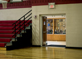
Exit to another Trophy!!!by justamistereComment: This image really grew on me the longer I viewed it (and viewing it again to comment). I've bumped it up from my original rating. It's hard to make a gym visually interesting but you've done it here. What particularly gets me here is the story your image tells. I like that the exit doors frame the trophy case and how even the seats (and railing) lead your eye to the doorway. Excellent composition. |
| 10/27/2006 02:00:14 PM |
|
| 10/27/2006 01:58:34 PM |
|
Home -
Challenges -
Community -
League -
Photos -
Cameras -
Lenses -
Learn -
Help -
Terms of Use -
Privacy -
Top ^
DPChallenge, and website content and design, Copyright © 2001-2025 Challenging Technologies, LLC.
All digital photo copyrights belong to the photographers and may not be used without permission.
Current Server Time: 06/05/2025 08:07:40 AM EDT.