| Image |
Comment |
| 10/30/2008 02:35:57 PM |
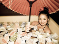
They are great for tipping, but hard to find.by jimsappComment: Superb contrast. The composition is a little weak though... might be interesting to shoot the dollar bills on an angle, with unfocused dishes and glasses in the background, to strengthen the restaurant/tipping concept? Just a thought. :) |
| 10/30/2008 02:33:28 PM |
|
 Photographer found comment helpful. Photographer found comment helpful. |
| 10/30/2008 02:32:57 PM |
Bankrupted!!!by adldxbsComment: personally, I think a little deeper depth of field would work better here, to get the person completely in focus. Also, this isn't really that important, but a more interesting background might help strengthen the concept. Nice even lighting though! |
| 10/30/2008 02:28:43 PM |
|
| Photographer found comment helpful. |
| 10/30/2008 02:27:33 PM |
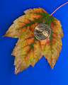
An Autumnal Gift from the Money Treeby banmornComment: I personally might have chosen a different background color - perhaps a neutral red or copper color - something that would compliment the beautiful colors of the leaf. But great lighting and focus. |
| Photographer found comment helpful. |
| 10/30/2008 02:26:22 PM |
|
| 10/30/2008 02:25:55 PM |
|
| Photographer found comment helpful. |
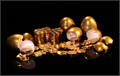
| 10/30/2008 02:25:10 PM |
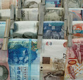
In a recession, eveyone needs an alternate source of incomeby ShamanComment: Great lighting and color. You've made everything look nice and sparkly. My only suggestion - and this is totally personal, maybe I'm nitpicking here - would be to crop a little of the right and left. Give the impression that there's a long line of gold spread out, instead of just a little pile. Just a thought... Nice image. |
| Photographer found comment helpful. |
| 10/30/2008 02:22:05 PM |
Coins for Charonby smudgeSMJComment: Well... here's my two cents...:)
I'm not sure I like the composition. It's a little akward, and when I first opened the thumbnail, it took me a a sec to figure it out. Alright, it was just a second, but I think instant impact is more memorable, and the subject certainly has the potential to really impact. Also, the contrast doesn't look quite right. highlights that should be white are a muted gray, giving the image a sort of dull quality. However, the actual lighting set-up looks and works perfectly, and the subject - coins in place of eyes - is extremely intriguing and captivating. Very neat! :) |
| Photographer found comment helpful. |
| 10/30/2008 02:16:01 PM |
Just use meby NichtComment: The bright colors and high contrast are a little too strong here in my opinion. I would also suggest trying a different composition. |
Home -
Challenges -
Community -
League -
Photos -
Cameras -
Lenses -
Learn -
Help -
Terms of Use -
Privacy -
Top ^
DPChallenge, and website content and design, Copyright © 2001-2025 Challenging Technologies, LLC.
All digital photo copyrights belong to the photographers and may not be used without permission.
Current Server Time: 08/08/2025 05:31:54 PM EDT.