| Image |
Comment |
| 04/02/2003 09:49:02 PM |
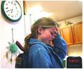
Double Takeby snsComment: The head is a little lower on the left than the right - not symmetric and does not meet challenge.
(April's Fool a day late.)
Good set up and idea for symmetry. Did you try a longer exposure to get more definition of the face in the two positions? That might be a little stronger. Good job. |
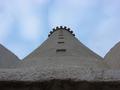
| 04/02/2003 09:42:43 PM |
My lighthouseby hilmarsigComment: The sky and clouds are a good shape created by the symmetry. At first I was going to say the focus should have been on the top of the lighthouse rather than the base, but your way sets off the shape of the sky. Good job. |
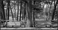
| 04/02/2003 09:38:20 PM |
Hidden Harmonyby casualguyComment: Idea works. I think the tonal range is too narrow and the benches and tree are too blended together. I think setting the levels or increasing contrast would help. |
| 04/02/2003 09:35:36 PM |
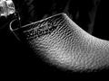
bearingsby marboComment: Good light setup to get all the highlights in the same place on each side. |
 Photographer found comment helpful. Photographer found comment helpful. |
| 04/02/2003 09:11:50 PM |
|
| Photographer found comment helpful. |
| 04/02/2003 09:08:24 PM |
|
| 04/02/2003 09:07:00 PM |
|
| Photographer found comment helpful. |
| 04/02/2003 09:03:04 PM |
|
| Photographer found comment helpful. |
| 04/02/2003 09:02:03 PM |
|
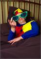
| 04/02/2003 08:52:08 PM |
The Victimby OneSweetSinComment: Good idea and representation of my feelings about practical jokes. GOod job. |
| Photographer found comment helpful. |
Home -
Challenges -
Community -
League -
Photos -
Cameras -
Lenses -
Learn -
Help -
Terms of Use -
Privacy -
Top ^
DPChallenge, and website content and design, Copyright © 2001-2025 Challenging Technologies, LLC.
All digital photo copyrights belong to the photographers and may not be used without permission.
Current Server Time: 08/17/2025 11:20:45 AM EDT.