| Image |
Comment |
| 08/09/2006 03:22:09 PM |
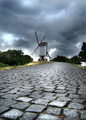
Up the lighthouseby tomzComment: If your verticals are going to converge, I say go wide angle and work with it. Nicely done. |
 Photographer found comment helpful. Photographer found comment helpful. |
| 08/09/2006 03:21:03 PM |
The Millby gullComment: This is a surreal shot and I love it. Very Terry Gilliam. |
| 08/09/2006 03:17:28 PM |
|
| Photographer found comment helpful. |
| 08/09/2006 01:17:20 PM |
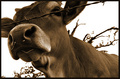
HAYby JutildaComment: I like this, but I think you could have exaggerated the viewpoint even more for extra impact. A wider lens and even lower viewpoint with the camera could move this from a good shot to a great shot. |
| Photographer found comment helpful. |
| 08/09/2006 01:13:35 PM |
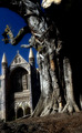
Source of Strengthby MichaelCComment: I really like the components of this image, the building and the tree. Just two small things I'd say, and I took a quick look at the rules for basic editing to make sure they were doable.
Firstly, there is a fair amount of lean that could easily be corrected by rotating the picture, and secondly I'd be interested to see what the image would look like in B & W, since its very much in monochrome already. |
| Photographer found comment helpful. |
| 08/09/2006 01:03:19 PM |
All the way up..and reverseby cryingdragonComment: like the the all the way up part, but not the reverse. I assume the image wasn't as interesting as you had hoped and thats why you reversed it. I still would have liked to see the original though. |
| Photographer found comment helpful. |
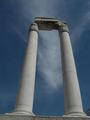
| 08/09/2006 01:00:54 PM |
greater than the skyby snejkiComment: I really like the cool gray and the blue sky, but I'd like to see the columns centered and straightened. The converging verticals are fine, the challenge is from the ground up, after all, its just the slight tilt to the right that is evident. |
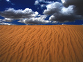
| 08/09/2006 12:57:14 PM |
natural texturesby deepfrog17Comment: liking the orange and blue, always my favourite colour combination, and nicely captured here. Think the sky might be slightly overcooked, but this would still make a great poster or calendar image. Well done. |
| Photographer found comment helpful. |
| 08/05/2006 04:31:26 PM |
|
| Photographer found comment helpful. |
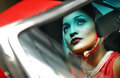
| 08/05/2006 04:21:34 PM |
J O U R N E Yby librodoComment: This is an absolutely fantastic shot, its got a real cosmopolitan feel to it (as in the fashion magazine and sophisticated city chic :) )
Love the colour tone too, which again is very reminiscent of the colour reproduction int those 30s and 40s photos in Cosmo and Vogue.
Great stuff, and beautiful model as well of course! :) |
| Photographer found comment helpful. |
Home -
Challenges -
Community -
League -
Photos -
Cameras -
Lenses -
Learn -
Help -
Terms of Use -
Privacy -
Top ^
DPChallenge, and website content and design, Copyright © 2001-2025 Challenging Technologies, LLC.
All digital photo copyrights belong to the photographers and may not be used without permission.
Current Server Time: 08/04/2025 11:32:56 PM EDT.