|
|
|
Showing 701 - 710 of ~822 |
| Image |
Comment |
| 04/02/2007 06:31:03 PM | The Opera Houseby dewdodesignComment: Greetings from the Critique Club.
Congratulations on a great image.
It absolutely does meet the challenge - I can see about 40 different light sources just at first glance. The colour of the sky is beautiful, the lighting is lovely, and you've succeeded in capturing an overphotographed cultural icon from an interesting angle. Not sure how much meaningful criticism I can really add here... :)
In terms of the composition: I think it works well, but I'd like to see a variation with a bit more water and a bit less sky. It might be possible to use the rule of thirds so that the first third ends at the line of light on the opera house, and the second third ends slighty below the tips of the highest roofs, in order to make the viewer's eyes move more naturally towards the focus of the shot. Well, maybe...
Oh, and minor point, but: you only submitted a 96kb image. The smaller the file size is, the more detail you lose, so try and get as close to the 150kb as possible.
Anyway, fantastic image, and congratulations on your new personal best!
And keep on snapping away!
Jelena |  Photographer found comment helpful. Photographer found comment helpful. |
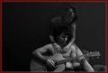
| 04/02/2007 06:11:41 PM | "When I was a boy... "by LipstudiosComment: Greetings from the Critique Club.
Nice image - the angle of the swing works well, and the expression on the boy's face is perfect. As the commenters have picked up on already, it's really a shame that the image wasn't captured with a higher shutter speed, as it's not quite crisp enough, and as far as I can tell, the focus seems to be on the swing rather than the boy's face. This can be fixed to a certain extent in post-processing using unsharp mask, just don't overdo it, as it does show.
There are a lot of distracting elements in the photo, but unless the photo was taken from a completely different POV, I don't think there's a way to fix this - a tighter crop wouldn't really do much for the photo. It's fine to just go with it anyway - I suppose part of the point of the picture is to put the boy using the mobile phone in contract with a representation of traditional childhood (boy on phone in amongst cuddly toys would've been cute :) ). However, I would crop off the vertical wooden pillar on the left - I think the diagonals in the photo show up much more nicely without it.
In terms of post-processing: I would've increased the contract and saturation quite a lot. In order to represent childhood, you want the colours to be bright and jumping out towards the viewer. Also, running it through Neat Image would make the foreground smoother and the background more blurry (if that's something you'd desire to do).
Here's the edit:

Anyway, hope this helps.
PM me if you have any questions.
Jelena Message edited by author 2007-04-02 21:31:00. |
| 04/02/2007 05:47:57 PM | Stillness Withinby LaMasComment: Greetings from the Critique Club.
First of all - welcome to the madness of DPC challenges.
This is a very interesting image. The first striking thing about it is the wealth of textures - the walls, her cloak, the rug above her head. The depth of field works well for this.
The composition isn't necessarily very DPC friendly - the conventional thing to do is to make the subject very much the focus of the picture, and steer clear of any distractions (like the rug above her head), unless they're directly complementing the subject. However, the fact that it's unconventional makes it interesting.
The other obvious DPC objection is that the face isn't in focus. Again, I'm not convinced it's a valid objection. The voters have a bias towards very crisp, clear images, but in this case the soft focus and shadows on her face make it look quite mysterious, and are possibly complementing what you were trying to achieve with the photo.
The white spots in the lower right corner are quite distracting. I know these just randomly happen, to the best of my knowledge, the only real solution is to take lots and lots of images, then pick the ones that don't have such problems (I've taken anything up to 300 for a single challenge).
In terms of the post-processing:
I would've cropped a small part of the bottom of the picture to get rid of the white line in the right corner. The best way to get exactly the relations you want between the blacks and whites in the picture is to use the 'curves' function in Photoshop, which might potentially improve the picture. Also, I don't know what you used to convert it to B&W, I find the channel mixer does a much better job than the 'desaturate' function, as you can get exactly the level of contrast you want by playing with the percentages. Also, the image is 620px high, which is close to the maximum, but you might as well use the full dimensions allowed - the bigger the image is, the more of a chance it gives the viewers to appreciate it.
Anyway - hope this helps, and keep on entering challenges!
Any questions, just PM me.
Jelena Message edited by author 2007-04-02 17:49:47. | | Photographer found comment helpful. |
| 04/02/2007 04:28:01 PM | Maniacsby vadviragComment: Greetings from the Critique Club.
As was commented on already - this is a perfect picture for the challenge theme. My comments would be as follows:
Technically, I think this is a very good photo. The lighting is just right (their faces are nice and lit up), and the DOF works very well for this - I love the small blur of a person in the lower right-hand corner, I think it really adds to the image. Good background too - contracts against the lady nicely.
However, I think the composition could have been better. The positioning of the lady is perfect, and the expression on her face and the wind in her hair work really well - she's got this lovely faraway look that captures the fact her mind is really somewhere else. The guy, on the other hand, clutters up the composition (imo). If she was by herself, the picture would have a much greater emotive content, but I guess wouldn't capture the 'mania'. As it is, it could have been improved if he was standing slightly further back, and maybe facing in the other direction. Because they're the same height, and he's sort of blending into her, I think the photo loses some of its impact. It also doesn't help that his face and clothes are a similar colour to the background - I think the shot would benefit from being recomposed so that he's a smaller but distinct entity.
But anyway - well done on a good shot.
PM me if you have any questions.
Jelena | | Photographer found comment helpful. |
| 04/02/2007 03:57:04 PM | Love me tenderby SimpaComment: Sexy image! But why, oh why the silly border...? Because the image is B&W, the first thing you see is the coloured border, and it actively distracts from what I consider to be a lovely, sensual image.
I also would have maybe cropped off some of the empty space on the left, I'm not sure it's actually enhancing the photo.
Btw - once the challenge is over, if you add a black border copy of this to your portfolio, I'll add it to my faves. | | Photographer found comment helpful. |
| 04/02/2007 12:47:39 PM | Awakening Sunriseby sherpetComment: Lovely silhouettes, but I would've gone for more gentle colours - something that can at least theoretically pass as natural. | | Photographer found comment helpful. |
| 04/02/2007 12:46:00 PM | | | Photographer found comment helpful. |
| 04/02/2007 12:44:55 PM | Pure Natureby rhipsterComment: Pretty, sharp image, but the horizon isn't quite horizontal, and I'm not sure I like the burning at the top. | | Photographer found comment helpful. |
| 04/02/2007 12:43:44 PM | Taken For A Rideby EstimatedEyesComment: A bit too overprocessed for me. Which is a shame, cause it looks like a really cool image. Most of it actually still looks quite pretty, but the gray building on the right somewhat ruins the shot imo. | | Photographer found comment helpful. |
| 04/02/2007 12:40:57 PM | | | Photographer found comment helpful. |
|
Showing 701 - 710 of ~822 |
Home -
Challenges -
Community -
League -
Photos -
Cameras -
Lenses -
Learn -
Help -
Terms of Use -
Privacy -
Top ^
DPChallenge, and website content and design, Copyright © 2001-2025 Challenging Technologies, LLC.
All digital photo copyrights belong to the photographers and may not be used without permission.
Current Server Time: 08/04/2025 06:56:00 PM EDT.
|