|
|
|
Showing 601 - 610 of ~822 |
| Image |
Comment |
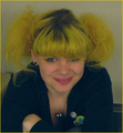
| 04/18/2007 12:14:25 AM | happy hairby tnunComment: Shame about the level of noise in the background. Otherwise a fun, happy image :) |  Photographer found comment helpful. Photographer found comment helpful. |
| 04/18/2007 12:07:52 AM | | | Photographer found comment helpful. |
| 04/17/2007 11:44:31 PM | G o a tby JeffDayComment: lol Aww, that's cute. I've never seen a goat that fluffy before! | | Photographer found comment helpful. |
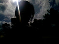
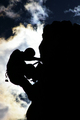
| 04/17/2007 10:59:53 PM | Hiding in a Silhouetteby illusionaryComment: Greetings from the Critique Club.
Welcome to DPC :)
Interesting image, which definitely meets the challenge. However, there are a number of ways of improving it.
The clouds look good, and I like the mysterious off-centre silhouette. The title works well with the image, and the ray of sunlight going across the person's face looks very cool. However, as has been commented on already, the background blends into it and somewhat clutters up the image. Moving around or taking the photo from a different angle in order to get rid of the buildings would greatly improve it.
There's also a lot you can do with editing. I'm not sure turning it B&W would have been a good idea (the blue sky is pretty nice), but there are a number of PhotoShop adjustments you can use to bring out the colours and improve the image. 'Levels' to lighten the sky a bit, brightness and contrast adjustments to make the image more clear, maybe a 'sharpen' (helps images a lot of the time). There's also quite a lot of noise in the sky, there's a number of noise reduction programs you can use to change that (Neat Image is the one I use, it's free to download).
Anyway, hope this helps, message me if you have any questions. And do keep submitting stuff, I look forward to seeing more of your entries!
Jelena |
| 04/17/2007 07:56:15 PM | | | Photographer found comment helpful. |
| 04/17/2007 07:41:54 PM | Iceberg Martiniby LiehscComment: Lovely colours, and I like the soft focus. Looks tasty :)
I'm just not too keen on the glass being exactly in the center, I think if you'd cut off some of the black bits and made an off-centre shot, it would look more interesting. | | Photographer found comment helpful. |
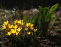
| 04/17/2007 07:15:12 PM | Allegro cantabileby LouisonComment: Greetings from the Critique Club.
I second your disappointment. I gave this image a 7 during voting, and I think it should have scored much higher. The image definitely does meet the challenge - I thought it was obvious that the reason the flowers appear to be shining is because the light source is behind them... However, I would imagine that the low marks are indeed dnmc's - while it should be obvious that the photo does meet the challenge, it's not as obvious as the rest of them (you can actually see the light source at the back in most photos). Which is just to say that voters are silly and should be ignored in this case, as their only objection seems to be that they weren't sufficiently hit on the head with the challenge theme.
As for the image itself - I think it's very pretty. The DOF works well, the flowers are shining beautifully, all the colours are pretty and complementary. The crop is just right, and the rule of thirds is being used perfectly - the leaf on the top right nicely leads the viewer's gaze towards the subject of the photo. Not sure about the focus - it might have been nice if the front flower was also in focus, but this seems to work well too.
I like the title - it does look like the flowers are raising up their arms in joy and singing happily :)
Well done, lovely photo. And don't worry about the score - there are times when you shouldn't take such things too seriously.
Jelena | | Photographer found comment helpful. |
| 04/17/2007 06:00:52 PM | The road to...by hajekaComment: Greetings from the Critique Club.
During voting, I gave this image a 2. It definitely does meet the challenge, but I found the choice of subject matter unoriginal. My argument was that if you're going to do something as obvious as a silhouette for Contre jour, it really better be an interesting one.
The good thing about the composition is that it's simple, and the fact that it's slightly off-centre makes the image less static and more symbolic of a journey. The sky is niceish enough, but unexciting. Maybe more post-processing would have brought out the colours more. The white halo around the sign is indicative of oversharpening, but it might just be the light in this case.
There's nothing obviously wrong about the image, but there's just nothing that moves me about it. Maybe a different POV would have helped. Maybe leaving more negative space on one side would have been more indicative of a journey. Maybe giving a more thought-provoking title would have made it more interesting. Or maybe you should have just gone for a different picture.
Jelena |
| 04/17/2007 03:52:46 PM | Climbing to the top!by WriteHeartComment: Greetings from the Critique Club.
Wow, what a beautiful image! I gave it a 7 during voting, and it probably deserved higher.
Striking subject matter, definitely contre jour, and the clouds have alligned so beautifully...
The composition is somewhat imbalanced - there are a lot more dark areas than light ones (hence the comment about wanting more sky). However, I think this benefits the image. Because of the imbalance, the mountain looks very imposing, and the dark sky above it adds to the effect, with the white cloud giving this lovely aura of light to the struggling climber. The focus is good, and the fast shutter speed worked great - I love the level of sharpness and detail that the silhouette has, especially the chain hanging off his belt. Nice use of the rule of thirds too.
In general, I think people prefered images that weren't just silhouettes, but had a second, more gentle source of light that gave some detail to the subject. However, the advantage of using silhouettes is that, while it removes some of the reality of the subject matter, it gives it an iconic appearance, making it a lot more symbolically powerful. What I see in this image:
I have what could possibly be my last ever exam in 3 days. And I've been struggling under a ton of revision for days now. I requested another image to critique during a revision break, had a look at it, and let it linger around in my mind for another revision session before coming back to it. And it really moved me, I found I could actually identify with it. The struggle of the rock climber, the need for perseverence, the fact that the top was so close, yet getting to it still seems so difficult. I think there are a lot of life situations like that, where people could really identify with this image and the need to be strong, and to go out and find beauty. Very Nietszchean actually - the quest for freedom, the will to power, self-fulfilment, there's all sorts of things you could read into it.
In terms of the editing, what I normally do is as follows:
-In PhotoShop, use adjustment layers for each adjustment you do. Standard ones I go through with pretty much every photo: levels, curves, brightness/contrast, hue/sat, trying out a partial desat with the channel mixer, selective colour (in this case I might have messed around with the blues and yellows), unsharp mask. The great appeal of adjustment layers is the little eye symbol at the left hand side of each one - when you press it, it shows you what the image would look like without that particular adjustment. So I go through all the adjustments, twiddle with the settings until they seem to make the photo better, but then go through them again using the eye symbol to check whether they genuinely benefit the image. If they don't, get rid of them. In this case, I don't think the image actually needed any further editing.
Anyway, hope this helps. PM me if you have any questions.
And well done on a fantastic image, and your new well deserved personal best.
Jelena | | Photographer found comment helpful. |
| 04/17/2007 01:38:51 PM | Zaus is fitnessby macphotographComment: Greetings from the Critique Club.
Welcome to DPC :)
While you had a good model, and the right general idea for the challenge, there are a number of ways in which this photo could have been improved in order to make it score higher.
The background is very distracting. For this kind of studio shot, you will normally get marked down unless the background is pure white - this way the shadows are a bit distracting, and the top left corner spoils the shot. So either point a gentle light source at the background to make it white, or maybe use a natural rather than a studio background? The dust has been commented on already.
While the model is very muscular, he's just standing around. Possibly getting him to pose in a way which illustrated fitness more would've helped - like get him to show off his arm muscles or something. The centred composition also doesn't look great either - it makes the shot look quite static. Combined, these bring your score down. Try a different pose, different composition, and maybe a different point of view, and see what happens...
The focus isn't great because you can't really see his face. Same with the lighting. You've done very well at showing off his body, but for some reason the face is in shadow and not really focused on at all.
Anyway, that's a decent first score. Do keep submitting stuff and watch it get better and better :)
Message me if you have any questions.
Jelena | | Photographer found comment helpful. |
|
Showing 601 - 610 of ~822 |
Home -
Challenges -
Community -
League -
Photos -
Cameras -
Lenses -
Learn -
Help -
Terms of Use -
Privacy -
Top ^
DPChallenge, and website content and design, Copyright © 2001-2025 Challenging Technologies, LLC.
All digital photo copyrights belong to the photographers and may not be used without permission.
Current Server Time: 08/05/2025 04:05:05 PM EDT.
|