|
|
|
Showing 551 - 560 of ~822 |
| Image |
Comment |
| 04/26/2007 01:15:47 PM | street outtakeby posthumousComment: Hmm... I definitely prefer the one you actually entered in the challenge.
Not entirely certain what the point of this photo was... I like the right hand side - the shape of the snow and the way they're lined up manages to make the cars look quite aggressive and ready to race. I suppose the bent sign goes with that. The person just seems to be in the way though. There's no obvious readable expression, I can't think of a symbolic explanation, it just looks like he happened to be in the wrong place when you were taking the picture. If he was smaller and further away, he might add to the picture, but atm he's just disrupting it. The B&W conversion works well enough, although a casual viewer might get the impression that it's there in order to make a bad photo look a bit more artsy, thus turning it into an artsy bad photo.
But do let me know if I'm wrong... :) |  Photographer found comment helpful. Photographer found comment helpful. |
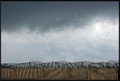
| 04/25/2007 07:12:49 PM | Storm Fenceby noranekoComment: Wow, this is really cool! All those parallel lines in the fence make a wonderful pattern, the shadows are really interesting, and the wavy shape of the top of the fence really does make it seem turbulent and stormy. Wonderful level of detail too.
The clouds lined up just right too - I love the light third in the middle and the dark third above it. Everything's quite regular but deviates enough to make the image more interesting and dramatic.
I'd like to tell you how to improve it, but I think it works really well as it is. Introducing a subject or foreground interest would be common suggestions, but I actually really like the impact of the simple geometry in this picture. Maybe a small colourful helium baloon flying past in the sky would have been cool, but I suppose you can't have everything :)
Very cool image, well done. | | Photographer found comment helpful. |
| 04/25/2007 06:44:17 PM | Moonby raishComment: Shame you didn't get more detail. Looks sort of oversharpened and pixelated. But is at the same time better than any moon picture I've ever managed to get.
I'm not too keen on the centered composition, I'd prefer it if it was cropped more tightly and the moon was more in the lower right corner. Particularly since there's the cute little star in the top left corner - it'd be nice to see the star in one corner and the moon in the opposite one. | | Photographer found comment helpful. |
| 04/25/2007 06:31:14 PM | Ficusby cuspieComment: Ooh, that's cool. Very nice detail. I really like the light in this - the little leaves at the front shine really nicely, and the big one at the back seems to be giving out rainbow colours :)
The thing I'm not too keen on is the composition. You can get away with cutting off the top right of the big leaf, but it seems a shame to cut off the top left bit and the tip of the little leaf. At the same time, I'm not sure the empty space at the right is really doing much. So if you just moved the camera slightly to the left and up, it would be perfect. | | Photographer found comment helpful. |
| 04/25/2007 06:24:22 PM | desertsunset1.jpgby liltritterComment: Ooh, very pretty! Lovely capture, with the sun just setting behind the hill.
Improvement suggestions:
At the moment, the composition looks a bit confusing - it's almost centered, but not quite. I don't think a centered composition would work too well, because the silhouettes are asymmetrical. Instead I'd be tempted to crop off some of the left side of the picture, and maybe a bit of the top of the sky as well, to make this into a proper off-centre subject composition.
Also, the top part of the sky is pretty, but a bit subdued compared to the rest of the image. If you want the image to really jump out towards people, you could do a hue/sat adjustment and just increase the saturation of yellow colour. It makes the image ridiculously warm, but also really makes it pop out towards people. | | Photographer found comment helpful. |
| 04/25/2007 05:13:13 AM | | | Photographer found comment helpful. |
| 04/25/2007 05:08:57 AM | Underhairby posthumousComment: Ah, that was you? :) I should've known. I still think it's hilarious! | | Photographer found comment helpful. |
| 04/24/2007 06:18:58 PM | Harper sepia portraitby krnodilComment: Oh, she's gorgeous! A combination of some of my favourite things in life - cats and fluffy things. I want one! Lovely photo, I love that laid back but inquisitive look. | | Photographer found comment helpful. |
| 04/23/2007 03:28:54 AM | | | Photographer found comment helpful. |
| 04/22/2007 07:05:03 PM | Love Chainby TheStickComment: Greetings from the Critique Club.
Good take on the challenge - the chains present are both a real one and an emotional one. Well represented.
I think the subject matter is good - the chain is interesting, and the fact that it's on skin is heavily suggestive of loving intimacy, I think that works really well. I think the composition is also very good - the intersecting curvy diagonals are very aesthetically pleasing, and the heart is pointing in an interesting direction, all nice and dynamic.
What heavily brought your mark down (as you can tell from the comments) is the fact that the image appears out of focus. Were you handholding the camera? It's basically impossible to hand-hold a camera for anything longer than a 1/30s exposure (even then it takes practice, 1/60 is comfortable), so if you want a longer exposure, you really do need a tripod. And also, ask your model nicely to keep very still (although for this length of exposure, I don't think that's what caused it). Basically, regardless of what your image is like otherwise, if it's OOF it'll get a sub-5 score, it's like a DPC rule. Another technical point that would've brought it down is the lighting - it's very difficult to photograph metal without the light shining off it. A polarizing filter fixes that, provided you've got one. What I'd try and do (lacking the filter) is diffuse the light as much as possible - bounce it off a wall or a white piece of cardboard.
Anyway, don't worry too much about the score - I think the idea and the composition are very good, but the score was brought down by technical objections. And technical stuff is something you pick up over time, especially in a place like DPC.
PM me if you have any questions.
Jelena | | Photographer found comment helpful. |
|
Showing 551 - 560 of ~822 |
Home -
Challenges -
Community -
League -
Photos -
Cameras -
Lenses -
Learn -
Help -
Terms of Use -
Privacy -
Top ^
DPChallenge, and website content and design, Copyright © 2001-2025 Challenging Technologies, LLC.
All digital photo copyrights belong to the photographers and may not be used without permission.
Current Server Time: 08/06/2025 07:23:29 AM EDT.
|