| Image |
Comment |
| 09/04/2006 10:00:57 PM |
|
 Photographer found comment helpful. Photographer found comment helpful. |
| 09/04/2006 09:59:08 PM |
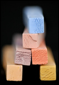
Edibility Factorby hotpastaComment: Was the blur achieved in camera or added in photoshop? It feels to dramatic. would have preferred less blur. I like how it looks like scooped ice cream. Vanilla, butterscotch, strawberry, chocolate and blue raspberry. Not sure what to call the purple one. ;) |
| Photographer found comment helpful. |
| 09/04/2006 09:54:45 PM |
|
| Photographer found comment helpful. |
| 09/04/2006 09:53:24 PM |
|
| Photographer found comment helpful. |
| 09/04/2006 09:50:02 PM |
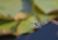
Final Approachby cabaComment: This is difficult to achieve. I really don't care for the distracting background. I know shots like this can't be helped. Seems the dark tones are a tad noisy. I applaud you on the difficulty of this shot but its not really working for me, sorry. |
| Photographer found comment helpful. |
| 09/04/2006 09:46:36 PM |
Revelationsby ImagineerComment: omg I love this! Its simple, delicate and very eye appealing! A very thought provoking title! 10 |
| Photographer found comment helpful. |
| 09/04/2006 09:38:51 PM |
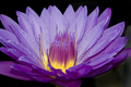
Inner lightby MattOComment: Vibrant colors! Crisp clarity. There are some white specks in the lower right petals I would have removed. I would also have blackened the entire background since the majority of it is already black. The green is a bit distracting. |
| Photographer found comment helpful. |
| 09/04/2006 09:35:29 PM |
Morning Gloryby newtune3Comment: Im not crazy about the color tones. I would have altered it in photoshop to boost the blues/pinks better. Looks like the ISO might have been a bit high as you have some noise in the dark areas. I might have flipped this image to show the rays coming downward as we would expect them to be even though they may not have been. I like the shape of the cloud. Looks like a hand holding the sun if it had been flipped. |
| Photographer found comment helpful. |
| 09/04/2006 09:31:01 PM |
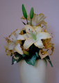
Rosesby lifternessjtComment: I love the contrast of the flowers against the white stone. Looks like something you would see on a sympathy card. Absolutely beautiful! |
| Photographer found comment helpful. |
| 09/04/2006 09:24:24 PM |
|
| Photographer found comment helpful. |
Home -
Challenges -
Community -
League -
Photos -
Cameras -
Lenses -
Learn -
Help -
Terms of Use -
Privacy -
Top ^
DPChallenge, and website content and design, Copyright © 2001-2025 Challenging Technologies, LLC.
All digital photo copyrights belong to the photographers and may not be used without permission.
Current Server Time: 12/20/2025 06:35:36 PM EST.