| Image |
Comment |
| 07/02/2003 01:56:33 AM |
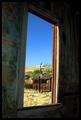
...and we have a picture window, too!by autoolComment: *Critique Club*
It is me again, don't you just love how busy I am?
The colors here are really good and the way the entire image is framed is very nicely done. Your focus and dof are very good. I really don't have much to say about how to improve it other than that white line of old paint in the window frame just seems so out of place, too bad you couldn't have gotten rid of it.
Again this is very good. Nice capture and definately a well done entry for the country life challenge.
Anna |
 Photographer found comment helpful. Photographer found comment helpful. |
| 07/02/2003 01:49:26 AM |
Country Brideby pncowleyComment: *Critique Club*
Very nicely done portrait. I read your comments and one thing you might want to try with PSP8 is an unsharpening mask it might bring the eyes out a little more. That being said the photo is truly very good there really isn't a lot to change with it. You might want to try cropping just below the sleeve, and also I hope you got a photo with that background of the entire gown. It is so simple and yet very elegant looking.
Your focus is good as is the dof used, and it definately meets the challenge. Your sister-in-law should love this wedding day portrait.
Anna |
| Photographer found comment helpful. |
| 07/02/2003 01:30:03 AM |
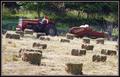
First Cutting, 2003by karmatComment: *Critique Club*
This is without a doubt country life. The focus is good and the hay bales create a nice pattern in the foreground. There is a nice array of color throughout, but there is a harsh light hitting just above the tractor and it definately is taking away from the rest of the photo.
Other than the light the angle in which this was taken is a little distrating, might help to turn it slightly.
Overall this is country life, the farmer even reminds me of some old movies that portray the farmer as lazy. He just looks so relaxed and at ease there on the tractor seat. Although I know a farmer's life is not a lazy one, they just always look so relaxed on the tractor.
Anna |
| Photographer found comment helpful. |
| 07/02/2003 01:01:28 AM |
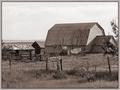
Desolate Lonelinessby CLarson557Comment: *Critique Club*
Nice image definately says country. The sepia tones work well here. The focus is really good, and the dof used works nicely with this.
As I look at it the one thing I wonder is would it have improved greatly had you taken it at a different angle? As it is now the buildings form an L shape possible taking the bar at more of an angle would have added some interest to the entire photo or taking the milkhouse end and putting it in the front of the photo might have added more to this. As it is now you have these strong leading lines from the barn and other buildings that come to a point and there is nothing there when your eye gets there.
Overall it is a very eye pleasing image and does meet the challenge well.
Anna |
| 07/02/2003 12:16:11 AM |
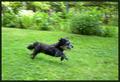
Old; but still quick.by TwocentzComment: Very cute and nicely done. The dogs face is in focus and it appears you panned slightly, cause of the background being out of focus. |
| Photographer found comment helpful. |
| 07/02/2003 12:15:06 AM |
|
| 07/02/2003 12:13:33 AM |
Play Ballby Crafty SueComment: This would be a great photo if something anything was in focus. Either the runner of the adults in the background but as it is nothing is in focus. |
| 07/01/2003 11:29:10 PM |
Meby nathaliedooComment: *Critique Club*
Very touching image. The focus and dof used are perfect for the photo. I actually like the way you did it and I can understand the lighting and the colors you used, however not everyone can. I am sure there are those who didn't like the harshness of the golds or the brightness of the reds, but to me the work well.
Personally I wouldn't have changed a thing cause you expressed yourself very well. Nicely done.
Anna |
| Photographer found comment helpful. |
| 07/01/2003 09:02:01 PM |
Me-Myselfby justineComment: *Critique Club*
I see where you did a lot of blurring, for me it just doesn't work with the strong backlighting. You should have opted for a darker backround with the softness of the blur. The top of the background just pulls the eyes to it and away from you.
Also you're white balance may have needed set differently or you could have balanced it out more with your editing it seems a bit too yellow.
The pose is very becoming to you and with just a little lighting adjusting I think this could be an outstanding photo
Anna |
| 07/01/2003 02:28:28 PM |
Kiss me!by sylkComment: *Critique Club*
Overall the focus is good, the photo is very sharp and the colors are viberant. I understand you for wanting to let the real you show but at the same time you ruined a fantastic photo of yourself by using those teeth.
From reading the comments left and my personal feelings also I would say you could have very easily finished in the top 10 if not for the teeth they just were such a distraction here.
You definately met the challenge, and overall the image is good. Next time just consider what is more appealling to the person voting.
Anna |
Home -
Challenges -
Community -
League -
Photos -
Cameras -
Lenses -
Learn -
Help -
Terms of Use -
Privacy -
Top ^
DPChallenge, and website content and design, Copyright © 2001-2025 Challenging Technologies, LLC.
All digital photo copyrights belong to the photographers and may not be used without permission.
Current Server Time: 08/05/2025 10:50:07 PM EDT.