| Image |
Comment |
| 08/08/2004 07:37:02 AM |
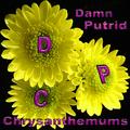
Damn Putrid Chrysanthemumsby banmornComment: I'm here looking at this and wondering why it didn't do better...first off the flowers jump out and grab your attention so that is a plus. However, the font just doesn't do a lot, it looks good on the yellow and stands out but then it is almost to dark against the black.
Overall I like the image and it does meet the challenge. Nice work. Message edited by HBunch - Removed Critique Club status. |
 Photographer found comment helpful. Photographer found comment helpful. |
| 08/08/2004 07:31:44 AM |
Dead Poets' Childrenby Dr.ConfuserComment: Critique Club,
Good attempt on the challenge. Excellent name you came up with shows a lot of creativity.
The one thing I see here that I would say hurt you was that shadow over those 3 stones. They seem to be your main point of interest and yet the shadow just distracts from them.
The other thing that might have helped here is making it duotone. It would have gave it a more eerie feeling. This met the challenge well. |
| Photographer found comment helpful. |
| 08/02/2004 03:22:03 PM |
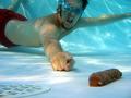
Doodie! Doodie!by DefyTimeComment: Critique Club
I'm amazed this didn't score better just because of the type of photo it is. I give you credit just for attempting the shot. Then I also gave you a few extra points just for the comedy, even if it wasn't orginal...
Now It does meet the challenge...that chocolate bar sure does look like more than just chocolate in the pool...lol...seriously though the photo does have one minor pitfall that catches my attention. It's just a little too dark.
Again awesome first attempt with you new underwater case. |
| Photographer found comment helpful. |
| 08/02/2004 12:20:08 AM |
|
| Photographer found comment helpful. |
| 08/01/2004 10:53:09 PM |
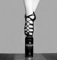
The Celtic Balanceby ColeyComment: Critique Club
This is a marvelous photos. The composition is outstanding and the detail is simply fantastic. It's a beautiful piece. On my first look I only saw a minor distraction that I might try to get rid of and that would be the the square under the can...not sure if that is a tiled floor but that seems to be a very slight distraction one that you could easily edit out. This does fit the challenge well. Nice way to express balance.
Congrats on the fantastic finish and I will be looking forward to seeing more from you.
|
| Photographer found comment helpful. |
| 08/01/2004 10:46:16 PM |
Contrastby chasmoComment: I tend to agree with the comments the photo is just to dark and needs brightened up slightly. Also the title seems to leave you questioning what contrast. Message edited by HBunch - Removed Critique Club status. |
| 07/28/2004 05:34:49 PM |
Safari Samby JackoComment: Fantastic portrait, just noticed it in a forum post and had to look. He's a handsome little dude you got there. |
| Photographer found comment helpful. |
| 07/28/2004 05:30:34 PM |
|
| 07/25/2004 11:46:48 PM |
|
| Photographer found comment helpful. |
| 07/25/2004 11:44:10 PM |
|
| Photographer found comment helpful. |
Home -
Challenges -
Community -
League -
Photos -
Cameras -
Lenses -
Learn -
Help -
Terms of Use -
Privacy -
Top ^
DPChallenge, and website content and design, Copyright © 2001-2025 Challenging Technologies, LLC.
All digital photo copyrights belong to the photographers and may not be used without permission.
Current Server Time: 08/05/2025 12:01:34 AM EDT.