| Image |
Comment |
| 11/05/2005 08:58:28 AM |
A Light Mealby ShermyComment: Greetings from the Critique Club
Beautiful image. Your use of different white tones makes this a stunning and eye appealing photo. The splash of green just adds a touch of interest to the photo.
Your composition is really well executed nice placement and use of diagonals.
The only real issue I see with this appears to be coming from your source of lighting casting a slight shadow and making your background appear slightly lavender and grainy.
Hope to see more beautiful work from you.
Anna |
 Photographer found comment helpful. Photographer found comment helpful. |
| 11/04/2005 10:31:02 PM |
Sister's hugby srugoloComment: Greetings from the Critique Club
Very strong composition with lots of emotion. This is definately a feel good photo. The bond between the sister is there as one seems to be comforting or protecting the other.
Your focus is nice slightly soft but works well for this image. The lighting I feel is just a little to strong on the bottom sisters face she seems slightly washed out.
You definately met the challenge here. Beautiful work.
|
| Photographer found comment helpful. |
| 11/04/2005 10:08:35 PM |
Competitionby jpetersComment: Greetings from the Critique Club
This image lets you say why the two matches what was the purpose. The match on the right just doesn't do anything for the photo except to be distracting.
Your lighting seems good and the subject is in good focus you definately met the challenge well with this.
Even now looking at it I wonder why isn't the one match or the candle lit for effect?
Anna |
| 11/04/2005 09:19:45 PM |
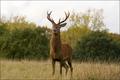
Strong yet Powerlessby jseyerleComment: Greetings from the Critique Club
Very nice image and good detail and the deer. The dof used is wonderful the lighting seems really good as well.
My biggest issue with this photo is placement. it needs cropped more so that the deer is not in the middle. I would probably have cut about half the distance between the deer and the right edge to move the deer out of the center.
That really seems to be the one main flaw here the cropping of the photo.
As for meeting the challenge I understand what you are saying but think it may be a little week for the average voter. A buck is strong had it been a doe or fawn i believe delicate would have been represented better.
Anna
Anna
Anna |
| 11/04/2005 09:13:04 PM |
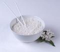
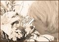
Pearly Whitesby JaimesonComment: Greetings from the Critique Club.
White on white definately a tough challenge to avoid the over exposured areas which cause your subject to blend in with the background and that is what happened with two of the three drops here.
This appears to be slightly out of focus and just needs a little less softness to it.
Your composition is good and your use of thirds is well excuted. As for meeting the challenge. Yes without any question you met it.
Anna |
| Photographer found comment helpful. |
| 11/04/2005 09:07:30 PM |
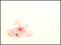
Alstromeria on Whiteby Buckeye_FanComment: Greetings from the Critique CLub
I'm going to start out by saying WHY WHY WHY that black border the image stood well on its own but that border seems to say hey look out here on the edges where there is nothing...definately it was a big distraction.
Next there does seem to be a bit of noise in the background.
Also you seem slightly overexposed on part of the flower. just a tad to much lighting.
Now that I'm done complaining what I do like about the photo is the simplicity of it the colors and the way the flower stands out. It is does meet the challenge well as being delicate.
Anna |
| Photographer found comment helpful. |
| 11/04/2005 09:02:54 PM |
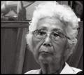
A Delicate Ageby sarnComment: Greetings from the Critique Club
Very nice capture of expression and the black and white work well for this photo.
Your biggest problem here is the graininess. It doesn't add to the portrait but rather takes away. I
The other issue I notice is the glare in the glasses it seems to make both eyes look like two holes rather than eyes.
Its little things that make the difference in scores and this is a prime example of the little things. Your composition is good and your choice of black and white work well but it was the little things that hurt you.
Anna |
| 11/04/2005 08:57:49 PM |
Bluegrass Heritageby adamwebComment: Greetings from the Critique Club
This is a nice concept here just wish something would have been in crisp focus. You have though met the challenge well with lots of graininess here.
Your lighting and the overall content are good it does hold your attention and make you look but that lack of anything in focus seems to be a major distraction. |
| Photographer found comment helpful. |
| 11/04/2005 12:14:07 AM |
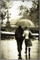
Reminiscenceby PanoComment: Greetings from the Critique Club
Beautiful image, very appealing subject matter.
You seem to have a small area of brightness above the bridge that needs touched up. Also you might want to crop in just a tiny bit on the right side to get rid of a tree trunk I believe. Just doesn't seem to need to be at the edge of the photo.
Definately fit the challenge well and stunning!
Anna |
| Photographer found comment helpful. |
| 11/04/2005 12:10:17 AM |
Mutual attractionby edmengComment: Greetings from the Critique Club
Good use of grain it reminds me of an old magazine ad from the 70s. So of course it fits the challenge well.
Your lighting seems to harsh causing much of the flowers and background to be overly exposed. A litle less backlight might have solved all the lighting issues.
As for your composition I like it has an air of freshness about it in this challenge.
Anna |
| Photographer found comment helpful. |
Home -
Challenges -
Community -
League -
Photos -
Cameras -
Lenses -
Learn -
Help -
Terms of Use -
Privacy -
Top ^
DPChallenge, and website content and design, Copyright © 2001-2025 Challenging Technologies, LLC.
All digital photo copyrights belong to the photographers and may not be used without permission.
Current Server Time: 08/01/2025 01:44:12 AM EDT.