| Image |
Comment |
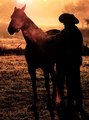
| 10/06/2010 09:20:32 AM |
" The Day Begins " by RmacComment: Congratulations. A well deserved blue as you scored over a 1/2 point higher than your nearest competitor. If you get the time to post your processing steps it would be much appreciated. Great image.
Tim |
 Photographer found comment helpful. Photographer found comment helpful. |
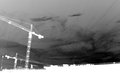
| 10/01/2010 06:05:08 PM |
Bridgeby LukaTrajkovicComment: Back to comment: To be honest, I am having trouble determining what is the main focus (subject) of this photo. The crane? The sky? The little portion of building at the bottom? |
| 10/01/2010 06:03:52 PM |
heavenly negativeby curtpetguyComment: Back to comment: A statue is a statue is a statue. Generally, the composition of a statue image is often as static looking (low on the wow factor) as the statue itself. It is hard to tell if the bird is real or a statue also, as there is no motion blur visable in the wings. If it is real, a little motion blur may of helped your score. |
| 10/01/2010 05:57:03 PM |
Pick your colorby Hafst1Comment: Back to comment: I think your out of focus area in this image is misplaced. My eyes are drawn to the brightest pieces and they are out of focus. When I reverse your image back to a positive, my eyes again go to the brightest pieces but they are in the back and in focus. |
| 10/01/2010 05:54:37 PM |
Foggy Bridgeby kawanaComment: Back to comment: I'm not real fond of half the image being negative space. If you would crop this at a 8x10 ratio instead of the standard 4x6 camera ration, I think you would find the composition to be stronger and the bridge to be more dynamic. |
| 10/01/2010 05:51:48 PM |
Carnivalby stfleckComment: Back to comment: I'm finding the images in this challenge that start with a black background the least appealing to look at for any period of time. Overall, I like the positive of this image better than the negative. |
| 10/01/2010 05:50:03 PM |
Pray for usby felipecrpComment: Back to comment: The statue in itself has an interesting color when made into a negative but there is little else of interest to look at. I find myself looking at the stuff at the bottom of the image trying to figure out what it is more than I do looking at the statue. |
| Photographer found comment helpful. |
| 10/01/2010 12:07:11 PM |
Like a drop of waterby BlampyComment: Back to comment: The fisheye image is fun to look at but converting it to a negative actually takes away from the overall look of the image. |
| 10/01/2010 12:04:14 PM |
Here Mousie Mousieby meowComment: Back to comment: As a negative, the black cat lacks detail and my eye is attracted more to the background. |
| Photographer found comment helpful. |
| 10/01/2010 12:02:11 PM |
Ghost Town.by mrbig65Comment: Back to comment: I actually like the positive of this image better than the negative. As a negative, the composition is very cluttered and lacks a focal point. |
| Photographer found comment helpful. |
Home -
Challenges -
Community -
League -
Photos -
Cameras -
Lenses -
Learn -
Help -
Terms of Use -
Privacy -
Top ^
DPChallenge, and website content and design, Copyright © 2001-2025 Challenging Technologies, LLC.
All digital photo copyrights belong to the photographers and may not be used without permission.
Current Server Time: 08/20/2025 03:55:52 PM EDT.