| Image |
Comment |
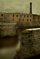
| 11/03/2006 07:45:43 AM |
Factoryby hudsonComment: Back to comment: I love the composition of this image. A little tweaking with levels (bump the gamma & contrast)or curves would increase the depth perception of this image. |
 Photographer found comment helpful. Photographer found comment helpful. |
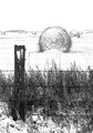
| 11/03/2006 07:38:33 AM |
Winter is back... End of harvest season.by iceMan71Comment: Back to comment: I suspect you forgot to sharpen after down sizing this image for the challenge. This image would also benefit from a little post processing work with levels or curves to boost the detail in the hay bales. With levels, I would suggest dropping the gamma (the middle slider) and then boosting the brightness and contrast. |
| Photographer found comment helpful. |
| 11/02/2006 02:23:43 PM |
Steaming Colorsby tpastoreComment: Hello from the Critique Club,
Congratulations on such a great score in your first challenge and a top ten finish to boot. Not much to critique here, as the image is so delightful. I must admit that I would love to play around with this image in post processing to see what could be done without changing the natural feel to it. Maybe bump the saturation or play with curves in just the green channel or mask for the smoke and see if some detail could be brought out with levels or curves. The best thing I can say about this image is that it is one of those fall type images I hope to take someday in my lifetime. Nice job.
Feel free to PM me if you have any questions regarding this critique.
Tim
|
| 11/02/2006 01:33:36 PM |
Journeyby LifeLostComment: Back to comment: I've decided to give this one a bump for your out of the box thinking. I'm not a big fan of lens flare but the creative thinking on your part deserves at least a 7. |
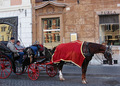
| 11/02/2006 01:26:15 PM |
Coachmen at restby patryComment: Back to comment: Sorry to say but this is more of a candid photo than a portrait in my opinion. This image would be easier to accept as a portrait of the coachmen if it were more closely cropped and you could see both of their faces. The color and focus are nicely done but the cropped of back end of the buggy looks a little odd. |
| Photographer found comment helpful. |
| 11/02/2006 01:23:18 PM |
Jugglerby lambie83Comment: Back to comment: A creative idea for this challenge; however, the image has a couple of technical issues that will hurt your score a bit I'm afraid. First, the flash reflecting off the glasses is a major distraction. This is hard to prevent unless the flash is aimed more from the side of the subject. Second, it appears your camera focus on the hands and oranges instead of the eyes. Portraits don't score well without the eyes sharply focused. |
| Photographer found comment helpful. |
| 11/02/2006 01:19:14 PM |
Introspectionby freakin_hilariousComment: A lovely girl but sorry but this is more of a candid photo than a portrait in my opinion. As for the image itself, it appears to be a little flat looking (washed out). Maybe a little tweaking with curves or levels in posting processing would help, especially in the face area. |
| Photographer found comment helpful. |
| 11/02/2006 01:17:43 PM |
Surprised!by chesireComment: Back to comment: You did a nice job of getting a sharp focus on the girl's eyes but the colors in this image look weird. I'm not sure if you tried selective desaturation or had to crop this image a lot but the background has a weird cast and the girl's face (except for the eyes) look washed out. Part of this may be related to your file size being only 100 kb. The challenge rules allow for images up to 150 kb. The extra 50 kb might have helped the background in this image. I also betting that a little work in post processing with levels or curves could have brought about a bit more life in the face. |
| Photographer found comment helpful. |
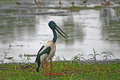
| 11/02/2006 01:12:41 PM |
Jabiru in Kakaduby chrism23Comment: Back to comment: Sorry to say but this image looks more like a snapshot from the zoo that you thought might fit the challenge than it does a portrait. This image would be easier to accept as a portrait of a bird if it were more closely cropped. The partial birds at the top of the image are a big distraction and add nothing of value to the picture. I would suggest playing around in post processing a bit more with this image, as the detail in the bird's face are pretty much lost. |
| Photographer found comment helpful. |
| 11/02/2006 01:03:02 PM |
Memoirs of Bokehby jlchavesComment: Back to comment: Sorry but this is more of a still life than a portrait in my opinion. The image if very well done but I'm afraid last week's Bokeh III challenge would have been a better fit for this image. |
Home -
Challenges -
Community -
League -
Photos -
Cameras -
Lenses -
Learn -
Help -
Terms of Use -
Privacy -
Top ^
DPChallenge, and website content and design, Copyright © 2001-2025 Challenging Technologies, LLC.
All digital photo copyrights belong to the photographers and may not be used without permission.
Current Server Time: 12/20/2025 06:31:25 AM EST.