|
|
|
Showing 381 - 390 of ~1260 |
| Image |
Comment |
| 12/04/2006 08:02:25 AM | |
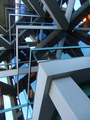
| 12/04/2006 07:48:59 AM | cornersby sickdogComment: Hello from the Critique Club,
First, let me congratulate you on your new personal best. There is a lot about this image that I like, the various shades of blue and gray, the three-dimensional look of the image, and the complex pattern. I do find the lights to be a little distracting but that is something you could not control. The reason you finally broke into the 6's is that you found a subject that strongly meets the challenge and you captured and post processed it extremely well. Although a building wasn't the strongest subject for a perspective challenge, the perspective you used definitely enhanced the subject matter. If this were my image I would try to clone out the lights and then print it for hanging on the wall. Nice job!
Feel free to PM me if you have any questions regarding this critique.
Tim
|  Photographer found comment helpful. Photographer found comment helpful. |
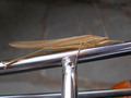
| 11/30/2006 07:59:30 AM | Good Morning from Serpent Lake and Have a Nice Dayby rjackpineComment: Hello from the Critique Club,
My first impression of this image is that it looks kind of flat. There is enough color variation and shadows on the serpent that this image should have a lot more depth to the look. Therefore, a bit of work is needed in post processing to get the most out of the subject you photographed. My suggestions for post processing are to bring up a levels layer and bump up the gamma a bit (the middle slider). Then do a brightness/contrast layer and boost the contrast and lower the brightness to compensate for bumping the gamma. Then after down sizing the image to 640 pixels, I would apply a bit of Unsharp Mask to help sharpen up the details in the serpent that get lost due to downsizing (Almost everyone sharpens their images after downsizing at DPC instead of before, as downsizing can cause artifacts when the image is really sharp). Give it a try. I think you will find that this image can be a very good tool for learning how to post process with PS. It has a lot of potential and I think you will be pleased with the results using the simple adjustments I've suggested.
Feel free to PM me if you have any questions regarding this critique, as I'd be more than happy to post process this image and send you the results.
Tim
Edit: Added sharpening comment. Message edited by author 2006-11-30 08:03:46. |
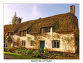
| 11/30/2006 07:40:07 AM | Dunster Cottagesby tembaComment: Hello from the Critique Club,
This image brings back fond memories for me, as I've have the pleasure of traveling through the UK a couple of times on holiday. You did a very nice job in post processing this image, as the colors and contrast are nicely done. I found the comment from GrayGhost very interesting, as there definitely are some wide-angle effects on the left side of the building but they weren't really noticeable to me until after I read his comment. All in all, I don't think a perspective correction would have changed your score that much, as it is the charm of the cottages that grab the viewer's attention.
I'm glad this scored over a 6, as it is a very lovely image and deserving of such a fine score. Feel free to PM me if you have any questions regarding this critique.
Tim
| | Photographer found comment helpful. |
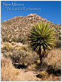
| 11/29/2006 10:54:12 AM | Greetings from the Desertby LoreneComment: Hello from the Critique Club,
You found a very lovely scene and did a very nice job with the composition. The size relationship between the plant and mountain give the image a lot of depth. Where I think this image falls a little short is in the color. The harsh sun gives the image a washed-out look. You might want to try bumping the gamma in levels and then decreasing the brightness. This will strengthen the colors and contrast in the mid-range features.
Feel free to PM me if you have any questions regarding this critique.
Tim
| | Photographer found comment helpful. |
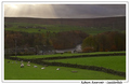
| 11/29/2006 10:44:07 AM | by KHoltComment: Hello from the Critique Club,
You found a very lovely scene and did an exceptional job with the composition. Overall, the image appears to be dark, as mentioned in more than one of the comments you received. However, I believe it is an optical illusion of sorts, as people expect the sun they see breaking through the clouds to shine on the sheep themselves instead of the countryside in the background. If you had balanced the light for the sheep, you would have received comments about the washed out sky. Tough lighting conditions to shoot under and I think you got as much out of this image as was possible.
Feel free to PM me if you have any questions regarding this critique.
Tim
| | Photographer found comment helpful. |
| 11/29/2006 09:31:38 AM | You Are Ascending Into Paradise, Caby cogeroxComment: Hello from the Critique Club,
This image definitely meets the challenge and you received a lot of feedback on this image (some if it contradictory). With over 40% of your votes being 5's, that to me indicates that people looked for literally 2-3 seconds and concluded, "this picture isn't bad (so I can't give 4 or less), but it doesn't do too much for me (so I can't give 6 or more). The compositional centering of the sign gives a snapshot kind of feel to the image and lacks the wow factor required for a 6+ score at DPC. Compounding that is that the yellow border and letters make the colors in the foliage look a little washed out. I'm betting that this area of California looks a lot more attractive in the spring and summer when the plants are a dark green and the sky is blue. The timing of this challenge worked against you.
Feel free to PM me if you have any questions regarding this critique.
Tim
| | Photographer found comment helpful. |
| 11/28/2006 08:05:39 AM | Ready for My Close Upby EyesupComment: Hello from the Critique Club,
I think there are several technical issues with this image that had a less than favorable effect on your score. I'll try to break it down into individual categories for discussion. Since there is little detail in the photographer's comment section, I have to guess at how this image was taken and post processed. Therefore, my comments are based on some assumptions (Which I will state) and can be disregarded if the assumptions are wrong. If my assumptions are wrong, feel free to PM me with the correct details and I'll try to help you as much as I can.
Sharpness: The image doesn't appear to have any areas sharply in focus. This could be related to camera shake, as it is sometimes difficult to hand hold an image at a shutter speed of 1/20 sec. If your original is sharp, then it could be from down sizing the image for the challenge. Most DPCers sharpen the images after down sizing to 640 pixels. The most common sharpening tool for doing this is USM but if your program doesn't have that option, I suggest you use the lowest setting possible and sharpen a couple of times if necessary.
Lighting: I'm guessing that you used on camera flash. The result from the direct flash is that the black hat shows very little detail and looks flat. If you would have used window light from the side or some other side lighting instead of the on camera flash, it would have provided better a light gradient on the hat and helped provide better definition.
Composition/Subject Matter: The subjects are centered in the image and provide little to hold the viewers attention. Plus, the hat and boa are very ordinary objects and there doesn't appear to be any relationship between two. There may be a connection for you but the connection doesn't come across to the voter in this image. If you plan on shooting everyday objects for a DPC challenge, you need to do it in a very creative way if you want a solid score (5 or higher).
Feel free to PM me if you have any questions regarding this critique.
Tim
|
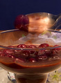
| 11/19/2006 03:10:02 PM | Berries and Chocolateby TlemetryComment: Hello from the Critique Club:
It looks like you used this challenge to try a new technique and I like seeing that in the challenges (We�re here to learn right?). The trouble is that I can�t quite tell which technique you are trying, the ghost effect or motion blur. Either way, you were smart to go with something a little out of the box, as the subject matter is a bit blasé on its own and would not have even hinted at being long exposure without the effect. If you could have executed your concept a little better this image could have scored over a six easily. Keep trying, as creative thinking like this will help you get higher scores in the long run once you master the techniques.
On the technical side, the exposure and lighting are nicely done. The green items in the background behind the spoon are a bit distracting should have been removed before taking the shots. It is very important to remove all items from an image that are not essential if at all possible.
Tim
| | Photographer found comment helpful. |
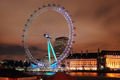
| 11/19/2006 02:58:31 PM | London Eyeby GrandadComment: Hello from the Critique Club:
Congratulations on your new personal best. This is a really well done image and deserves the solid score it received. Looking at the time of day that this shot was taken, it clearly was a long exposure and meets the challenge. You did a nice job with your composition and post processing of this image. The quality of this image was well rewarded with a near six score. The primary suggestions I have for improvement are related to when you took the image. The image would have been a bit more impressive if the buildings at the bottom could have been avoided. Also, a little motion of the London Eye would have given this a more artsy feel instead of a touristy feel to the shot. Not sure if either change would have helped your score, as the subject matter chosen, while solid, lacks uniqueness to really capture the attention of the voters.
Tim
| | Photographer found comment helpful. |
|
Showing 381 - 390 of ~1260 |
Home -
Challenges -
Community -
League -
Photos -
Cameras -
Lenses -
Learn -
Help -
Terms of Use -
Privacy -
Top ^
DPChallenge, and website content and design, Copyright © 2001-2025 Challenging Technologies, LLC.
All digital photo copyrights belong to the photographers and may not be used without permission.
Current Server Time: 08/24/2025 05:56:16 PM EDT.
|