| Image |
Comment |
| 03/07/2007 06:01:38 PM |
www.red.....by MikeOComment: Back to comment: Good sharp looking details and the colors look really nice. However, the subject isn't interesting enough to hold my attention for very long and cropping off part of the "d" makes the image look off blanced. |
 Photographer found comment helpful. Photographer found comment helpful. |
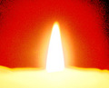
| 03/07/2007 05:59:23 PM |
Candle Glowing on Redby Ice-Tea-1983Comment: Back to comment: You choose a tough subject to photograph for this challenge. The flame looks a bit over exposed and the post processing makes the dark areas of the background look like they were spray painted. I would also suggest you read up on the rule of thirds, as the centering of the flame in the image is one of the least interesting locations you could have put it. |
| Photographer found comment helpful. |
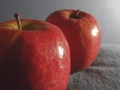
| 03/07/2007 05:55:04 PM |
Applesby sumskater41Comment: The focus is a little soft on this image. Did you sharpen the image after resizing for the challenge? Most people run Unsharp Mask (USM) after resizing. In addition, the subject is rather ordinary and doesn't offer much to hold the viewer's attention. |
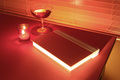
| 03/07/2007 05:54:56 PM |
REaDby JIMCJ1301Comment: Back to comment: This image would have benefited from a different background. The blinds look a little busy. I'm also not very fond of the post processing of this image. The pages of the book look like they are glowing and have totally lost all detail. Although you managed to give the image a reddish looking tint, it doesn't look natural. |
| Photographer found comment helpful. |
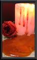
| 03/07/2007 05:50:10 PM |
Melted Loveby jcapps25Comment: Back to comment: I'm not sure what actually melted but it doesn't really look that appealing. Three things that could help your score with this image: 1) The image is much smaller than what is allowed for the challenge. Your longest dimension is 480 pixels and you are allowed 640 pixels on the longest side 2) Most voters prefer no borders or very simple ones. This one is a bit over the top. 3) You�ve cropped the image a little too tight on both sides. You really should have included the complete candle and the complete rose in the picture. |
| Photographer found comment helpful. |
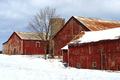
| 03/07/2007 05:44:38 PM |
Red Barn Complexby gg3rdComment: Back to comment: Nice composition. I really like the layers barn structure. Put you in my top five for the challenge. |
| Photographer found comment helpful. |
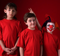
| 03/07/2007 05:44:33 PM |
There's Always Oneby scalvertComment: Back to comment: Don't you just love it when the smear the make-up? This better go up on your wall after you get a chance to do a little clean up. Put you in my top 10 for the challenge. |
| Photographer found comment helpful. |
| 03/07/2007 05:44:17 PM |
Red Point Hotelby WindtaleComment: Back to comment: When you have an image this nice, you really shouldn't waste any pixels on a border. I wish I could see the full size version of this. Put you in my top 10 for the challenge. |
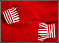
| 03/07/2007 05:44:14 PM |
RED WHITE AND REDby whitewolfComment: Back to comment: Simple, clean, and so sharp I cut myself typing this comment. What a pleasure to look at. Put you in my top 10 for the challenge. |
| Photographer found comment helpful. |
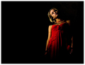
| 03/07/2007 05:43:56 PM |
Mirror reflectionby anferhComment: Back to comment: Great lighting, wonderful pose, love the composition. Put you in my top ten for this challenge. |
| Photographer found comment helpful. |
Home -
Challenges -
Community -
League -
Photos -
Cameras -
Lenses -
Learn -
Help -
Terms of Use -
Privacy -
Top ^
DPChallenge, and website content and design, Copyright © 2001-2025 Challenging Technologies, LLC.
All digital photo copyrights belong to the photographers and may not be used without permission.
Current Server Time: 08/24/2025 05:00:02 AM EDT.